Become a MacRumors Supporter for $50/year with no ads, ability to filter front page stories, and private forums.
Mac OS X Alternate Dock Concept
- Thread starter Arekusandaa
- Start date
- Sort by reaction score
You are using an out of date browser. It may not display this or other websites correctly.
You should upgrade or use an alternative browser.
You should upgrade or use an alternative browser.
Interesting concept, but I don't think it works.
And I wouldn't have believed it if I'd never seen it.
But there's just not enough diversity in the icons to be able to differentiate them at a glance. Part of the reason it works so well on Windows Mobile is the diversity in size and placement. Here it's just one long row of similar looking squares.
Don't get me wrong - I *love* the concept behind the Metro UI. But I don't think the dock is a good place to implement it.
Nice work, though.


http://youtu.be/6gt5eU9ZDnY
I am convinced that Steve would have never approved of the new iOS 7. It's a combination of Android and Windows Vista and 7. Hideous - and the Icons against the background are hard to read and look like Kindergarten. Yuck. It just does not feel refined. And Apple without Steve Jobs, is just like Apple without Steve Jobs.
After a few months since the introduction on iOS 7 my opinion does not really develop in the favor of the Software. After having played with the Developer Releases, the terrible look and feel is more appeared then my first guess. No longer am I in favor of iOS7 Interface Design. Apple couldn’t diversify itself, within its own departments, if it tried. All of this Steve Jobs wouldn’t have allowed happening. John Ive maybe a great Product-Designer, but is by no means a Interface-Designer. The Design separates the iOS devices more form the Apple Computers – even though Job’s main goal was always consistency and integration. iOS 7 is so far from that. Apple now has a huge Problem fixing this, if they ever will. How can you gracefully bring the look and feel to OSX? Impossible!*Helvetica Neue Ultra Light*in the menu-bar. You will not be able to read the Menu-items. And the Icons are completely different in iOS 7. How can they bring a transparent Icon design from iOS 7 on top of a transparent dock in OSX? – ridicules. My prediction: though most people the will update to iOS7, but their updating will not state a true resonance of the level of satisfaction. The interface feels so “Unfinished” and “Unpolished” that over time iOS will loose share in the market. After all, what separates iOS 7 from a themed Android App. Android is cooler, and I can still pick another theme, if I don’t like what i am seeing. So the mere introduction of the iPhone 5C may keep iOS in the statistics. But Apple being the innovator and delivering absolutely solid products that where completely refined, died with Steve. Tim Cook is maybe a great businessman, but in no way a visionary. Again will Apple fall, and become just another electronics manufacturer, but this time Steve Jobs will not return to salvage the company.
Sad is also, that this minimalistic approach does not really set the Retina in a good light. Were is the need for more Pixels when everything is white? The new typography and the transparencies are that of Windows Tiles and Windows Vista. And it didn’t work then… Those have no additional value to an interface, and make them rather busy, annoying and deconstructive. Especially the new control center is terrible and inconsistent to the notification center. It should be over a solid, because it has absolutely no relation to the elements behind. Even on the keyboard I find it unnecessary, but here I get the sense of content maybe a reasoning, but doesn’t have any additional value. The Home-Screen icons are not better and not good, they are as inconsistent as they ever were. If you want flat, stay flat; do not use gradients.
As of OSX Mavericks; it sets off with a new icon and name, as if it is all new. But then it is not. The new X icon looked at first as if OSX is finally coming together with iOS – but no way, was I wrong! It is yet another attempt to solve problems and issues of the last version and pretend it is a new one. Since the introductions of full screens it has always been the problem to use my secondary screen as well as having the toolbars and dock in the right place, so this is just an answer to what had to happen. And FinderTaps is nothing really new; I’ve been using the way better interpretation of that with TotalFinder for years. I was hoping, that if they introduce a new direction on iOS, that this would find its way to OS X. Now we have completely different icons for the Apps with the same name and function, like Safari, Mail, Calendar, etc. An OS with the look of iOS would be so cool! Here is my idea of how OS X would improve its user experience and merge the two interfaces I call it the Dockboard, and I designed it before iOS7 was introduces, which is why the iOS6 Icons.
Last edited:
copperdesign - I watched your youtube video of your proposed OS X interface. I'm curious to know some of the background behind it and why you made the decisions that you did. What specific usability and UI problems does it address?
Watching the video, I saw a few things I thought were odd. But I wanted to get a better understanding of where you're coming from before I get into that.
Watching the video, I saw a few things I thought were odd. But I wanted to get a better understanding of where you're coming from before I get into that.
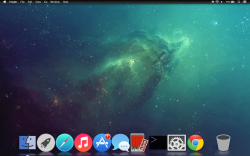
this is actually my dock right now
What dock are you using and icons as well?
What dock are you using and icons as well?
I'm using Dockmod with custom icons I made in photoshop
Dockboard
SwiftLives: this is just a comp-up non working. I am trying to combine LaunchPad, the traditional Dock on the bottom, Dashboard and the Widgets into one unified concept. Also if OSX ever goes full touch, then this could be the first take. Here are a few reasons:
Trying to make all of these things work in one simple interface. Which is why I made the video.
SwiftLives: this is just a comp-up non working. I am trying to combine LaunchPad, the traditional Dock on the bottom, Dashboard and the Widgets into one unified concept. Also if OSX ever goes full touch, then this could be the first take. Here are a few reasons:
- The LaunchPad is useless, because it just lists ALL Apps I have, without any type of usefull sorting, like the dock does.
- The Dock has the limit of the width and doesn't support any widgets from the dashboard.
- The dashoard is noching but an inheritent fullscreen look - so therefore any widget app should act like a normal program, and you should be able to purchase them thru the App Store
- Settings and Audio controls could follow the look from iOS6
- Its large enough for true touch, but would hide away, when it is not needed, and not interfere with other things on the screen like the current dock does. It could be brought up by a gesture, much like the notification center. Swiping 2 fingers from bottom up - and for those not using gestures, it could be triggered by a hot-corner.
Trying to make all of these things work in one simple interface. Which is why I made the video.
Register on MacRumors! This sidebar will go away, and you'll see fewer ads.