Become a MacRumors Supporter for $50/year with no ads, ability to filter front page stories, and private forums.

mmzplanet

macrumors regular
Original poster
Nov 4, 2004
221
0
Florida
I see that everyone seems to have a gripe about the consistency of the UI. I thought about it for a bit and am gonna play the side of Apple for a minute. Maybe (I have no clue whether this is indeed the case) Apple has left each app different by design. Maybe having all pinstripes in the beginning caused everything too blend in and it was decided a mixture of UI between apps would make it more intuitive.

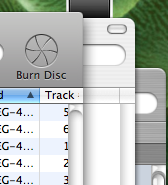
Think of it this way...Expose is nice but it is sometime faster to just click the tiny portion of a window stick from behind of the app you are working with. I commonly have Safari, Mail, iChat, and on occasion iTunes windows open simultaeously. Maybe the differences remain so you can quickly recognise the app because sub-consciously you know that the app is in brushed metal, plastic, subdued pin-stripe. See attachment

Without Expose you would not know what is likely the correct window to click on if they are all identical. Look at the image below... I can tell you what each are by the UI style alone...yeah some apps are the same...but its interesting that my 3 common apps each are different...what a coincidence. Maybe in the end this is Apple being fine detailed in making OS X the most intuitive OS. Whether this is really Apple's intent or not, I dont mind it.
 

Attachments

  • Picture 2.png
    Picture 2.png
    21.8 KB · Views: 580

mkrishnan

Moderator emeritus
Jan 9, 2004
29,776
15
Grand Rapids, MI, USA
I also don't really mind the mix. On other OSes, when there was this kind of inconsistency, it really annoyed me, but with OS X, I've found that the different interface looks go together very well. I notice right away when a program written in Java or somesuch doesn't look like OS X. But it doesn't bother me that I have Safari and Mail running, and they look different, because they seem to flow together very well to me.

Now with the white plastic vs. aluminum, I have some issues. Many times, I think it looks nice. I got an iSight, and I think it goes well with white plastic hardware. But then I have mixed feelings about the white power adapter coming out of the PBs and MacBooks.... I dunno.

But mostly, I think both in software and hardware, Apple's industrial design is good. :)
 

mkrishnan

Moderator emeritus
Jan 9, 2004
29,776
15
Grand Rapids, MI, USA
shrimpdesign said:
I bet that second one is Mail.

I think the point is that recognizable, but visually compatible, differences in style between windows makes it easier to distinguish applications, thus subtly aiding the ergonomics of the UI. I don't think the OP was challenging you to figure out which is which. ;)
 

mmzplanet

macrumors regular
Original poster
Nov 4, 2004
221
0
Florida
shrimpdesign said:
I bet that second one is Mail.

Right on... Mail is subdued stripes when not the active window.

mkrishnan said:
I think the point is that recognizable, but visually compatible, differences in style between windows makes it easier to distinguish applications, thus subtly aiding the ergonomics of the UI. I don't think the OP was challenging you to figure out which is which. ;)

Exactly
 

Laser47

macrumors 6502a
Jan 8, 2004
856
0
Maryland
I also like the current style of GUI mac has. Everything is different, if apple uses a unified window style its gonna get boring. Its also easier to pick out programs in Expose. I like variety,
 

yippy

macrumors 68020
Mar 14, 2004
2,087
3
Chicago, IL
If it weren't for people complaining about the inconsistent UI I wouldn't even be aware that there is one. Not something that even registers for me let alone have an opinion about.

That said I like how it looks.
 

Heb1228

macrumors 68020
Feb 3, 2004
2,217
1
Virginia Beach, VA
Add me to the list of people that don't really care if all the apps look "consistent." And I think the OP does bring up an excellent point as to the usefulness of the differences, although with iPhoto now looking the same as the newer iTunes, I'm not sure if that's Apple's reasoning.
 

EGT

macrumors 68000
Sep 4, 2003
1,605
1
I'd prefer UI consistency.

I think Apple are testing out different styles but I don't really mind the differences at all. As long as the software works, I'm happy.

Although a complete UI like Aperture would be sweet. :cool:
 

iMeowbot

macrumors G3
Aug 30, 2003
8,634
0
If you want an inconsistency to complain about, try the little oval search boxes that have been sprouting up on everything. In some places they work like Spotlight with search as you type, in other places you need to press Return to make anything happen, and the box appearance is the same. Even within iTunes the same search bar works differently when you are in your library or the store!
 

solvs

macrumors 603
Jun 25, 2002
5,684
1
LaLaLand, CA
I like some things to be consistent, so I use UNO Gloss. It's a theme that works great, never had a problem with it. I like that the apps look different though. Like FCP and GB.
 

Project

macrumors 68020
Aug 6, 2005
2,297
0
As long as windows and widgets BEHAVE consistently, then different themes is all good. I really like the iTunes/iPhoto06 look though. But dont want it to become overkill with every app mimicing it.

Imagine a Finder based on Aperture though... wow....
 

sunfast

macrumors 68020
Oct 14, 2005
2,135
53
I've never seen aperture but some people here seem to think it looks very slick. Any chance of a picture?
 

Eidorian

macrumors Penryn
Mar 23, 2005
29,190
386
Indianapolis
sunfast said:
I've never seen aperture but some people here seem to think it looks very slick. Any chance of a picture?
http://www.apple.com/aperture/gallery/

That's the best I could do on short notice. MacWorld magazine might have some more shots too.

I like the new look. Brushed metal is much nicer than the old Aqua interface. I love the new plastic look of iTunes 6. iPhoto 6 got a nice make over as well.

The UI between iTunes, Mail, and Safari does vary but their interaction with the user is consistent among them. Exposé is a wonderful to switch between applications but a distinct look between the applications lets the corner of your eye pick out what's running on screen.
 

dolphin842

macrumors 65816
Jul 14, 2004
1,172
29
I was originally a fan of the brushed metal look... but then it started reminding me of water fountains :p ;)

I like Panther's take on Aqua (subdued gray stripes, as opposed to blue) and am glad it is sticking around on some older apps. I like the unified look as well.

As with most here I agree that it's good to have the different styles mixed together, so long as the actual UI of the windows remains consistent. Different styles go with different apps and as long as they are used properly, it works for me.
 

XNine

macrumors 68040
OS X's UI needs to be customizable from within System PReferences tow hatever the user feels. And I'm not talking about some piece of crap Haxie like Unsanity releases, I'm talking COMPLETELY native.

That way there's no processor load that doesn't need to eb there (like with Shapeshifter) and is easier to configure then having to mess with the actual system files.

Give us the ability to customize the GUI all we want, that way, EVERYONE is happy.
 
Register on MacRumors! This sidebar will go away, and you'll see fewer ads.