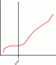
You can use drawing tools to add a line anywhere in the chart. Then, add an additional data label and move it next to the line. That's the simplest way I know. I'm not sure if there's something that will recognize an event you're looking for and automatically create the line.
This will work only as long as you don't change the range of your axes (esp. the X-axis). If you do, then the lines will no longer be in the correct place in relation to your data.
The way I do it is create a seprate series. For example, suppose you're plotting some lab test data with conversion of a chemical compound on a Y-axis (0-100%) and time (in hours) on the x-axis. Now suppose your chemical reactor suffered some upsets during the test (e.g., power outage) at 540, 765, 1200 and 1743 hours, and that you would like to indicate those events on the plot. To do this type the following set of numbers in your spreadsheet (in two columns):
540 0%
540 100%
765 0%
765 100%
1200 0%
1200 100%
1743 0%
1743 100%
540 0%
540 100%
Note: it's important you separate each set of numbers with a blank row, otherwise you will wind up with a sawtooth pattern. Now select the range of cells containing these numbers and add them to you graph as a new series. Next set the line and marker attributes (any type of line is fine, besides
none
; I usually select
no marker). You will now have vertical lines on you graph that will always be correctly placed in relation to the data. If you don't want the series name to appear as part of the legend, simply select it in the legend and delete it.


