Become a MacRumors Supporter for $50/year with no ads, ability to filter front page stories, and private forums.
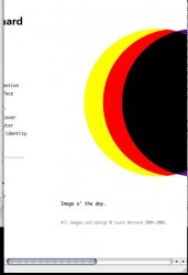
Well, since everyone else is doing it - my new portfolio site!
- Thread starter Lau
- Start date
- Sort by reaction score
You are using an out of date browser. It may not display this or other websites correctly.
You should upgrade or use an alternative browser.
You should upgrade or use an alternative browser.
- Status
- Not open for further replies.
devilot said:Her previous site's links were images of staples... you had to click on the staples to go to the corresponding link. They were really neat.
Oh. thanks-a-lot devilot

I guess thats ol' school.. way before i ever showed up here..
L
Lau
Guest
Original poster
Ooh, blimey, I've been a bit busy the last week or so and didn't see all these replies. Thanks everyone who said they liked it - now for all these questions....
Well, one of them certainly isn't suitable for a family forum....
Well, those are really small, (like about 8cm square) so I printed the pages out on my A4 inkjet. To make them double sided I had to centre the print in Quark, measure the distance the print was from the top end of the paper, turn it over and cut the bottom edge of each bit of paper to be the same distance then put in back in the printer the other way up. I forget why I couldn't just flip the image, there was a reason! Then I used dark red heavy paper and printed on black for the cover, trimmed all the pages down and folded them, then they're bound using a white rubber band. And little brown wage enevelopes are the perfect size for posting it out. It worth thinking about things like envelopes first if you are going to be posting it, it's a nice touch if they fit perfectly. Using a photocopier and then coloured paper inside or coloured card for the cover is a good way to do something cheaply (or free, if you have a free copier at college - yay! Don't know what I'm going to do without a copier when I leave).
Here's another example - it's my dissertation about 'zines, and so I did it like a zine. The cover is really bright yellow and the inside it just copied onto white. It's A5 - so just the standard A4 copy folded in half - dead easy.
![]() ...
...
![]()
I've no idea what mark I'll get for it - maybe some for creativity but the writing is pretty dire.
I'll stop now, but feel free to ask any more questions - I'm not a professional or nowt, but I do spend a lot of time photocopying random stuff into books.
Fantastic! I've never seen them live, but I would like to.
Not yet, at the moment it's just a single case a-z. I'm working on a set though - like a whole Argos set and some other tacky catalogues. I'll see how it develops. I can't imagine anyone actually using it though....
Cheers - I was giggling to myself the whole time I was doing it. And you'll be pleased to see I didn't cheat and use the diamondique Alphabet necklace letters.
eyeon said:The "10 things you didn't want to know about me" book is brilliant. What a fantastic idea... I'm now quite curious about the other 9 things...
Well, one of them certainly isn't suitable for a family forum....
SpaceMagic said:Love that ten things book... was wondering though, how do you publish these things/make them into books?
Well, those are really small, (like about 8cm square) so I printed the pages out on my A4 inkjet. To make them double sided I had to centre the print in Quark, measure the distance the print was from the top end of the paper, turn it over and cut the bottom edge of each bit of paper to be the same distance then put in back in the printer the other way up. I forget why I couldn't just flip the image, there was a reason! Then I used dark red heavy paper and printed on black for the cover, trimmed all the pages down and folded them, then they're bound using a white rubber band. And little brown wage enevelopes are the perfect size for posting it out. It worth thinking about things like envelopes first if you are going to be posting it, it's a nice touch if they fit perfectly. Using a photocopier and then coloured paper inside or coloured card for the cover is a good way to do something cheaply (or free, if you have a free copier at college - yay! Don't know what I'm going to do without a copier when I leave).
Here's another example - it's my dissertation about 'zines, and so I did it like a zine. The cover is really bright yellow and the inside it just copied onto white. It's A5 - so just the standard A4 copy folded in half - dead easy.
 ...
...

I've no idea what mark I'll get for it - maybe some for creativity but the writing is pretty dire.
I'll stop now, but feel free to ask any more questions - I'm not a professional or nowt, but I do spend a lot of time photocopying random stuff into books.
Dunepilot said:Ah, David Devant and His Spirit Wife - highly underrated. I once supported them with my old (pop/rock) band. They were wonderful.
Fantastic! I've never seen them live, but I would like to.
_bnkr612 said:I like it. Do you have the whole alphabet and glyphs for Elizabeth Duke?
Not yet, at the moment it's just a single case a-z. I'm working on a set though - like a whole Argos set and some other tacky catalogues. I'll see how it develops. I can't imagine anyone actually using it though....
dietcokevanilla said:The Lizzie Duke typeface is just pure genius!
Cheers - I was giggling to myself the whole time I was doing it. And you'll be pleased to see I didn't cheat and use the diamondique Alphabet necklace letters.
Hi.
Your site looks good. Just a couple of things you might be interested in....
On my PC, I change the desktop/color theme to not use white as background for windows...I find it hard on the eyes. Your site looks like this. Try forcing your background color to what you want:

Also, some work on the HTML with respects to your navigation bar and content pane. When sizing the window for narrow width, I get this:

L
Lau
Guest
Original poster
Thanks, VanMac for your comments (just saw them now).
I've tried specifying the background colour as white in the body CSS tag, but I'm not sure it makes any difference. When I set my browser preferences to change the background colour (and override the site's colour) it still makes it blue. However, if I say don't override the site's colours, it doesn't make any site have a blue background, so I assume you've set yours to override? How many sites do you visit that then override your settings and show their own background colour? Do you know how I might do this? (Does that make any sense?!)
As for the scrolling problem, I think this might be an Internet Explorer problem, as I just tested it in Safari, Camino and Firefox on a Mac, and have tested it on Firefox on a PC and it scrolls like the attachment below. I just looked on Internet Explorer on a Mac, and it does indeed do what you showed above. Bloody Explorer! It has to be difficult. Presumably it doesn't play nice with CSS the same way the others do. I'll have to look into it.
Thanks for bringing them to my attention, VanMac. I'd expect most of my viewers to be on a Mac and not on Internet Explorer, but obviously the more viewers that see it the way I wanted it to the better.
Attachments
Hey.
No problem.. Happy to comment.
I see your colors are fixed.....all looks good on IE now.
With regards to formatting issues around your nav bar and content pane. Tables are your friend. I'm no expert, but I typically put everything in a table. Tables in tables in tables. Allows for a lot of flexibility and control over space allocation and formatting.
Regarding browsers, if I was going to target one browser for it too look good on, it would be IE. Whether we like it or not, it is the most dominant browser out there. I basically do all my web development on a mac now, but then flip to my pc to check formatting. Quite often I need to change things, but nothing big. Just little tweaks here and there can get things looking good on Safari/Firefox/IE.
Have fun, and keep up the good work,
L
Lau
Guest
Original poster
Well I'm glad the colour thing worked at least!
As for the layout, I've been trying to move away from tables (my old site was tables) and do the whole thing in CSS. I really like CSS, but it seems that IE renders it all differently. Then again, at least that will only happen if someone resizes my site smaller than it should be, and if they do that they can't see all the pictures in any browser. I designed it to fit in 800 x 600 so it looks good on a 12" screen, so hopefully people won't feel the need to make it smaller to fit on their screen. Hopefully few people will both use IE and resize it really small, as most people on Windows will have it maximised as well. In the meantime though, if anyone has any help as to why this works on everything but IE it would be appreciated.
As for the layout, I've been trying to move away from tables (my old site was tables) and do the whole thing in CSS. I really like CSS, but it seems that IE renders it all differently.
Then again, at least that will only happen if someone resizes my site smaller than it should be, and if they do that they can't see all the pictures in any browser. I designed it to fit in 800 x 600 so it looks good on a 12" screen, so hopefully people won't feel the need to make it smaller to fit on their screen. Hopefully few people will both use IE and resize it really small, as most people on Windows will have it maximised as well. In the meantime though, if anyone has any help as to why this works on everything but IE it would be appreciated.- Status
- Not open for further replies.
Register on MacRumors! This sidebar will go away, and you'll see fewer ads.