

Apple is considering changes to Safari on the iPhone Duo that would give websites access to more of the outer display, although the company has yet to settle on an approach.
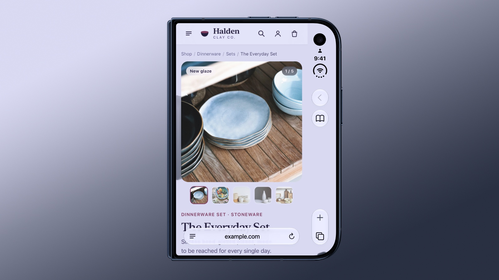
Article Link: Apple Wants to Fix Safari's Cramped Layout on iPhone Duo


Like normal. Menu buttons are on the bottom of the screen.Yeah it’s a mess for certain sites and apps. How do other foldable do it?
Does not work for me tbhThere's a Safari extension for this already: https://outspan.app/
There's a Safari extension for this already: https://outspan.app/
Does not work for me tbh


Why is it okay to have the URL cover the bottom but not okay for the back button to cover a tiny space on the right? Just fill the screen, we're adults.
Better still, hide the controls and let me do a drag from the top right corner or something. I already swipe from the left screen edge to go back and don't need a button.

Just move the URL bar and the right side icons to the top (so they all line up with the camera cutout). So that way on the top space is used up and everything else is free. People are already comfortable to ignore the top nowadays so it won't be an issue even in this smaller screen.
100% agree. Alternatively offer users an option in settings. This sidebar is the reason I mainly browse the duo open in portrait mode.Make it disappear/minimised as soon as you start scrolling (like the URL bar) is such an easy and basic implementation.
Or let us swipe it away when not in use.
None of the above require any developer collaboration.
It’s been showing lately…It's Apple. They don't have any beta testers.
I guess it's one of the problems of having such a secretive development process for a new product. No one challenged the absurdity of the current approach until things went live...I don’t understand why Apple struggle so much with it as this is already done on any iPhone running iOS 26-27 with all the controls automatically minimised at the bottom of the page in navigation mode, expanding back to size when needed.
Because the camera cutout is at the top. So that is already compromised, might as well use the rest of the top for everything and be done with it. This is a smaller phone so not hard to reach the top.Why to the top when all the other iPhones have it at the bottom, where they are also easier to reach without obstructing the screen?
To me, the whole right-side dock area needs to go to the bottom, where it belongs.

