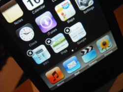
Become a MacRumors Supporter for $50/year with no ads, ability to filter front page stories, and private forums.
Can I ask how the new Dock fits better with the new updates than the Leopard style dock???

I have the complete opposite opinion...just curious. I don't understand why the iPhone would not have gotten the transparent dock.

:confused:
 
I think it looks fine. Though the original looks better I don't think it looks bad.....it's more like an iPhone now which is what most people bitch about on a daily basis.
 
Toxicbomber are you serious? The new dock totally sucks! There is to much silver/gray.
 
I don't understand why so many want their Touches to look like iPhones. They are both great devices, and respective owners should be proud of each and their distinct qualities. JMO.

I still don't see how the new Dock is in any way more attractive than the Leopard Dock.
 
I personally think the iPod Touch dock looks much nicer than the iPhone's.
 
I agree...I do not like the new look nearly as much as I like the old look.

However, it's obvious they want the iPod to look as much like the iPhone as possible...Which I guess I understand. But I wish they would not have changed the dock.
 
Toxicbomber are you serious? The new dock totally sucks! There is to much silver/gray.

Yes, very serious! It's my own opinion. Apple chooses what they think is the best and most elegant type of UI. This is a step forward I think. :apple:
 
Design issues with tech upgrades will haunt your waking life faster and more often than ever...lol!

Honestly...how many of you are seeking counseling over Leopard's break with past OS X wallpapers? Or XP vs. Vista? Registry Mechanic '05 vs. '07?

Mustang '67 vs. Mustang '71?

I believe that we can cope with these seismic shifts in our daily lives, God Willing! :cool:
 
OK. well, I updated...I'd still prefer the transparent dock. However...the new one is better than I thought. I thought it was just going to be this grey bar, but is actually a brushed-metal grate kinda thing, which at least looks thought-out. I can live with it in the end, considering the new features.
 
but is actually a brushed-metal grate kinda thing, which at least looks thought-out.
How does that make is thought out? For crying out loud, the orginal dock was thought out much better. The Touch uses a black tone to the front of it, even the edge. This is unlike the iPhone. The iPhone dock is out of place for the design tone of the Touch. Which is why the Leopard dock look fit in much better.
 
I don't understand why so many want their Touches to look like iPhones. They are both great devices, and respective owners should be proud of each and their distinct qualities. JMO.

I still don't see how the new Dock is in any way more attractive than the Leopard Dock.

If you add new apps and web apps to the home screen it would look too crowed and you wouldn't be able to distinguish what is in the dock.

Makes sense even though at first i hated it.
 
Why does the Touch or iPhone even need a dock? If now you can move the icons around then it seems to me the dock is pointless. So for this very reason Apple should bring back the original dock.
 
i think the reason why they nixed the reflective floor is that previously you couldn't move the icons, so these 4 icons had a reflective graphic in the icon. because now you can move all icons in and out each icon would need to contain a reflection for the switch, since it's not a realtime effect like in leopard.

i still think they could've done this a bit nicer. a bit more sleek, something with highlights like a coverflow ui as the dock or something.
 
How does that make is thought out? For crying out loud, the orginal dock was thought out much better. The Touch uses a black tone to the front of it, even the edge. This is unlike the iPhone. The iPhone dock is out of place for the design tone of the Touch. Which is why the Leopard dock look fit in much better.

What right do you have in telling people they have no taste and that this dock sucks? It's their own freaking opinion and if you cannot respect it then don't post. Stop being an idiot and let people decide for themselves because god forbid we like something you don't it shouldn't be an issue.......
 
Whatever.....either way, again, there now is no reason to even have a dock. What is the point of the dock anyway? Four icons you use the most. Like it's that hard to touch anywhere on the thing. And besides now that we can move the icons around, all we have to do is move them to the bottom without it being a dock. So there is no point to having an "official dock" any longer.
 
because now you can move all icons in and out each icon would need to contain a reflection for the switch, since it's not a realtime effect like in leopard.
Actually each icon wouldn't need a reflection for a switch as no reflection is needed at all for the other icons to work. But the reflection could be added once an icon is placed at the bottom row.
 
Wirelessly posted (Mozilla/5.0 (iPod; U; CPU like Mac OS X; en) AppleWebKit/420.1 (KHTML, like Gecko) Version/3.0 Mobile/4A93 Safari/419.3)

it's just the dock... Lighten up would ya?
 
Introducing The iPhone Dock - Now on ipod touch too

Just incase anyone hasn't seen it on the ipod touch yet ...

Personally I like it. :)
 

Attachments

  • ipod 05.JPG
    ipod 05.JPG
    107.7 KB · Views: 172
I like the original better, and whats wrong with a little uniquality?

iPod does not need to look like iPhone, the only reason anybody wants the iPhone dock is so that people may think it is an iPhone, instead...

I just hope it will become customizeable at some point (hopefully soon, cuz ugly beast has got to go!).
 
Register on MacRumors! This sidebar will go away, and you'll see fewer ads.