Become a MacRumors Supporter for $50/year with no ads, ability to filter front page stories, and private forums.
How do you like this application icon?
- Thread starter iostream.h
- Start date
- Sort by reaction score
You are using an out of date browser. It may not display this or other websites correctly.
You should upgrade or use an alternative browser.
You should upgrade or use an alternative browser.
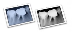
Blue looks good. Is that an actual x-ray, or just a representation? IMHO, it looks just a touch blobby/vague.
Kingsnapped said:Blue looks good. Is that an actual x-ray, or just a representation? IMHO, it looks just a touch blobby/vague.
It's an actual xray. I'll probably get a clearer one though.
Who you aiming it mostly at Dentists? Doctors? or other allied health professionals?
If mostly dentists - then blue one definitely!
If you are aiming for the wider health and medical market - I'd go for a more generic... Doctors and other health professionals probablyl won't jump at a Tooth.
Just my thoughts anyway - as I'm in the wider allied health industry.
If mostly dentists - then blue one definitely!
If you are aiming for the wider health and medical market - I'd go for a more generic... Doctors and other health professionals probablyl won't jump at a Tooth.
Just my thoughts anyway - as I'm in the wider allied health industry.
Blue, I like the graphic. As for the clarity, I don't think it necassarily needs to be perfectly discernible at first look, but that's just my opinion - I like it as it is
Without a doubt blue.
If it's for doctors as-well, consider a more generic icon. Perhaps you will want to supply two icons, one for docs and one for dentists. If you have an installer see if you can set the applications icon there (I'm sure many people won't like this idea).
Perhaps you'll want to keep the grayscale icon for update packages?
AppleMatt
Groan...molcas&e'sdad said:Looks like the next generation of "blue tooth".
Actually, I'm kicking myself for not thinking of that earlier - good one!
Blue is good - but have you tried adding a little more perspective to the image. Don't know if that would make it any better.....
D
D
I pick blue too. It looks better. Also I think the x-ray looks fine. You don't need to change it.
Register on MacRumors! This sidebar will go away, and you'll see fewer ads.