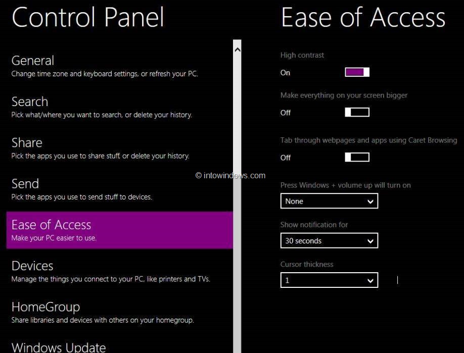
The big font reminds me of failed Microsoft’s Windows Phone UI with unnecessarily huge font headings. I mean if I tapped on Settings or Messages, I don’t need to be reminded that “Dude you have opened Settings, you need to calm your horses now”
The big font looked horrid on Windows back then and it still does look horrid even now.
With the loss of Steve Jobs, there is no real authority in Apple Campus to tell their designers about strange UI choices. It’s still B1 and there are 3-4 months for tweaking and changes. But I was kinda disappointed with their design direction. Perfectly working things have been changed for the sake of change.
![Enable-Windows-Phone-7-Style-User-Interface-In-Windows-8-Step2.jpg]()
At least Windows Phone UI has a dark mode.
The big font looked horrid on Windows back then and it still does look horrid even now.
With the loss of Steve Jobs, there is no real authority in Apple Campus to tell their designers about strange UI choices. It’s still B1 and there are 3-4 months for tweaking and changes. But I was kinda disappointed with their design direction. Perfectly working things have been changed for the sake of change.

At least Windows Phone UI has a dark mode.

