Got a tip for us?
Let us know
Become a MacRumors Supporter for $50/year with no ads, ability to filter front page stories, and private forums.
New font in Notes?
- Thread starter 4004786
- Start date
- Sort by reaction score
You are using an out of date browser. It may not display this or other websites correctly.
You should upgrade or use an alternative browser.
You should upgrade or use an alternative browser.
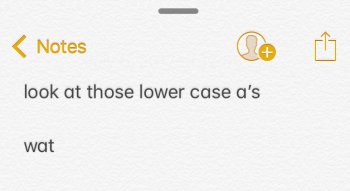
Has anyone noticed the new font in Notes? What’s up with those lower-case a’s? I looked through the beta feature thread, and didn’t see anything mentioning this. Has anyone else noticed?
If not, what do you think?
Yes it’s super ugly! Looks like a children’s book font.
I'm not a font expert but other than the a change what is it that is so different and makes it "super ugly! Looks like a children’s book font" while iOS 10 doesn't?Yes it’s super ugly! Looks like a children’s book font.
To me they look the same except for the a and the a in iOS 11 looks more natural since that is the way you would write it. Don't see the big deal.
Last edited:
If they're changing something, why not remove that stupid paper-texture background they've been using since iOS 7? It's hilariously ugly.
The new font seems marginally more legible (at least in the Notes comparison posted above), due to the thinner weight and shape of letterforms.
That font looks strange indeed. What's up with Apple UI these days? Third parties are doing a lot better in some cases.
For example, I use Bear for notes now. Love it. And they added sketching so it's fully equivalent to Notes with the exception of needing to pay for Cloud sync, which will admittedly turn a lot of people off but I find the small cost worth it for a nicer experience if you use the Notes app a lot.
For example, I use Bear for notes now. Love it. And they added sketching so it's fully equivalent to Notes with the exception of needing to pay for Cloud sync, which will admittedly turn a lot of people off but I find the small cost worth it for a nicer experience if you use the Notes app a lot.
If they're changing something, why not remove that stupid paper-texture background they've been using since iOS 7? It's hilariously ugly.
i rather like that background and the fonts.
but if you wanted to argue for giving users a choice in either, sure. that would be great
I find them rather similar, with the new one a bit easier to read. I therefore prefer the new one.
Register on MacRumors! This sidebar will go away, and you'll see fewer ads.


