Become a MacRumors Supporter for $50/year with no ads, ability to filter front page stories, and private forums.
No flat iOS 7 icons for the Google apps?
- Thread starter Oz.
- Start date
- Sort by reaction score
You are using an out of date browser. It may not display this or other websites correctly.
You should upgrade or use an alternative browser.
You should upgrade or use an alternative browser.
None of the apps made by google have the icons updated for iOS 7 (flat)
google does not like iOS7?
")
Could that maybe be because they were already flat?
They did update them but they didn't make them exactly flat. They gave them a border on the bottom which makes them a bit 3D, whereas before they were 'flat'.
Could that maybe be because they were already flat?
Does this look like flat to you?
Compare the google icons to the other app icons.
Attachments

They did update them but they didn't make them exactly flat. They gave them a border on the bottom which makes them a bit 3D, whereas before they were 'flat'.
That border sucks...
Does this look like flat to you?
Compare the google icons to the other app icons.
Yes, the do look flat. Slight different from Apple ones (they got that border effect on the bottom) but big deal, hardly noticeable.
Yes, the do look flat. Slight different from Apple ones (they got that border effect on the bottom) but big deal, hardly noticeable.
They don't.. this border at the bottom make them 3D objects which are not flat..
I hate this boarder too!!!
But it's Google's design approach so they won't change it in the near future :/
Yes, the do look flat. Slight different from Apple ones (they got that border effect on the bottom) but big deal, hardly noticeable.
It is very noticeable!
I don't care if they look flat! they don't use the iOS 7 flat design!
That's the main reason I don't have any of their apps installed. Stupid, yeah, but I don't like inconsistency on my home screen. I can just use Safari instead.
I can just use Safari instead.I think their icons are "flat" in a tasteful way, unlike most of Apple's icons that are "too flat" and appear childish.
iOS7 icons "appear childish"? I don't think so...
Everyone have different perceptions and see the things as they are not as the things are...
I am just saying that the google apps should use the the iOS 7 flat design and simplicity.
simplicity is the ultimate sophistication
There's also oversimplification which doesn't make things more sophisticated and generally moves that needle in the opposite direction by quite a bit.iOS7 icons "appear childish"? I don't think so...
Everyone have different perceptions and see the things as they are not as the things are...
I am just saying that the google apps should use the the iOS 7 flat design and simplicity.
simplicity is the ultimate sophistication
But yes to each his/her own (which includes Google using whatever icons and design they deem as being nice for themselves given that the apps are theirs after all and would have their touches).
According to 'flat design' trends - the Google icons are, indeed, 'flat', and have been since before iOS7.
In my opinion, it's a better style Apple's. Subtle icons, with a subtle thickness and subtle gradient, yet tangible. Buttons should "look so good you'll want to lick them*".
* Steve Jobs
In my opinion, it's a better style Apple's. Subtle icons, with a subtle thickness and subtle gradient, yet tangible. Buttons should "look so good you'll want to lick them*".
* Steve Jobs
Oh good god. It's gotten to the point where every single subject around here is seen as an "opinion." Some things are just yes-no questions.
This is a simple question. Is it flat or 3D?
It has a beveled edge:
![edge.jpg]()
That makes it 3D. This is a simple fact, not something where people get to argue their feelings.
This is a simple question. Is it flat or 3D?
It has a beveled edge:

That makes it 3D. This is a simple fact, not something where people get to argue their feelings.
Oh good god. It's gotten to the point where every single subject around here is seen as an "opinion." Some things are just yes-no questions.
This is a simple question. Is it flat or 3D?
It has a beveled edge:
Image
That makes it 3D. This is a simple fact, not something where people get to argue their feelings.
Is it really? And how many dimensions you see there, may I ask?
On the other hand, this is...
Attachments
An icon consists of its basic shape and its contents. The google icon shapes are 3D because they have been designed to look like they're tilted up slightly, revealing the underside. Their content can be a symbol, text or some kind of image, all of which can be 2D or 3D.
Is it really? And how many dimensions you see there, may I ask?
On the other hand, this is...
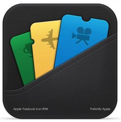
iOS 7 Passbook icon looks different than the one you have posted
I do not usually say this, but, this thread is absurd.
----------
"This is a simple question. Is it flat or 3D?"
You need a better definition of what flat design is.
flat and 3D are NOT mutually exclusive.
----------
Oh good god. It's gotten to the point where every single subject around here is seen as an "opinion." Some things are just yes-no questions.
This is a simple question. Is it flat or 3D?
It has a beveled edge:
Image
That makes it 3D. This is a simple fact, not something where people get to argue their feelings.
"This is a simple question. Is it flat or 3D?"
You need a better definition of what flat design is.
flat and 3D are NOT mutually exclusive.
iOS 7 Passbook icon looks different than the one you have posted
That's because it is. Its an example of how 3D icon would look.
Flatness can still have depth to it.
DarkSky:
https://itunes.apple.com/us/app/dark-sky-weather-radar-hyperlocal/id517329357?mt=8
Rise:
https://itunes.apple.com/us/app/rise-alarm-clock/id577221529?mt=8
Soulver:
https://itunes.apple.com/us/app/soulver-notepad-calculator/id348142037?mt=8
Tapatalk:
https://itunes.apple.com/us/app/tapatalk-connecting-communities/id307880732?mt=8
SoundHound:
https://itunes.apple.com/us/app/soundhound/id284972998?mt=8
They all have good examples of how it can be done and look good with the rest of the OS.
Google just needs to take the bevels from the bottom and they'll be fine.
That's because it is. Its an example of how 3D icon would look.
lol
do you even know about what is this thread?
you give ex. about iOS 6 app icons design!
we are talking about iOS 7 app icons design!!!
lol
do you even know about what is this thread?!
Do I even give a rats a.... what you think the thread is about?
I was replying to the other dude and not you.
iOS7 icons "appear childish"? I don't think so...
Mmm, florescent colors.
They are flat, just not nauseating flat like stock iOS 7 stuff.None of the apps made by google have the icons updated for iOS 7 (flat)
Register on MacRumors! This sidebar will go away, and you'll see fewer ads.