Become a MacRumors Supporter for $50/year with no ads, ability to filter front page stories, and private forums.
Post Card Critique....
- Thread starter iGary
- Start date
- Sort by reaction score
You are using an out of date browser. It may not display this or other websites correctly.
You should upgrade or use an alternative browser.
You should upgrade or use an alternative browser.
- Status
- Not open for further replies.
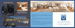
I don't know much about any of this... but as someone who gets postcards in the mail, I feel like this one is a bit busy. My attention is divided-- not sure where to look (at least the front side). But at the same time, I understand because this concept really needs those photos as mini-demos, huh?
Sorry, I'm not helpful.
:edit: I do like the logo you finally decided on, though. And I like the fonts and colors you've chosen for the postcard, they're simple.
Sorry, I'm not helpful.
:edit: I do like the logo you finally decided on, though.
And I like the fonts and colors you've chosen for the postcard, they're simple.First thing I thought, was I wasn't sure where my eye was supposed to go to first on the front.
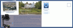
Perhaps the copy on the back of the post card should go on the front? Being that it explains what the premise is about, the copy for the front card could go on the back, detailing the service.
Just my two cents...
Perhaps the copy on the back of the post card should go on the front? Being that it explains what the premise is about, the copy for the front card could go on the back, detailing the service.
Just my two cents...
I like. I wouldn't use the phrase
"an advanced imaging codec from Apple Computer"
Likely to turn some off, think it won't work with non-Apple PCs etc. I would suggest something like, the industry standard for the fastest loading, highest quality...
"an advanced imaging codec from Apple Computer"
Likely to turn some off, think it won't work with non-Apple PCs etc. I would suggest something like, the industry standard for the fastest loading, highest quality...
rdowns said:I like. I wouldn't use the phrase
"an advanced imaging codec from Apple Computer"
Likely to turn some off, think it won't work with non-Apple PCs etc. I would suggest something like, the industry standard for the fastest loading, highest quality...
Good point. Thank you.
MagicWok said:First thing I thought, was I wasn't sure where my eye was supposed to go to first on the front.
Perhaps the copy on the back of the post card should go on the front? Being that it explains what the premise is about, the copy for the front card could go on the back, detailing the service.
Just my two cents...
I think I am going to remove the light blue block in the middle on the front, you're right it makes it busy and a bit confusing...
I think they look really good but one thing that could maybe be changed is the capitalisation in the text, particularly on the first page. Most of the words begin with a capital letter, though not consistently, which I don't really think is necessary.
This is REALLY nit-picky, but it looks like there are 2 spaces between "Appointments at No Extra Charge".
This is REALLY nit-picky, but it looks like there are 2 spaces between "Appointments at No Extra Charge".
I think it looks good -- I like the balance of colors and the shots you've chosen to include.
Not sure what's going on with capital letters in the light blue section on the front? Get an apostrophe into your "its" at the end of the second chunk of text in that section, too.
Not sure what's going on with capital letters in the light blue section on the front? Get an apostrophe into your "its" at the end of the second chunk of text in that section, too.
max_altitude said:Most of the words begin with a capital letter, though not consistently, which I don't really think is necessary.
That really bothered me too, but overall it looks really good.
I feel the "High-Quality" "Four Rooms" needs a hair greater leading between the lines.
Did you try the darker grey on the back? I didn't notice the > symbol right off, come to think of it do you need the greater than symbol?
Did you try the darker grey on the back? I didn't notice the > symbol right off, come to think of it do you need the greater than symbol?
Thanks for the capitilaztion comments - I pulled most of this off my "still in development" Web site, so there are a lot of typos, I am sure.
Let me ask everyone something - what is your eye drawn to first?
Would you be likely to at least give this a glimpse if you were a realtor?
I gotta head to lunch - I look forward to more good criticism - thanks.
Let me ask everyone something - what is your eye drawn to first?
Would you be likely to at least give this a glimpse if you were a realtor?
I gotta head to lunch - I look forward to more good criticism - thanks.
Another really nit-picky thing... the kerning of the 2nd line or the 3rd paragraph: "Our imaging technology..." is a bit strange.
That's me just being me really though lol.
I think I was drawn to the lens first, being that it's almost a solid black circle againt mainly blue
That's me just being me really though lol.
I think I was drawn to the lens first, being that it's almost a solid black circle againt mainly blue
MagicWok said:Another really nit-picky thing... the kerning of the 2nd line or the 3rd paragraph: "Our imaging technology..." is a bit strange.
That's me just being me really though lol.
I think I was drawn to the lens first, being that it's almost a solid black circle againt mainly blue
No, that's cool - that's why I posted it. I'm burnt on it and need fresh eyes.
iGary said:Thanks for the capitilaztion comments - I pulled most of this off my "still in development" Web site, so there are a lot of typos, I am sure.
Let me ask everyone something - what is your eye drawn to first?
Would you be likely to at least give this a glimpse if you were a realtor?
Was about to make this point. Who is your target audience? Speak to them and why they need it.
Realtors - sell homes more quickly, less driving around showing properties
Spas - don't just tell your clients, show them
I would put dots or dashes before each point of use for "What is QTVR?"
I would also take out the "Canon EOS" stuff and replace it with "Professional Industry Equipment" or something tot hat effect. As an earlier poster said, you want to remove yourself from brand loyalty on behalf of the consumer. Though, the rest looks pretty good.
I would also take out the "Canon EOS" stuff and replace it with "Professional Industry Equipment" or something tot hat effect. As an earlier poster said, you want to remove yourself from brand loyalty on behalf of the consumer. Though, the rest looks pretty good.
iGary said:Let me ask everyone something - what is your eye drawn to first?
At first glance I thought it was a camera ad. Any way to diminish the camera so people will read it as a service instead of a product at first glance?
To piggy back on that statement, the first thing I thought was about the camera. It really took away from the amazing photos. I didn't even care to read any of what you wrote right away. I would change the little things people mentioned about caps and what not, but I would remove the bit about the camera. Seriously at this point I couldn't care less what kind of camera was on what kind of head because technically, you're not being hired because of what you use, it's how you use it. It sounds a bit rough I guess, but that is how I see it. I would also try and fade the camera a bit. If you are dying to have it there then I would lower opacity to 60-70% and see how that fairs. To me, the camera was the focal point and instead that great room shot should be the focal point. In all honesty, they'll know you'll use a camera of some sorts, why bother showing them too?ATD said:At first glance I thought it was a camera ad. Any way to diminish the camera so people will read it as a service instead of a product at first glance?
Overall, it is great, with all honesty I would give it the 10 seconds every brochure deserves. I would also as a realtor know that this sort of thing can sell a property faster. If I can't see something online I am not likely to go hunt it down yanno. You have a great market for this and you're super good at it. </ego stroke because I am nice>
Forgive me if I'm wrong, but shouldn't it be Canon EOS 20D, not Cannon EOS 20D (above the camera setup). And yes, first glance my eye is drawn to the camera, making me think it's a
Also, the dimensions seem more narrow than what I'm used to getting in the mail. How will it work exactly?
Also, the dimensions seem more narrow than what I'm used to getting in the mail. How will it work exactly?
Over Achiever said:Forgive me if I'm wrong, but shouldn't it be Canon EOS 20D, not Cannon EOS 20D (above the camera setup). And yes, first glance my eye is drawn to the camera, making me think it's a
Also, the dimensions seem more narrow than what I'm used to getting in the mail. How will it work exactly?
Nope, not wrong at all - in fact, I am removing that verbage altogether.
I put the camera in there to try and distinguish it a bit form the usual junk mail people get. If it draws their eye, and then they look at the virtual tour part, then it is my hope that they look at the rest.
I'm printing these two up on 8.5 X 11 120lb stock to get two 4.25 X11 pieces.
I want them to be a little different in size so they get noticed.
Have you thought about the cost of mailing these in the size you've designed them in? I'm sure you realize that off-sizes are more expensive to mail, but I'd just make sure that there isn't an off-size that would be more cost effective. Having it 1/2" too long might not be worth the extra money it costs to mail these suckers.
Just a thought...
Just a thought...
tobefirst said:Have you thought about the cost of mailing these in the size you've designed them in? I'm sure you realize that off-sizes are more expensive to mail, but I'd just make sure that there isn't an off-size that would be more cost effective. Having it 1/2" too long might not be worth the extra money it costs to mail these suckers.
Just a thought...
Yup, looked into that. Thanks.
first impressions...
I find the front of the card very balanced in its division of visual information. Sometimes that harmony is good. However, on first glance my eye is drawn to the camera and first impression is that its advertising a camera or tripod, not necessarily a service. I think the pictures are very strong, perhaps you could deemphasize the camera/stand on the front of card? I think the size of camera/stand works well on back.
Perhaps instead of "High Quality Four Room QTVR Virtual Tours", just say High Quality Virtual Tours. I know my folks are kind of lowtek and QTVR would confuse them.
fblack said:I find the front of the card very balanced in its division of visual information. Sometimes that harmony is good. However, on first glance my eye is drawn to the camera and first impression is that its advertising a camera or tripod, not necessarily a service. I think the pictures are very strong, perhaps you could deemphasize the camera/stand on the front of card? I think the size of camera/stand works well on back.
Perhaps instead of "High Quality Four Room QTVR Virtual Tours", just say High Quality Virtual Tours. I know my folks are kind of lowtek and QTVR would confuse them.
I'm shrinking the camera a bit and increasing the sixe of the "Four-Room Virtual Tours from $99" text.
Thanks.
- Status
- Not open for further replies.
Register on MacRumors! This sidebar will go away, and you'll see fewer ads.