iOS 7 needs buttons for navigation. It offloads some of the increased white space. The users also like them and are used to them. Buttons can also be more easily increased or decreased in size than text links. Text in a button can be shortened if the center title is long. Example: (Voice sett..) A button also is intuitive to press than a text link with no underline. The user know when they have pressed a button because it changes color or some other animation. The text links in iOS 7 let's the user hang in a vacuum until the next page comes in view. The same example with text links would be: Voice sett..Main settings. The designers and engineers will have a nightmare on their hands if they go with navigational text links. They will have to check every old and new page in iOS against so many languages.
Become a MacRumors Supporter for $50/year with no ads, ability to filter front page stories, and private forums.
Quick poll. Navigation buttons or text links with a symbol
- Thread starter iOSOS
- Start date
- Sort by reaction score
You are using an out of date browser. It may not display this or other websites correctly.
You should upgrade or use an alternative browser.
You should upgrade or use an alternative browser.
I prefer the way it is now in iOS 7.. Looks much cleaner.
You should read the new Human Interface Guidelines in Apple's developer portal. Helps you understand a lot of the reasoning behind their UI choices.
You should read the new Human Interface Guidelines in Apple's developer portal. Helps you understand a lot of the reasoning behind their UI choices.
Theres something really off about the lack of buttons in Messages app. "< Messages" makes the contact name look off center. I wouldn't mind small buttons, they can easily incorporate them with a flat design and make the heading of texts look less cluster ********ed
So where is the poll...?
I will cast my vote here: iOS 7 looks much nicer. Very sleek and clean compared to the dates and ugly iOS 6 interface.
We don't need "buttons" for everything. You've managed to navigate websites for decades using text and arrows, so why are you suddenly lost without buttons?
I will cast my vote here: iOS 7 looks much nicer. Very sleek and clean compared to the dates and ugly iOS 6 interface.
We don't need "buttons" for everything. You've managed to navigate websites for decades using text and arrows, so why are you suddenly lost without buttons?
And yet even with browsers the standard is to have links underlined, because despite attempts to do it differently, it's been pretty much clear that having actionable items that look like any other text is simply not clear enough or usable enough. Sure, people will ultimately figure it out and use it (and probably get used to it even), but that still doesn't make it good.So where is the poll...?
I will cast my vote here: iOS 7 looks much nicer. Very sleek and clean compared to the dates and ugly iOS 6 interface.
We don't need "buttons" for everything. You've managed to navigate websites for decades using text and arrows, so why are you suddenly lost without buttons?
iOS 7 needs buttons for navigation.
I agree, for all the reasons you mentioned. But I'd also say that a button doesn't have to be a three-dimensional representation of a physical button. Simple text with a rectangle drawn around it would suffice to identify it as a button.
The user know when they have pressed a button because it changes color or some other animation. The text links in iOS 7 let's the user hang in a vacuum until the next page comes in view.
Yes, I find the lack of visual feedback in iOS 7 disturbing. I'm never sure if I've hit the right spot or not. I'm not sure how long I should wait to try again. They need to do something there. Make the background flash, or change color, whatever, but do something.
And yet even with browsers the standard is to have links underlined, because despite attempts to do it differently, it's been pretty much clear that having actionable items that look like any other text is simply not clear enough or usable enough. Sure, people will ultimately figure it out and use it (and probably get used to it even), but that still doesn't make it good.
Not anymore. All of the browsers I use have hyperlink as blue text, and are only underlined when you hover over them.
But guess what color the iOS 7 navigation text is? I'll give you a hint... You're used to it
")
Attachments
Not anymore. All of the browsers I use have hyperlink as blue text, and are only underlined when you hover over them.
But guess what color the iOS 7 navigation text is? I'll give you a hint... You're used to it
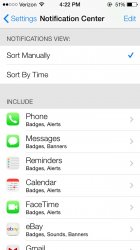
That is the color in settings. The color is set by the app though - look at notes for example.
Perhaps if you actually go and tweak your settings in your browsers. By default all browsers have links underlined, and very very few people change that, making it a fairly set standard for a while now.Not anymore. All of the browsers I use have hyperlink as blue text, and are only underlined when you hover over them.
But guess what color the iOS 7 navigation text is? I'll give you a hint... You're used to it
Blue or not, there's a definition of a button, and simply having text (a label essentially) does not make a button. It's certainly minimal, and people can certainly figure it out (and get used to it for the most part), as I mentioned, but it still doesn't make it a good UI design.
I prefer the new way. I like how the text is able to be larger, even though it's the same size as the buttons before. And, It looks better to me. I don't think it's too hard to get used to either.
Register on MacRumors! This sidebar will go away, and you'll see fewer ads.