I'll start: Ugh, that useless drop shadow in the tab view in Safari! Making the 'search tabs' text unreadable. There are many more small ugly mistakes like this. Keep em coming?

Got a tip for us?
Let us know
Become a MacRumors Supporter for $50/year with no ads, ability to filter front page stories, and private forums.
Thread of design flaws / inconsistencies in iOS 15
- Thread starter Joosst
- Start date
- Sort by reaction score
You are using an out of date browser. It may not display this or other websites correctly.
You should upgrade or use an alternative browser.
You should upgrade or use an alternative browser.
Hmm, very weird. I tested Safari in light mode, and it's fine on my end. The search box and text is clearly visible. Perhaps try restarting, could be an occasional glitch of some kind, maybe?
(Upgraded from iOS 14, no betas.)
(Upgraded from iOS 14, no betas.)
Safari is just one big car crash on iOS 15. It makes you wonder if the designer even uses an iPhone, it's that bad.
I found it also has to do with your Home Screen background. That could make it slightly better. I’m using the all black background. But still: using a drop shadow under black text, and above the search field… Thats just bad design.Hmm, very weird. I tested Safari in light mode, and it's fine on my end. The search box and text is clearly visible. Perhaps try restarting, could be an occasional glitch of some kind, maybe?
(Upgraded from iOS 14, no betas.)
My Safari is unusable after the update. Even when trying to close a tab, it takes upwards of 10 seconds to complete the task. (iPhone 11 Pro). Have had to go to Chrome in the meantime.
Some of the changes appear to be change for the sake of change or fixing what's not broken, in the process making things worse.
I'm not as bad but there are stutters, lags, and weird animation. No deal breakers but slight annoyance. Hope an update would make things smoother.My Safari is unusable after the update. Even when trying to close a tab, it takes upwards of 10 seconds to complete the task. (iPhone 11 Pro). Have had to go to Chrome in the meantime.
Perhaps it's to sadistically punish us for sometimes saying the OS is boring, in need to change, etc.
Last edited:
When using Dark mode with a black wallpaper in iPadOS, the App Library stacked folders in the dock in iPadOS need greater variation in shading to better distinguish them as separate folders. They all look black to me.
Also not a fan of the new “TIME SENSITIVE” label on scheduled reminders.
Also not a fan of the new “TIME SENSITIVE” label on scheduled reminders.
Last edited:
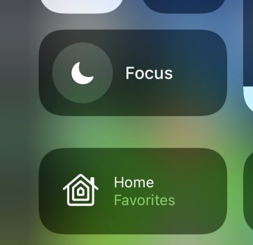
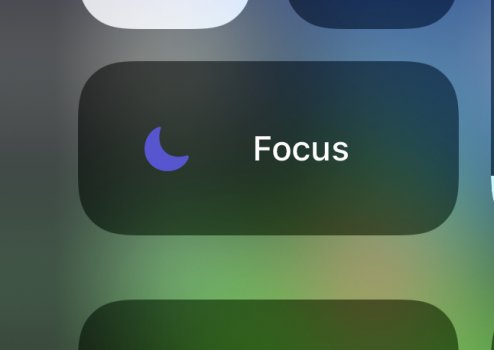
Don’t like how it’s now a two step process to turn on DND. Have no interest in using focus, I just want DND.
You can tap the moon icon in CC and it changes colors but it doesn’t do anything?
You can tap the moon icon in CC and it changes colors but it doesn’t do anything?
Attachments
The biggest design flaw….look that the damn iPad Home Screen especially portrait mode.
Seriously Apple needs to get their people back in the office because the software team definitely needs to be managed, micromanaged, whatever it takes to stop some of the garbage going on in recent years with their software rollouts. Maybe we will get iOS 15.12 by Christmas.
Seriously Apple needs to get their people back in the office because the software team definitely needs to be managed, micromanaged, whatever it takes to stop some of the garbage going on in recent years with their software rollouts. Maybe we will get iOS 15.12 by Christmas.
Reminder going to time and date: this extra click to get there is totally worthless.
Mine's only one tap to turn on DND?Don’t like how it’s now a two step process to turn on DND. Have no interest in using focus, I just want DND.
You can tap the moon icon in CC and it changes colors but it doesn’t do anything?
Mine turns on DND with one tap on the moon icon.Don’t like how it’s now a two step process to turn on DND. Have no interest in using focus, I just want DND.
You can tap the moon icon in CC and it changes colors but it doesn’t do anything?
Mine's only one tap to turn on DND?
I thought that was normal behavior. A reboot fixed it.Mine turns on DND with one tap on the moon icon.
What do the channel buttons even do? It doesn't change my TV's tuner channel.. My TV supports CEC, and turns on/off with the remote's power button.Control Center TV Remote.
Look how the tops of the Home, Back and Channel buttons connect to the bottom border of the Touch Pad. Absolutely awful…
View attachment 1840526
The "narrow" vertical springboard icons are SO UGLY on iPadOS 15. I just cannot get over it.
Haha I was thinking the same thing. I was like if this is the crap the software team is putting out, get the heck back in the office. Hardware team can go ahead and work from the beach.The biggest design flaw….look that the damn iPad Home Screen especially portrait mode.
Seriously Apple needs to get their people back in the office because the software team definitely needs to be managed, micromanaged, whatever it takes to stop some of the garbage going on in recent years with their software rollouts. Maybe we will get iOS 15.12 by Christmas.
100% this.Some of the changes appear to be change for the sake of change or fixing what's not broken, in the process making things worse.
I don’t have a clue, not an effing clue so if you figure it out, let me know lol. I use AT&T DirectTV Stream and it certainly does nothing there. I’m guessing it has something to do with Apple Channels but couldn’t tell ya for certainWhat do the channel buttons even do? It doesn't change my TV's tuner channel.. My TV supports CEC, and turns on/off with the remote's power button.
Why have they changed the colour of main roads in Apple maps from yellow to grey…. some of the font and colour changes in maps is horrific. Doesn’t even look like Apple’s design aesthetic.
Last edited:
Three things that are really bugging me with this update and could probably be considered "design" choices by apple.
- Pull down to reply to messages from the notification lacks the top bar info that was there in previous versions. No close button, no three dots, no status bar telling you who you're replying to, its just a frameless window now. I think its referred to as quick reply maybe? I don't know I just know it looks different and I used it all the time in 14.
- Quick access to notification settings. The thing where you could swipe over and hit options and then chose turn off or deliver silently. This is gone now, it drops you into the settings app now which is ok but I really liked being able to quickly triage this from the lock screen and turn off the ones from newly installed apps quickly.
- Swiping up on a live photo in the photos app now lacks the preview for loop, time lapse etc. It's just the EXIF data now which is great but I really liked seeing the live photo style previews. Now you have a drop down at the very top and you have to wait to see each one render.
O my. I hadn’t even looked at maps yet. That IS horrific. What even is that narrow font.Why have they changed the colour of main roads in Apple maps from yellow to grey…. some of the font and colour changes in maps is horrific. Doesn’t even look like Apple’s design aesthetic.
Register on MacRumors! This sidebar will go away, and you'll see fewer ads.


