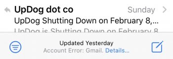
I use the mail app with gmail.
I have 2 issues with it:
- The archive button and the "every else" button are so close that I keep hitting archive accidentally especially when using the phone with one hand. The entire screen bottom is empty, why'd they have to put these two icons right next to each other?
- When I want to put a message into a folder, it is now a 3 step process:
1. Hit the "everything else" button.
2. Scroll to find the "folder" option and select.
3. Scroll to find the actual folder and select.
Didn't need step 2 in iOS 12.
Who is designing this stuff?


