Are you thinking of Dieter Rams' work for Braun? If so, yeah... you're absolutely right. I like it. Very uncluttered and clean.
Yes, Braun! Thank you. I was trying to find it on Google looking for "Brohnson" lol.
Check out these pictures:
Music.app has the wood on the sides with the light metal in the middle. And when playing the music app also has that little orange needle (on the record player it indicates what station you are tuned to) that tracks your position within the song.
It's just a completely different look. Initially I didn't like it, but I played with it and realized what it was and I really like it now. I agree that it'd be nice to have a list mode for Artist, but I do like it. The old music app (iPod) just looked like iTunes on the computer. Why not change it up a bit?
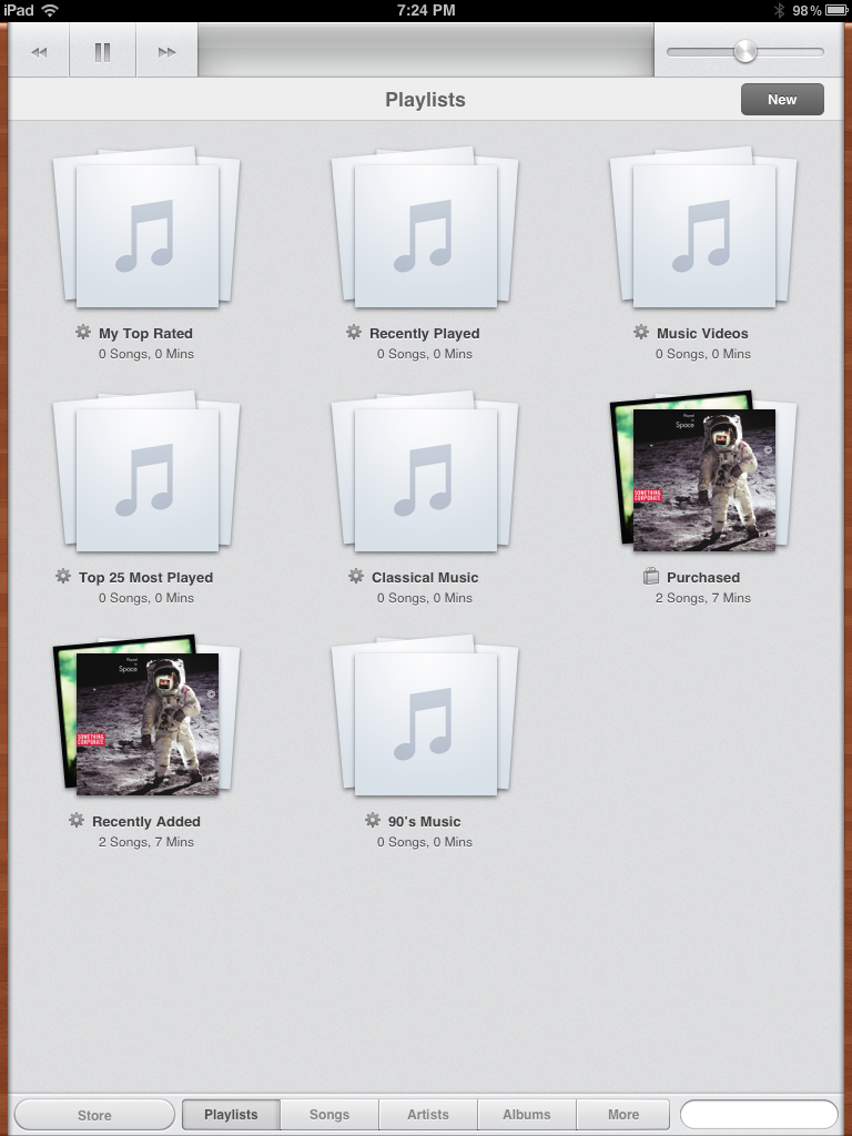
Are there any other shots of this? I assume turning it sideways has the same effect it has in other Apple apps with lists (full text list down the left)? What's under New and Other? Settings?

Such much uproar over so little info... so early. I don't get it.
No. In landscape view you get the same view - just wider. The only "list mode" is seen when you touch "Songs". Touching "Songs" gives you an alphabetical list of every song on your device with an "A ... Z" shortcut on the right hand side. Not the most useful view.
Touching "More" lets you select view by audiobooks, composers, or genres. The "New" button in Playlist view lets you create a new playlist (which is pretty dang neat.)