Become a MacRumors Supporter for $50/year with no ads, ability to filter front page stories, and private forums.

ezekielrage_99

macrumors 68040
Original poster
Oct 12, 2005
3,336
19
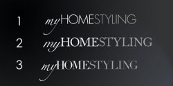
Well I am in the process of putting together a proposal as a part of a branding overhaul for a new company. The logo concept is still very much in the infancy stage of the concept, but the company has a pretty good idea what they want but thought a bit of testing would be in order...

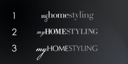
The main query about the logo is to do with font choice, serif/san-serif or if anyone else has some ideas (anything overlooked).

*Please bare in mind the "keming" isn't great because this is a quick mock-up.
 

Attachments

  • myHOMESTYLING_logo.jpg
    myHOMESTYLING_logo.jpg
    37.4 KB · Views: 123

spillproof

macrumors 68020
Jun 4, 2009
2,028
2
USA
San-serif is more modern. Is your "homestyling" modern? I do like 1 and 3's "Y" in "my" nonetheless.

You could check with magazines and/or websites that deal with home styling to see what they use then use something different form the majority to grab people's attention
 

ezekielrage_99

macrumors 68040
Original poster
Oct 12, 2005
3,336
19
The organisation is a home styling web based company, it is a specialised services that creates high-end interior designs.

Although the specified branding direction is specified to be professional, high class, luxury and with focus on typography like with Vogue, D&G and Bvlgari logos.

It's the mixing traditional with the "classic" design in the most simplified way is tricky...
 

Cabbit

macrumors 68020
Jan 30, 2006
2,128
1
Scotland
Always like sans serf better, but that is mainly because i can follow sans serf without the letters jumping.
But my other input her is that #1 looks much more modern that the others and home styling magazines and such are usually a sans serf font as it looks more modern unless they are covering old designs in that issue and that is where they have a serf design.

Perhaps take this into consideration that the client could have both designs available depending on the product category.
 

bbeers

macrumors regular
Dec 14, 2007
160
5
Maryland
sans

I would have to say the san-serif especially if you are dealing with high end interior designs. It feels much more modern and I really like the juxtaposition and balance it gets from the serif "my".
 

ezekielrage_99

macrumors 68040
Original poster
Oct 12, 2005
3,336
19
Perhaps take this into consideration that the client could have both designs available depending on the product category.

I'm considering that maybe the case but it's a really good idea anyway, having classic and modern branding would be rather cool.
 

Unspoken Demise

macrumors 68040
Apr 16, 2009
3,691
1
>9,000
I think an interent based site with "high end" quality needs #2 more. 1 and 3 seem very personable, like its "my" as in mine, like we can take ownership and pride in it as our own, as in a modern way as previously suggested, but for "high end interior design," I think #2 represents them better.

2 cents.
 

kedruff

macrumors newbie
Jul 6, 2009
17
0
You might try a font like Helvetica Neue (which you might be in #1)... try to vary the weight between HOME and STYLING... I like the "styling" in 1 but the heavier "home" in 2, but, in general, I'd use the sans-serif fonts ...
 

fxstb2002

macrumors member
Apr 22, 2008
90
0
I am not a designer, but I have an opinion.

Prefer "Homestyling" in number 3. I like the horizontal lines created by the serifs, much better than the curves on the serifs in number 2 that interrupt my reading. I feel like I am tripping over each character.

Something strange happening with the "s" in number 2. It is very narrow, and I can't stop looking at it.

Number 1 just feels too locked into modern styling. Number 3 feels more versatile.

Of the "my"s, I guess I like number 2, but it doesn't speak to me in any special way. It would be nice to see more options on it.
 

Mookamoo

macrumors member
Aug 7, 2006
72
0
Try it in a san serif font that has some styling - Try Optima

Don't use Helvetica Neue or DIN - they are being used to death.
 

bluetooth

macrumors 6502a
May 1, 2007
662
1
Toronto
I really like the "HOMESTYLING" sans font in number 1. I also like where you are headed with the contrasting font style of "my" but not sure if that particular font flows best. I think the "HOMESTYLING" sans font has an elegant, contemporary/modern feel which is perfect for the interior design concept. I take it this is going to be a logotype?
 

jecapaga

macrumors 601
Jul 1, 2007
4,291
23
Southern California
Any time you're using three different type treatments just in a simple logo you're inviting crap in my opinion. Essentially you have three going on already no matter if you choose serif or sans. I prefer the sans though.
 

ezekielrage_99

macrumors 68040
Original poster
Oct 12, 2005
3,336
19
I'll make a few more mock-ups with the suggestions (thanks).

Overall I am staying away from Helvetica although a very nice font it really "doesn't look right" in this context, Optima another one which would look good in tight type may also be an option.

For the moment it's narrowed down to 3 fonts:
- Bodoni
- Futura LT
- Didot

* Option 1 was Futura LT

* Option 2 was a very classic font Adobe Carlson Pro, and I do agree the S doen't look right. This wasn't my choice either... I was intending to mix Bodoni Script Pro and BodoniXT.

* Option 3 was Didot
 

stainlessliquid

macrumors 68000
Sep 22, 2006
1,622
0
Its too hard to read and theres no composition to it, keep working on the artistic part of it

The letters are too close together to be readable, and theres not enough difference between homestyling, that would help readability.

my is messing up the composition, the eye wants to move from the top left to the bottom right when reading, its awkward to go from bottom left. If its not going to be symmetric then it needs to have flow that people can relate to naturally. If you are set on using the script font then "styling" would be better suited for it because it would drive the eye to the end, and it would further emphasize the style aspect.
 

bluetooth

macrumors 6502a
May 1, 2007
662
1
Toronto
New Century Schoolbook (serif) in an italic genreally works well as a contrast with Futura (sans) although you would need to play around with the types, perhaps to a Futura book as NCS is a little heavier and may be too far the other way. I have seen these two work well together in several examples. Food for thought if you are trying to maintain that contrast of classic script (my) and contemporary (HOMESTYLING).
 

IgnatiusTheKing

macrumors 68040
Nov 17, 2007
3,657
2
Texas
I'd go with sans. Since it's a web-based company, a modern look is probably the way to go, and #1 looks the slickest/most modern. That would be my starting point.
 

ezekielrage_99

macrumors 68040
Original poster
Oct 12, 2005
3,336
19
Hello all, I've made a few version mainly to do with the fonts.

Thanks again for all the good feedback.
 

Attachments

  • myHOMESTYLING_rev1.jpg
    myHOMESTYLING_rev1.jpg
    54.9 KB · Views: 83

bbeers

macrumors regular
Dec 14, 2007
160
5
Maryland
revisions

Hello all, I've made a few version mainly to do with the fonts.

Thanks again for all the good feedback.

In these versions I quite like number 1.
The my is very familiar to me. The feeling of familiarity leaves me with some comfort and reassurance in the brand, and I can't quite explain why. After seeing the text in all lower case I really like it. The lower case serif fonts really seems to fit well to me.

The second one with the all caps feels very "Better Homes and Garden" or Architectural Digest to me. It could just be a because of similar fonts and the all caps. I am not say that is a bad thing at all, just the immediate feeling I get when I saw the designs.

The Third one I liked it better when it was in the light font. The kerning seems a little wide as compared to the light one. The light font felt very modern to me where as this one feels more bland. Also I am not the biggest fan of the my on the third, the weights the the two contrasting fonts feel to be too close to me.


Just my thoughts. I must says that I do like where you are going.
 
Register on MacRumors! This sidebar will go away, and you'll see fewer ads.