Become a MacRumors Supporter for $50/year with no ads, ability to filter front page stories, and private forums.

Dal123

macrumors 6502a
Original poster
Oct 23, 2008
903
0
England
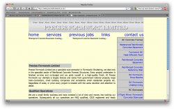
Finally we're getting their chaps :). My 1st website is available to view/ critique and help troubleshoot and try to make as cross-browser friendly as possible.
A massive thanks to angelwatt (couldn't have done it).
Check it out http://www.preciseformwork.co.uk

I haven't loaded an external css print sheet so far, more importantly a mobile phone sheet. Can some phones be too cocky and class themselves as pc's thus overriding the handheld sheet (so my stylesheet could be a waste of time). A lot of the time my site is viewed from a mobile phone and I think it's quite important that it looks professional. So far I have tested it on my phone and I notice that:

  • my text only goes around the width of the header above. I would like it to spread the width of the page.
    My top navigation bar does not spread evenly (and i think it would be better if I format it as a seperate list on each link and put it as 20% each one). I thnk this would sort that problem hopefully.

On internet explorer I have only tested it quickly as I've just uploaded the site (about 5 mins ago) and on 2 different pcs Internet explorer I've noticed:


  • Same thing with navigation bar (only on one pc other one was ok)
    sidebar has no white lines between the seperate links.
Any input appreciated :).
 

techfreak85

macrumors 68040
Jan 13, 2008
3,092
1
Places
My honest first opinion:"Seems 90s dot-com-ish".:eek:
I think from its all just basic solid color backgrounds, text, and boxes. First thing IMO that should go is the yellow background.
 

Dal123

macrumors 6502a
Original poster
Oct 23, 2008
903
0
England
I agree with what you're saying :eek:. It is bland and very plain, I was so stuck with mock-ups in photoshop, really struggling to find a layout.
Being my first one and trying to get some experience I had to keep it basic. I think in time I will do another with customised stuff in photoshop and I would stick to measurements and plan it properly next time.
Got some great ideas but it's hard to get the time to do it all where I know very little I wasted days just trying to place something on the left :eek:.
 

iOrlando

macrumors 68000
Jul 20, 2008
1,811
1
since your site seems to be purely informational (you dont have e-commerce, or an interactive sign-in etc)...why not just use a template? no need to reinvent the wheel here...
 

Dal123

macrumors 6502a
Original poster
Oct 23, 2008
903
0
England
A template would look better I know but I wanted to do it all myself learned so much from it and would like to continue and possibly do some web design on the side.
I think that laying it all out is the hardest thing (as we always see posts here about unexpected things happening).
Thanks for input people.:)
 

angelwatt

Moderator emeritus
Aug 16, 2005
7,852
9
USA
Just taking a quick look for the moment.
  1. The code looks pretty clean and validates
  2. Did notice an empty p tag right before the h2 tag that says "Precise Formwork Limited"
  3. You haven't given the page a title (home page)
  4. On your #masterhead, it has no content. I know you added a logo banner with CSS, but from a SEO standpoint you'll potentially be missing a chance to put the name of the company out there. You can either add hidden text that can't be seen visually or there's techniques like image replacement that you can use. I recommend turning off your CSS and JavaScript to see what your site looks like as this will tell you how search engines see it.
  5. For a professional site, I think it's better to capitalize navigation links.
  6. As others are noting, you'll want to continue working the color scheme.
As for mobiles. Here's a list of links I have concerning design for mobile devices in general.
http://validator.w3.org/mobile/
http://ready.mobi/
http://mtld.mobi/emulator.php?emulator=nokiaN70&webaddress=mtld.mobi (Nokia emulator)
http://www.opera.com/mini/demo/
http://www.marketcircle.com/iphoney/
http://na.blackberry.com/eng/developers/resources/simulators.jsp
http://www.browsercam.com/Default2.aspx
 

kate-willbury

macrumors 6502a
Feb 14, 2009
684
0
why javascript in the middle of your html? thumbs down. and no title? and lol a 'div spacer' ? "mailto:" links are always a bad idea.
 

nuxx

macrumors member
Jun 5, 2007
80
3
Tokyo
If you're going to continue using mailto, you should consider encoding the email address. Your email address is clear for all spam bots to see in your source.
 

maflynn

macrumors Haswell
May 3, 2009
73,448
43,370
The color selection and organization of the page, makes it look very dated.
 

Angelo95210

macrumors 6502a
Jan 7, 2009
972
15
Paris, France
My honest first opinion:"Seems 90s dot-com-ish".:eek:
I think from its all just basic solid color backgrounds, text, and boxes. First thing IMO that should go is the yellow background.

I agree as well. Avoid the pale yellow. Get a more readable font for the main title (though I like the rule idea). Work on your menu it's easy to tune it with tutorials.

But you are on the good way. Keep it simple would be my main advice. I did to many complicated and under-used websites.
 

Dal123

macrumors 6502a
Original poster
Oct 23, 2008
903
0
England
Thanks for all advice so far people, angelwatt great links, cheers bud. I see what you're saying about SEO, much appreciated. I might have the ruler plain and text as xhtml ontop of it. I think I might try to put the list of the nav in the masterhead too. What about when people create fancy buttons themselves in photoshop, they are wasting their SEO then, so how is the advanced styling done? Shiny text things like that.
nuxx great link, thanks. I'm going to encode my link very soon thank you very much for that.
Thanks for your encouragement people. Very kind. Trying to figure out some colour scheme.
Kev thanks for the inspiration link, much appreciated.
 

angelwatt

Moderator emeritus
Aug 16, 2005
7,852
9
USA
What about when people create fancy buttons themselves in photoshop, they are wasting their SEO then, so how is the advanced styling done? Shiny text things like that.

Some use techniques like the image replacement I linked to before. Others use the alt attribute on images. The rest rely on the rest of their content's SEO strengths. Missing SEO points like this are not devastating, but they also make the content a little less accessible for blind visitors who can't read the images.
 

Dal123

macrumors 6502a
Original poster
Oct 23, 2008
903
0
England
Cheers buddy, them links were great and I have managed to hide my text inside my masterhead, much appreciated.:)
 

dmmcintyre3

macrumors 68020
Mar 4, 2007
2,131
3
PS: Here is the site without javascript but with css. There is a "Loading" that never finishes without javascript.
 

Attachments

  • Picture 10.jpg
    Picture 10.jpg
    294.9 KB · Views: 63

Dal123

macrumors 6502a
Original poster
Oct 23, 2008
903
0
England
Of course there is; it is the alt text whilst the slideshow loads. The slideshow cannot load without javascript, so it's inevitable it will stay there.
You could argue that my wording should be different and 'loading' should not be used instead 'Slideshow of Basement' but the guide to installing the slideshow does recommend having 'loading'.
What do you suggest?:)
 

angelwatt

Moderator emeritus
Aug 16, 2005
7,852
9
USA
What do you suggest?:)

A common approach is to use the noscript tag and provide a message letting the visitor know they are missing out on a JavaScript powered slide show. If you can manage it, that empty space should not be there if JavaScript is disabled. This can sometimes get involved though, but at least a message for visitors to let them know what they're missing is nice.
 

Dal123

macrumors 6502a
Original poster
Oct 23, 2008
903
0
England
Wow I had no idea there was a specific no script tag. Thanks for that, was completely unaware. :) :)
 
Register on MacRumors! This sidebar will go away, and you'll see fewer ads.