
The IMDb app is one of the most popular apps on iOS, with the Internet Movie Database yesterday noting in a press release that its iOS app has been downloaded 25 million times. Along with the milestone comes a redesigned Version 3.0 of the IMDb iPad app, with the goal being to focus on discovery features and allow users to see more content. The iPhone version has also received a few more features and enhancements.
The universal IMDb app is a free update on the App Store. [Direct Link]What's New in Version 3.0
One of Macworld's 20 Best Apps for 2012!
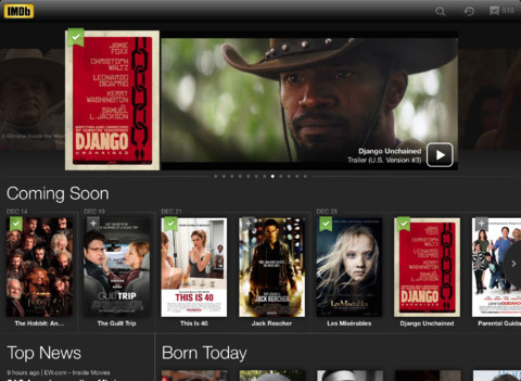
The IMDb iPad app has been completely updated with a new look & feel that showcases more movies, TV shows & celebs than ever before.
New iPad features include:
- Tap the plus sign (+) on any movie or TV show poster to add it to your Watchlist
- Sign in to get personalized movie and TV recommendations
- New full-page Watchlist and custom lists with updated sort and edit features
- Top 250 rank added to movie pages
- Tap the history or Watchlist icons to open previews from any page in the app
- Browse featured photo galleries & lists, most popular by genre, and charts
- Tap the IMDb logo to browse from any page in the app
Also new for both the iPad and iPhone:
- iOS 6 users can take advantage of native Facebook sharing
- Filmographies now include TV episode details
- Navigate to the entire image gallery from any photo or poster
Article Link: IMDb Updates iPad App with Complete Redesign