Become a MacRumors Supporter for $50/year with no ads, ability to filter front page stories, and private forums.
Status
Not open for further replies.

arn

macrumors god
Original poster
Staff member
Apr 9, 2001
16,363
5,795
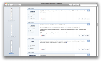
We finally are approaching the migration of MacRumors Forums to new forum software (Xenforo). Along with that migration will come a long-overdue redesign.

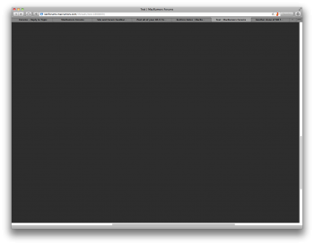
We have a test site up for you to explore at http://xenforums.macrumors.com

There is a browser/apache login and password required to get into it. Those are "june" and "superman", respectively.

The forums there are a snapshot of our current forums from May 8th. So, if you have had a login to our forums from that date or earlier, you should be able to login with those credentials. Feel free to post, like posts, send messages to each other. But, be aware, that anything you do on the test site will get erased before we do the final migration. Also, outgoing email is turned off. So you can't register and get a verification email. You also won't get email notifications for anything.

Here are some of the improvements:

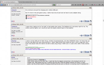
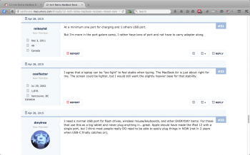
- Responsive Design - Works well on iPhone, iPad and Desktop
- Likes - you are actually notified when a user likes your post
- Username tagging - you can @username and they will get a notice
- Social Login - login/register via facebook/twitter/google+

There are a lot more, so please play around with it. Can post feedback here or there.

Known issues:

- Avatars are bigger on the new system, so everyone will want to reupload their avatars. Also, everyone gets avatars.
- Social buttons on bottom are duplicated
- User profile page spacing/formatting is a little off
- attachment thumbnails a little small
- some other spacing issues
- WikiPosts aren't working due to a bug, so the plugin is turned off.
- Userranks/titles and trophy system hasn't been defined yet.

arn
 
Last edited:

Doctor Q

Administrator
Staff member
Sep 19, 2002
39,789
7,525
Los Angeles
Avatars and profile pictures

Since everyone can use an avatar, there are no separate profile pictures.

Avatar are masked to a circular shape. If that doesn't suit your current avatar, it's time to get creative!

Depending on the page, your avatar is shown in various sizes, about 50x50 pixels, about 100x100 pixels, and about 200x200 pixels. That's why it's ideal to set your avatar to an image that's about 200x200 pixels.


Writing posts

There are no post titles, as there are in the current forums, but you can begin your post with a bold line to get a similar effect.

The post editor is WYSIWYG by default and you can type your post in the Quick Reply box at the bottom of a thread page.

To add attachments, click the Upload a File button.

To preview a post, click the More Options... button, then the Preview... button.


BB codes

BB codes are the tags in a post that control formatting, image references, links, etc. You can use the toolbar icons for these features without having to enter or see the BB codes. Some icons are drop-down lists.

If you want to type/edit your own BB code tags (like [b] for bold), click the wrench icon. wrench-icon.png To get back to the WYSIWYG editor, click the Use Rich Text Editor link.

The complete list of BB codes can be seen on the Help / BB Codes page, although the list may not be final. If you type your own BB codes, note that some have changed compared to the current forums:
  • For strike-through text, use [s] instead of [s].

  • For embedded videos, use [media=youtube]videoID[/media] or [media=vimeo]videoID[/media] rather than [media=youtube]videoID[/media] or [vimeo]videoID[/vimeo].

  • To link to a user's profile, use [user=123]username[/user] rather than [member=123]username[/member], where 123 is the user number.

  • Use the new [spoiler=title]secret message[/spoiler] code to enter spoiler text. The title is optional.

  • There is no longer a need for the [img] code, since images are sized automatically for display.

  • For text with BB codes that are to be displayed as is, use [plain]your text[/plain] rather than [nοparse]your text[/nοparse].

  • To display raw HTML, use the [html] code.
 
Last edited:

grahamperrin

macrumors 601
Jun 8, 2007
4,942
648
Thanks!

… feedback here or there. …

I'll opt for here (because what's there will be erased).

First impressions …

At http://xenforums.macrumors.com/categories/os-x.182/ I'd prefer immediately visible titles of sub-forums – without the need to point.

http://xenforums.macrumors.com/misc/quick-navigation-menu?selected=node-182 the order of things within some subsections could be better. Alphabetical, wherever it makes sense. And where things are in chronological/release order (e.g. 10.8, 10.9, 10.10, 10.11) it'll make sense to present in that order; not reverse chronological.

The option to perform an advanced search should be more intuitive and involve fewer clicks. At the moment the route seems to be:
  1. click once on the magnifying glass
  2. click again in the same spot without searching (and the pointer obscures the change of icon)
  3. move the pointer down and to the left
  4. click again on the same icon.
 

Scepticalscribe

macrumors Ivy Bridge
Jul 29, 2008
63,984
46,448
In a coffee shop.
Did I read correctly that 'User titles/tanks/trophy titles' haven't been decided yet?

Now, granted, I did notice that almost all members went under the title 'new member'.

However, this is one change that I can imagine may well give rise to much by way of heated discussion…..and much interest.
 

NT1440

macrumors G5
May 18, 2008
14,658
20,972
Looks great! Good job guys, I know this has been a long time coming.
 

Zxxv

macrumors 68040
Nov 13, 2011
3,558
1,104
UK
Thanks!


I'll opt for here (because what's there will be erased).

First impressions …

At http://xenforums.macrumors.com/categories/os-x.182/ I'd prefer immediately visible titles of sub-forums – without the need to point.

I also prefer this.


Also see pictures within threads need to be clicked to made a decent visible size. example show off your watch
http://xenforums.macrumors.com/threads/show-off-your-watch.1872015/page-70

----------

User CP which is so usable on this site is now gush on the new one. What are we to use watched threads? its a mess. Cant see whats been updated, need to hover to make last page visible. YUK YUK change for change sake rather than change for improvement. Im not blaming you entirely on that, its the state of the internet at this time and the forum designers who are to blame.

hey ho I bet i'll be dragged kicking and moaning into it with no choice but to suffer.
 

poiihy

macrumors 68020
Aug 22, 2014
2,301
62
Woah! Well uhm... that will take a while to get used to :p

Ok well... it's nice so far but one thing that really bugs me is the arrows box thing popping up in the lower left corner.
 

Attachments

  • Screen Shot 2015-05-18 at 6.20.29 AM.png
    Screen Shot 2015-05-18 at 6.20.29 AM.png
    8 KB · Views: 933

Doctor Q

Administrator
Staff member
Sep 19, 2002
39,789
7,525
Los Angeles
The option to perform an advanced search should be more intuitive and involve fewer clicks. At the moment the route seems to be:
  1. click once on the magnifying glass
  2. click again in the same spot without searching (and the pointer obscures the change of icon)
  3. move the pointer down and to the left
  4. click again on the same icon.
There are really three searches: basic, advanced, and very advanced.

For basic, it's one click on the magnifying glass icon, then you can type.

For advanced, it's one click on the magnifying glass icon, then one click on the gear icon (in the same position), then you can type and optionally limit the search to titles, a particular user or set of users, and/or pick a calendar date to limit the search to recent posts.

For very advanced, you need one more click on the gear at the bottom, where you gain two extra features: choosing which forums and what sort order.

It could be fewer clicks if there were three icons from the start, for basic and advanced and very advanced searches, rather than just one for a basic search, but I think that would leave a more cluttered display. Since there's no conventional icon for "advanced search", it would probably be words, making it even more cluttered.

It could also be fewer clicks if there was no "advanced" and only "very advanced" so the first gear click would take you straight to the very advanced search page. But then you'd lose your view of the current web page during most advanced searches.

Do you have an alternative suggestion?
 

Zxxv

macrumors 68040
Nov 13, 2011
3,558
1,104
UK
Cant change the width like on this forum to get a better use of the screen

Mobile Version | Fixed | Fluid | Fluid HD


Would also like to be able to change the colours as they are messy as too much info.

The whole thing looks messy when viewing a topic. Too much info around a post, especially when a post has a picture attached to it. Instead of the nice look on here with the pic included as part of the post the new forum is a cluttered mess with info around it. It gets even worse when someone quotes someone else. Like wtf! who designed this ****?

Look at this mess of a topic for example

http://xenforums.macrumors.com/threads/test.1880069/

then compare it to this one you're on now. Lovely looking quotes, etc

----------

Woah! Well uhm... that will take a while to get used to :p

Ok well... it's nice so far but one thing that really bugs me is the arrows box thing popping up in the lower left corner.

agree on this. Like how dumb are people that they need this monstrosity? for **** sake.
 
Last edited:

grahamperrin

macrumors 601
Jun 8, 2007
4,942
648
Clicking anywhere on the expanded image seems to shrink it back down for me.

I refrained from clicking because there's no visual hint to do so, and because (from the vBulletin experience) I half-expect a click to open the image in a new window.

… the arrows box thing popping up in the lower left corner.

They confused me because my first sight of them was whilst trying to find a way to escape from the enlarged image.

… It could be fewer clicks if there were three icons from the start, for basic and advanced and very advanced searches, rather than just one for a basic search, but I think that would leave a more cluttered display. …

Heh :) by coincidence, I was just thinking about the balances between content and space, between data (text of topics) and metadata. Searches aside, for a moment, I have a hunch that much more scrolling and clicking will be required …
 

AlliFlowers

macrumors 601
Jan 1, 2011
4,542
15,755
L.A. (Lower Alabama)
I like the overall look. It's difficult to tell a few things though. Will you still be able to go directly to the newest post in a thread?

I imagine the typical options will all be there before launch time, like Quick Links? I see "Spy" is there now, but nothing else. I'm one of those who always hits "Today's Posts," so that's a must have.
 

grahamperrin

macrumors 601
Jun 8, 2007
4,942
648
… Will you still be able to go directly to the newest post in a thread? …

Yes, there's a circular dot. Point at the dot, before clicking, to reveal its meaning.

… get a better use of the screen …

… Too much info around a post …

I feel similarly. The current design offers less content per screen.

Questions

Please: will there be the option to view more than 25 posts per page?

(I very often prefer 100.)

Can avatars be hidden?

(I'd like each screen to show more discussion, less metadata.)

I set the user agent to Safari iOS 8.1 in an attempt to get more content per screen, but at a glance I see no difference. What's required for the responsive design to take effect?
 

Attachments

  • screenshot 2015-05-18 at 22.13.10.png
    screenshot 2015-05-18 at 22.13.10.png
    233.3 KB · Views: 235
  • screenshot 2015-05-18 at 22.15.16.png
    screenshot 2015-05-18 at 22.15.16.png
    168.4 KB · Views: 237
  • screenshot 2015-05-18 at 22.18.57.png
    screenshot 2015-05-18 at 22.18.57.png
    530.2 KB · Views: 242
  • screenshot 2015-05-18 at 22.19.19.png
    screenshot 2015-05-18 at 22.19.19.png
    356.7 KB · Views: 232

Zxxv

macrumors 68040
Nov 13, 2011
3,558
1,104
UK
We get it. You don't like change.

that has nothing to do with change. and I welcome change when it is for the better.

Anyway grow up. This topic was created for feedback. I would guess as a grown man that means ALL feedback and comments are welcome as that is what allows change and progress ;)

----------

I saw it as feedback. This is a test phase …

Thanks :)
 

Ulenspiegel

macrumors 68040
Nov 8, 2014
3,212
2,486
Land of Flanders and Elsewhere
Well, I like it, mainly because - finally - the site keeps the set zoom preference. I was unable to insert ##☝️ these and similar signs, but I can leave w/o it.
What I have found to be unnecessary and a nuisance is the up and down red arrow in the right corner.
 

redheeler

macrumors G3
Oct 17, 2014
8,419
8,841
Colorado, USA
The forums there are a snapshot of our current forums from May 8th. So, if you have had a login to our forums from that date or earlier, you should be able to login with those credentials.

I am unable to log in with my account credentials.
 
Status
Not open for further replies.
Register on MacRumors! This sidebar will go away, and you'll see fewer ads.