Many thanks for the responses and open discussion.
There's much to like/praise but for now, I'll concentrate on problems and enhancement requests.
Social icon ambiguities
Icons for Facebook, Twitter and Google+ appear four times.
If the third level (not for sharing) is to remain, then top level icons for all three will be redundant.
At that third level, duplication is a known issue.
Neither the second nor the third level presents a push icon. Broader push options would be a very welcome addition to the forum.
I suggest abandoning the first level approach to contact details. Instead, links to
http://www.facebook.com/MacRumors http://twitter.com/MacRumors and
https://plus.google.com/+macrumors/posts may be placed at the top of the generic
footer of the site (not of the forum). It's normal and acceptable to find contact details in footers; compare with, for example,
http://www.apple.com where Apple chooses to write 'Contact us' at bottom right of the screen.
Placement of contact details in the generic footer need not detract from the tradition of readers offering tips.
It's somewhat counterintuitive to present the share icons (currently second level) beneath the four (or more) topics of similarity. I suggest elevating the three share icons to near the top of the forum content area, below the generic header of the site. Ideally the options to share the topic should be as close as possible to the title of the topic.
Forum home page design: misleading home icon
I expect any home icon to take me to the home page of the site, in this case
https://www.macrumors.com/
Something other than the
generic home icon should be given for the
forum home.
User preferences: forum home page layout
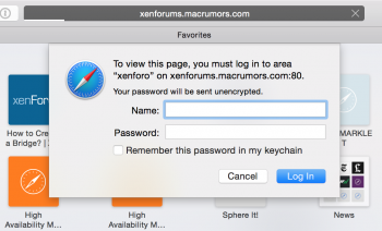
At
http://xenforums.macrumors.com the sections that I collapsed a few hours ago are expanded (following a restart of my Mac). This user preference should be persistent.
User preferences: Spy
If there is an interface, it's not obvious.
(It was whilst seeking the UI to preferences for Spy that I experimentally clicked on the inverted tree icon.)
If there will
not be user preferences for Spy, then the RECENT THREADS portlet at
http://xenforums.macrumors.com will be somewhat redundant.
Volatile up and down arrows
I agree that the volatile redness can be annoying. It assumes that the user's pointer is at, or near, the bottom right of the screen; that assumption may be more often false than true.
On devices without touch screens, it appears to be a touch-oriented intrusion; not responsive design.
Volatile blink-like refresh progress indicator
The first attachment to this post (2015-05-18 21-15-46 screenshot) may appear contrived, but it's not. Very soon after I began testing I was annoyed by frequent, repeated appearance and disappearance of an animated grey blob. (As annoying as blinking text, or an animated advertisement.)
That was probably part of Spy in a background window. If the refresh indicator must be animated, then please don't present it in the dark disappearing rectangle that contrasts with the pale background.
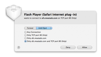
Adobe Flash content?
Second screenshot. That Flash-related prompt appeared whilst a relaunch of my browser reopened
many tabs, some of which are not in the macrumors.com domain, so it's possible/likely that the content is unrelated to MacRumors. (Normally I'd check page sources before posting but I'm in a bit of a rush so I'll throw it in now. Apologies if it causes unnecessary alarm.)
Elasticity
Please
")
The fixed width is not a showstopper, but whilst undergoing this major change you might consider allowing a more flexible layout that can make use of (small or large) widescreen.
Generally
When I first browsed
https://xenforo.com/community/ a few months ago I was delighted by the prospect of MacRumors using a comparable interface.
Some of what I loved about those first impressions is not (yet) evident in this first open test phase for MacRumors. I can be more specific about what I'd like to shine through, but it might be better to see how other things shape up before offering those specifics.
Postscript, 2015-05-31, pre-final migration
> …what I'd like to shine through …
I expect the following post to disappear from the test area, or lose referential integrity, so for posterity:
Now's a good time to say: it's shining, outstandingly good. The bugs are not a detraction.
Overall impression:
- the past two weeks have visibly shaped this test area into something that was extraordinarily well thought-out beforehand.