Become a MacRumors Supporter for $50/year with no ads, ability to filter front page stories, and private forums.
Layout suggestions?
- Thread starter dogbone
- Start date
- Sort by reaction score
You are using an out of date browser. It may not display this or other websites correctly.
You should upgrade or use an alternative browser.
You should upgrade or use an alternative browser.
Honestly? It all looks clunky. I would rework the entire thing from the logo on up. Is this all your design or some of your client's? This can look a lot better while still looking masculine.
However, if most of these elements belong to your client, there isn't much you can do outside of Blue's suggestions.
Just so you know- this is not a place I would take my car for service from what I'm seeing. I would be scared. Maybe I sound like Simon Cowell, but so be it. I'm just being honest. Find a way to make this more simple if you can.
Honestly? It all looks clunky. I would rework the entire thing from the logo on up. Is this all your design or some of your client's? This can look a lot better while still looking masculine.
However, if most of these elements belong to your client, there isn't much you can do outside of Blue's suggestions.
Just so you know- this is not a place I would take my car for service from what I'm seeing. I would be scared. Maybe I sound like Simon Cowell, but so be it. I'm just being honest. Find a way to make this more simple if you can.
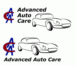
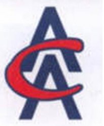
The original logo is not my design but I've reworked it a bit. I was finding AAC pretty tricky to work with. Here's the original logo. Also here is my first concept that I thought was quite good. The idea was to mimic the sort of metalic auto nameplates one would find on cars from the 50's. But the client didn't like it. So I just reworked their old logo.
The client likes the idea of having some sort of stylised car image. I agree it looks clunky. I knocked it up pretty quickly to use as a sort of placeholder. I'm hoping to get a more simplified design. But he's pretty adamant he wants some sort of car graphic in there somewhere.
Here's my latest effort using some of BlueVelvet's ideas. Originally I was trying to get the graphic much more sparse and try and fit the logo inside it.
Attachments
Honestly? It all looks clunky.
True. I assumed that the brief meant not altering any of the components... something I have to do at work occasionally. Messing about with a handful of quick comps just after you wake up is not the same thing as redesigning something from scratch or giving a crit, something I'm usually reluctant to do in this forum.
However, if it means starting from scratch, then I would start with the original logo. To me, it has a better overall balance than your redrafting, particularly the 'C'.
I'm done.
Register on MacRumors! This sidebar will go away, and you'll see fewer ads.


