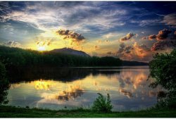
FIRST SHOT
It's good to see more of the bush at the left. It's present enough to be effective, unlike the fringe we get in the second shot.
Small bunch of foliage on the ground is far enough to the right to direct the eye back into the scene at a good point.
Hill makes a strong subject/focal point. The clouds form leading lines right to it, and the relatively subdued sun helps draw attention to the hill without overpowering it.
Floating debris in dark area at left reflects light and stands out nicely.
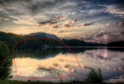
SECOND SHOT
The overall color palette, especially in the sky, is more pleasing and less suggestive of the HDR treatment (which causes that telltale 'burnt' quality we see in the first shot).
The shoreline in the foreground looks more intentional here. In the first shot it's too marginal. It's usually best to shoot beyond the shoreline or else include enough of it to serve as a deliberate base/frame for the image.
Ripples in the foreground are nice.
Sun rays are exciting, but they dominate the image, overpowering the mountain. Something in between, just a twinkle of rays, would be ideal.
Clipped highlights around the sun and its reflection spoil the subtlety of the image. The same is true for the first image as well. The transitions might be less harsh without the HDR treatment.
In summary, I'd say that the first shot wins by a narrow margin, mostly because the second one has a more busy, fussy quality about it. The clouds and color of the sky in the first shot aren't as pretty, but the patterns of the clouds aid the composition; in the second shot, they demand more attention in a scene that already has two competing focal points (sun and mountain). The HDR treatment really amplifies the presence of the clouds, which isn't helping.
HDR:
I haven't touched an HDR program in years, so I don't know how far they've come. Can you make changes selectively these days? The problem I have with most HDR images is that the process is usually applied globally, causing as many problems as it fixes. If you have Photoshop, you might try combining an HDR layer with a 'straight' one, painting a mask with areas of varying transparency so that you can have a bit more dynamic range only where you really need it (usually in the shadows to get some detail out of them).
I prefer the first one, for the same reasons as listed above. Have you considered taking a long exposure of this scene? I'm curious to see what it would look like if the reflection in the lake was smooth and without ripples
His lake is already pretty smooth, providing a nice reflection and rather lovely ripples, in my view. Also, a longer exposure might make the foliage in the foreground show motion blur, which wouldn't be desirable.
I'm not too keen on either pic, to be honest. The scene itself is fine, and I appreciate that without HDR there'd be little or no detail in the building on the shoreline. But, well, detail is lost when we look towards the sun, and our eyes and our brain tells us this is 'right'. To see the sun in shot, and so much detail in the shadows, feels 'wrong'... like we're looking at a still from a CGI movie... which makes us go "wow" at first, but soon feels rather artificial.
HDR has created a lot of 'drama' in the sky. The clouds have more 'body', feel more 3-D... but they don't convince me... 'cos I've seen a lot of clouds (a bit of a speciality in the UK) and I know they don't look like that.
I've been having a 'spring clean' of my photos, chucking out pix that didn't quite work. Very few HDR pix made the cut. I still think the technique has valid uses (mostly for 'lighting' interiors), but for 99.9999% of my landscape shots, I can't see much use for it. HDR is a bit of a distraction, IMO, from what the light is actually doing...
I don't mind the detail in the shadows at all. It's not the shadows that strike me as necessarily artificial. The human eye in this situation probably
could make out such detail; it's the typical camera sensor that cannot. The clouds, however, definitely introduce a sense of artificiality, calling the whole into question--when one area looks heavily manipulated, everything else tends to lose its credibility. Anything that calls attention to the technique makes it difficult for the viewer to suspend disbelief and appreciate the fiction for what it is.
So I essentially agree with Doylem that the HDR treatment has done some harm to these photos, but I think a touch of extra dynamic range can work well if it's applied selectively and subtly.
For example, have a look at the work of
this photographer. Many of his photos employ a dynamic range that is well beyond what you can get without some careful post-processing, but his treatments are selective and subtle enough to stay out of the way. For the most part, his photos declare themselves as hyper-realistic fine art creations, as opposed to documentary/stock images, but they stop short of drawing attention to their maker's technique.
")