Become a MacRumors Supporter for $50/year with no ads, ability to filter front page stories, and private forums.

zevrix

macrumors regular
Original poster
Oct 10, 2012
240
142
In addition to some nice improvements, Apple also made some truly BIZARRE UI choices in Big Sur.

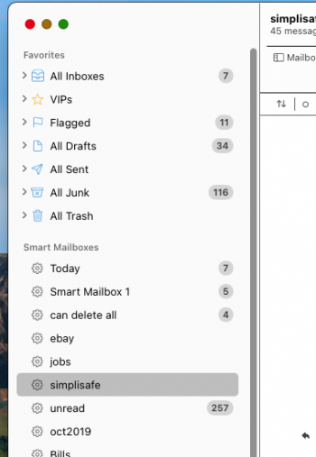
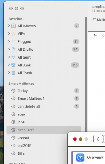
There are entire areas with white controls on white background. Controls are totally lost in the background.

It's hard to imagine it was a conscious decision to do this - but I guess it was. Looks more like a joke or mistake.

This suddenly makes the Increase contrast option - which I never considered on earlier systems - rather attractive. It makes the UI usable and helps distinguish between elements.

I did submit feedback to Apple. Hope they turn it into some normal UI one day.

I attached two screenshots to demonstrate the difference.
 

Attachments

  • system-dialog-contrast.png
    system-dialog-contrast.png
    383.8 KB · Views: 976
  • system-dialog-no-contrast.png
    system-dialog-no-contrast.png
    349.3 KB · Views: 808

ght56

macrumors 6502a
Aug 31, 2020
839
815
TBH I am finding Big Sur's UI to have pretty poor legibility and you have pointed out one of the various things that has been an issue. I've been trying to adapt to it but it just is not as legible as the UI in Catalina. I would not be totally shocked if we saw a third party app to try to address it. The font color changes has also been an issue. I don't really understand these changes since macOS Catalina had such outstanding legibility.
 

AAPLGeek

macrumors 6502a
Nov 12, 2009
610
1,718
TBH I am finding Big Sur's UI to have pretty poor legibility and you have pointed out one of the various things that has been an issue. I've been trying to adapt to it but it just is not as legible as the UI in Catalina. I would not be totally shocked if we saw a third party app to try to address it. The font color changes has also been an issue. I don't really understand these changes since macOS Catalina had such outstanding legibility.

They don’t care about legibility anymore. They care about what looks pretty in screenshots and marketing images.

The reason they iOSified the entire UI including system icons is to make iOS apps not look crappy and toy-ish on the new hardware. That’s it. It’s all about pushing devs to make ****** gimped iApps so they can be lumped and marketed as Mac apps. Doesn’t matter if the user experience is total **** if Tim Apple can brag about having millions of apps during the earnings call.

It’s almost comical how crappy the new UI looks on a 27” screen. It’s like using a giant iPad with a keyboard and mouse.
 

jgbr

macrumors 6502a
Sep 14, 2007
944
1,161
I take it people didn't read the months of reviews, videos and photos already taken before they were complaining, instead leaving to have a moan at apple and submit or not submit feedback AFTER beta is over?
 
  • Haha
Reactions: SketchyClown

ght56

macrumors 6502a
Aug 31, 2020
839
815
I take it people didn't read the months of reviews, videos and photos already taken before they were complaining, instead leaving to have a moan at apple and submit or not submit feedback AFTER beta is over?

I actually sent Apple three messages over a span of several months through two different mediums as this is something I found both frustrating and extremely concerning given how the legibility is probably even worse for many people with significant vision impairment. It's just not good.
 
  • Like
Reactions: Tozovac and zevrix

ght56

macrumors 6502a
Aug 31, 2020
839
815
They don’t care about legibility anymore. They care about what looks pretty in screenshots and marketing images.

The reason they iOSified the entire UI including system icons is to make iOS apps not look crappy and toy-ish on the new hardware. That’s it. It’s all about pushing devs to make ****** gimped iApps so they can be lumped and marketed as Mac apps. Doesn’t matter if the user experience is total **** if Tim Apple can brag about having millions of apps during the earnings call.

It’s almost comical how crappy the new UI looks on a 27” screen. It’s like using a giant iPad with a keyboard and mouse.

I hate to say it but that is what it seems to be...updating for the sake of being "new" without as much emphasis on updating for the sake of being "better". Hopefully Big Sur's replacement overhauls the UI, or at least changes the contrast options.
 
  • Like
Reactions: Tozovac and zevrix

AAPLGeek

macrumors 6502a
Nov 12, 2009
610
1,718
I hate to say it but that is what it seems to be...updating for the sake of being "new" without as much emphasis on updating for the sake of being "better". Hopefully Big Sur's replacement overhauls the UI, or at least changes the contrast options.

They aren’t gonna walk back on the stark white UI anytime soon, unless they do it on iOS first. MacOS from this point on is basically iOS’s bitch lol. Any UI overhauls they choose implement on iOS are going to end up on MacOS whether it makes sense or not.
 
  • Sad
  • Like
Reactions: Tozovac and tkermit

zevrix

macrumors regular
Original poster
Oct 10, 2012
240
142
I take it people didn't read the months of reviews, videos and photos already taken before they were complaining, instead leaving to have a moan at apple and submit or not submit feedback AFTER beta is over?

First, many people (including myself) did submit feedback during the beta cycle.

Second, when Apple releases a beta it's already highly unlikely they'll make any drastic changes in UI.

Third, the biggest issue is: how did Apple even end up designing and approving this UI in the first place? I mean they just had to make an enormous effort to assemble a team of designers with some totally WARPED ideas about decent human-oriented UI. That's when Apple - a trillion-dollar company - is supposed to have the best UI designers in the world. I mean you could grab a random person from the street who could come up with something better than that.

Obviously, some UI aspects in Big Sur are good and an improvement over earlier versions. But overall when users suddenly have to switch to the "Increase contrast" mode just to tolerate the UI, it indicates a serious failure.
 

rukind2

macrumors regular
Jul 8, 2012
175
97
System Preferences>Accessibility>Display>Increase Contrast made a huge difference for me in the MAIL app. Now I can see the toolbar icons and text more easily.
 
  • Like
Reactions: AdrianaP

AdrianaP

macrumors newbie
Oct 7, 2020
23
25
I'm going to submit feedback too. I don't mind the new look but the poor legibility is a problem.

System Preferences>Accessibility>Display>Increase Contrast made a huge difference for me in the MAIL app. Now I can see the toolbar icons and text more easily.

I already felt that the font on the mail app was too small on Catalina, now it's almost impossible to use without increasing contrast.

Yeah, but somehow Increase contrast also makes the UI more ugly. Lose/Lose.

Exactly. Have you tried "reduce transparency"? It's even worse!
 
  • Like
Reactions: Tozovac

Tozovac

macrumors 68040
Jun 12, 2014
3,020
3,226
Why do we "amateurs" and not Apple's UI experts remember the value in how light grey font at one time meant a non-selectable option. This was not only intuitive but it was ingrained into users' heads for decades leading up to ~2013, at which point (I think starting with iOS7 but possibly also Microsoft's Metro design language and/or Google's Material Design) light grey font on stark white backgrounds were relegated to being a main theme... Change for the sake of change, and forced learning replaced intuitive design.

I find Mail on Big Sur to be completely impossible to use unless both reduce transparency and increase contrast are selected, and even then the change is not enough.

This (from macOS Sierra on my 2014 MBA) is so much more easier and pleasing to use than today's "improved" Big Sur:

Screen Shot 2021-01-01 at 12.21.04 PM.png


Screen Shot 2021-01-01 at 12.21.52 PM.png


Little things like different shadings up top and to the side add immensely to intuitiveness and ease of use, as do black font, dark/fuller icons, and black/filled arrows, compared to Big Sur's interface where almost everything blends together, taking more time each time to get mentally situated to focus on where you need to go next.


I started a new thread before finding this Big Sur thread, hoping to find any 3rd party app options to customize the UI a bit in Big Sur:


I've been complaining bout these reduced-intuitive UI themes in websites and apps since 2017 here. :) I've been seeing incremental changes with each iOS revamp where elements of non-minimalist, intuitive interface design are returning. Someone at Apple gets it, but they're just not powerful yet enough to undo all the minimalist button-less white-out garbage in the iOS and macOS we're currently stuck with.

 
  • Like
Reactions: me55 and zevrix

Tozovac

macrumors 68040
Jun 12, 2014
3,020
3,226
I just increased contrast and I needed to turn the screen brightness down slightly.
I think I prefer it :)

I'm jealous. :)

Has anyone noticed: with "increase contrast" and "reduce transparency" enabled, the "better" appearance in mail is shown only when mail is *not* selected?

What's the point of enabling the more-helpful increased contrast representation only when the Mail app is not active?

With mail app selected:
Screen Shot 2021-01-01 at 1.34.52 PM.png

With another app selected:
Screen Shot 2021-01-01 at 1.34.46 PM.png
 

Altis

macrumors 68040
Sep 10, 2013
3,167
4,897
...and now, eight months later, we know that nothing has changed in macOS 12 Monterey: same bizarre white-on-white UI. (Not to mention the disastrous redesigned alert dialogs).
It looks even worse on non-retina MBs -- blurry, even.

The trend of light-grey on white has been awful. Half the time I can barely see roads in the maps, especially if I'm just trying to glance while on the move.
 
  • Like
Reactions: zevrix and Tozovac

Tozovac

macrumors 68040
Jun 12, 2014
3,020
3,226
It looks even worse on non-retina MBs -- blurry, even.

The trend of light-grey on white has been awful. Half the time I can barely see roads in the maps, especially if I'm just trying to glance while on the move.

What’s worse, the distraction you describe, where the interface gets in the way of getting the job done quickly, or the prolonged vision started by Jony Ive’s (and Federighi’s?) teams that the interface should be as light and minimalist as possible so as to “not distract the user unnecessarily with unnecessary detail?”
 
  • Like
Reactions: zevrix

svenmany

macrumors demi-god
Jun 19, 2011
2,066
1,339
When I drag a window I sometimes accidentally grab inside the search box since I can't easily see the boundaries of that box.

I'm trying to wrap my head around how they could get this so wrong. It's almost as if they only have young eyes with extremely hight resolution monitors evaluating the final look.

Setting things to high contrast is a solution - thanks to the OP. However, I don't enjoy the overall look of things with that setting turned on.
 
  • Like
Reactions: zevrix

Idgit

macrumors 6502a
Mar 14, 2004
553
158
I'm still on Mojave. I had a look at Big Sur recently and the white-on-white UI is absolutely brutal. I find it causes eye strain and discomfort.

I just want Big Sur to be easier on the eyes like Mojave. I tried increase contrast but that only helps a little by reducing transparency.

Are there any options, hacks, or apps that allow you to restore the grey UI in the Finder and in Safari?
 

ignatius345

macrumors 604
Aug 20, 2015
7,024
11,554
I take it people didn't read the months of reviews, videos and photos already taken before they were complaining, instead leaving to have a moan at apple and submit or not submit feedback AFTER beta is over?
Not everybody cares to install a beta OS on their Mac.
 
  • Love
Reactions: colourfastt
Register on MacRumors! This sidebar will go away, and you'll see fewer ads.