Okay, since I suggested the grundge on the cow, and I wasn't the one who provided a rather useless suggestion such as "Not enough variety in the size of things" Would you retract your statement?
That qualifies you right there. I didn't say you had to have an art education to be a qualified critic. You must have a sense of what looks good, and provide sensible suggestions. Unlike.. "Oh I think you need more sizes in there." <- Yeah whatever the hell that meant..
Every single design class I've taken, whether it be for landscape architecture, drawing, 2D design, 3D design, or graphic design, or even what I do for a living, jewelry design, have ALL taught that if you want a composition (or design) to be more engaging then have a variety of things, one of which being the size of various elements. All the text the same size, the boxes the same size are BORING!
http://www.goshen.edu/art/ed/Compose.htm#balance said:
Variety - You create variety when elements are changed. Repeating a similar shape but changing the size can give variety and unity at the same time. Keeping the same size, but changing the color can also give variety and unity at the same time. In visual composition, there are many ways you can change something while simultaneously keeping it the same.
And how about some visual examples from business cards:
Notice how in EVERY SINGLE ONE there is bigger text, smaller text, big image, etc. In the design by
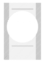
-kritter- the two boxes are the same size. The text was the same size. The line weights are the same. The only thing different was the circle in the middle, and the cow.
I find it funny that someone wanders to the Design and Graphics forum and only posts in two threads, both about business card design, and then tries to tell me that I'm posting useless comments. What evidence do you have that my comments are not helpful in ANY way? I'd like to know.
So, since I seem to be posting "useless comments," let's ask the graphic designers on here if I am blowing hot air, or if what I am saying is true, that a variety in size of elements makes it more interesting. What do you designers have to say about size and variety?