Become a MacRumors Supporter for $50/year with no ads, ability to filter front page stories, and private forums.
First Look at Google's Android Mobile Platform
- Thread starter MacRumors
- Start date
- Sort by reaction score
You are using an out of date browser. It may not display this or other websites correctly.
You should upgrade or use an alternative browser.
You should upgrade or use an alternative browser.
When you say Apple "makes (blank) pretty" you don't realize that making something "pretty" is actually a ton of work for designers, people who make a living off of making things intuitive and presentable, or "pretty" as the less embarrassing among us call it. You don't realize that more then half of the worth of an OS or electronic device is it's "prettiness" or design. Sure apple didn't invent the computer (actually, I think they may have) but the reason the iRiver clix hasn't sold 100 million pieces is because it is not designed well and the iPod is. Some people, like you, are more into the technical aspect of coding and whatever else. I admittedly know almost nothing about that but I am part of the group of people who appreciate and know good design. What you write off in a word I understand as being what makes something useable. Please don't assume that design is not a huge part of electronics because it certainly is and the pile of money that Steve Jobs sleeps on every night is a testament to that.
Of course I realise, and there is nothing wrong with that. I love Eye Candy. I think it's fantastic. But people should realise that Apple don't have a monopoly on eye candy. Just because it's pretty doesn't mean they are copying Apple.
Icons moving through a 3D space should not immediately result in cries of "OMG. They haz copies
 designs. They are losers!!!!111"
Translation: OMG That icon looks like a folder!!! Apple owns a patent on that!!!!!Anyone else notice that a lot of the icons were complete iPhone and Mac rip offs as well???
Translation: OMG That icon looks like a folder!!! Apple owns a patent on that!!!!!
THANK YOU! When will people realize that not everything is a rip off of Apple?
I can't remember if it was here or somewhere else, but I saw someone comment on how having the application icons on the bottom of the screen is stealing from Apple.....I had a BlackBerry Pearl that had app icons on the bottom of the screen like that long before Apple even announced the iPhone. But I don't see anyone accusing Apple of ripping off BlackBerry. Because Apple is perfect and would never steal from anyone, right?
I wonder if a certain Google member of Apple's board of directors will be invited off the team... "to pursue other interests."
I don't see why. As has been argued here many times, Apple is a hardware vendor, their job is to sell hardware.
This is a software product.
THANK YOU! When will people realize that not everything is a rip off of Apple?
I can't remember if it was here or somewhere else, but I saw someone comment on how having the application icons on the bottom of the screen is stealing from Apple.....I had a BlackBerry Pearl that had app icons on the bottom of the screen like that long before Apple even announced the iPhone. But I don't see anyone accusing Apple of ripping off BlackBerry. Because Apple is perfect and would never steal from anyone, right?
Listen I love Apple and I will be the first to admit they also copy and take ideas from other places... BUT if you know anything about design you know the work that goes into icons especially with Apple which is why theirs are so beautiful and those icons are definitely rip offs in design from Apple, no other way around it.
Listen I love Apple and I will be the first to admit they also copy and take ideas from other places... BUT if you know anything about design you know the work that goes into icons especially with Apple which is why theirs are so beautiful and those icons are definitely rip offs in design from Apple, no other way around it.

The only thing in there that might even remotely be a ripoff of an Apple icon is the compass one.
Because 9 days was enough time for LG to completely build a phone from scratchLG's Press release dated Jan. 18th, 2007, iPhone introduced Jan. 9th. But still a valid point.
I don't see why. As has been argued here many times, Apple is a hardware vendor, their job is to sell hardware.
This is a software product.
Apple sells hardware AND software. It's an integrated experience. More to the point of Android, it is a competing mobile phone OS.
Anyone else notice that a lot of the icons were complete iPhone and Mac rip offs as well???
I don't think the icons are final since this is a prototype. They represent placeholders for what the developer is responsible for designing.

To all those who are so excited to have a free and open platform to develop all your apps on, I would just ask: "What apps?"
I mean how much can you really do with a tiny screen and miniature keyboard? It's too small to watch movies, a few minutes of news broadcast or Youtube maybe.
No video or photo editing is realistically possible. You can't do massive hundred page documents on it, only short notes or emails. You can check your appointments or view a small map.
In other words it's an appliance. A grand platform is nothing to write home about in this case because there's only 10 or so practical apps for such a device anyway (excluding many varieties of game).
The only thing in there that might even remotely be a ripoff of an Apple icon is the compass one.
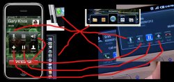
Ok sorry for the confusion. I meant these. Now I know some symbols are just unavoidable, but come on??? The volume and the mute at least are total Apple rip off. Once again, I'm not saying Apple hasn't ever copied, but come on, seriously lol......
P.S. these are not just place holders for other apps because this IS the phone app that Google wrote and includes (I know everything is customizable, but still). And I know my image lines suck lol
Attachments
To all those who are so excited to have a free and open platform to develop all your apps on, I would just ask: "What apps?"
I mean how much can you really do with a tiny screen and miniature keyboard? It's too small to watch movies, a few minutes of news broadcast or Youtube maybe.
No video or photo editing is realistically possible. You can't do massive hundred page documents on it, only short notes or emails. You can check your appointments or view a small map.
In other words it's an appliance. A grand platform is nothing to write home about in this case because there's only 10 or so practical apps for such a device anyway (excluding many varieties of game).
You need to think of future devices like the iPhone or little mobile tablets that will be in the hand of EVERYONE in the future, not stupid little small screened keyboard phones that are out now
You need to think of future devices like the iPhone or little mobile tablets that will be in the hand of EVERYONE in the future, not stupid little small screened keyboard phones that are out now
In other words you have to imagine why it's good because there's no real reason
I agree completely, the competition can only mean that both platforms will improve over time.
I, however, don't agree at all. You speak like lawyers. Just because something existed before, doesn't mean that the first impression people get will be of the original. It's of the thing that made it popular.
Even if something similar to the dock existed for linux - first thing you think of is apple osx. Same goes for zoom-and-pan style browser, and coverflow.
Maybe I invented multitouch 20 years ago in my sleep, this doesn't mean everyone will say apple copied it from me. It's what makes it popular - that matters. Associations are based on that. I'm not speaking about copyrights though.
P.S. these are not just place holders for other apps because this IS the phone app that Google wrote and includes (I know everything is customizable, but still). And I know my image lines suck lol
Holy **** you are right! Check it out, google used a + symbol to mean "add" and so did the iPhone. And you know what else? Those damn ancient greeks totally ripped off Apple to mean the same thing!!!
And then there is the speaker symbol to indicate volume!! It looks strangely like one of those old gramaphone. We should totally find out who invented that so we can sue!
And then the green phone symbol... You know what, I think my sarcasm well has just dried up.
I, however, don't agree at all. You speak like lawyers. Just because something existed before, doesn't mean that the first impression people get will be of the original. It's of the thing that made it popular.
Even if something similar to the dock existed for linux - first thing you think of is apple osx. Same goes for zoom-and-pan style browser, and coverflow.
Maybe I invented multitouch 20 years ago in my sleep, this doesn't mean everyone will say apple copied it from me. It's what makes it popular - that matters. Associations are based on that. I'm not speaking about copyrights though.
And when I think of an application window most people will think of MS Windows instead of the people who invented it, Apple. Oh wait! They didn't invent that either, they stole it from Xerox along with the mouse.
Hey! I guess my sarcasm well wasn't dry after all
In other words you have to imagine why it's good because there's no real reason
You simply have a severe lack of vision and the near future! Just wait 1-3 years!
Holy **** you are right! Check it out, google used a + symbol to mean "add" and so did the iPhone. And you know what else? Those damn ancient greeks totally ripped off Apple to mean the same thing!!!
And then there is the speaker symbol to indicate volume!! It looks strangely like one of those old gramaphone. We should totally find out who invented that so we can sue!
And then the green phone symbol... You know what, I think my sarcasm well has just dried up.
You conveniently didn't quote where I said obviously some symbols are unavoidable but its funny how every other device in the world has found a way to make a volume symbol that doesn't look EXACTLY like Apple's. All I'm saying is you can see that they were influenced by iPhone design, God, can't you at least admit that???
Absolutely cannot wait for this to be in the mainstream.
Just the building blocks and supported technologies look good, and the fact they are giving good financial incentives for all the developers out there.
If they can pull this off, and I think they can, Apple and their closed minded nature will have something very real to worry about while they go around breaking unlocks with every small firmware update.
I'm certainly excited about this and I genuinely hope it's a success.
Reason? Well, I want an iPhone at some point and much prefer the hardware (and what I've seen of the software) but some decent competition would be excellent. I really hope this means that the iPhone will become more open to 3rd party developers.
Ok, I admit. I just want to play Quake on my phone.
Reason? Well, I want an iPhone at some point and much prefer the hardware (and what I've seen of the software) but some decent competition would be excellent. I really hope this means that the iPhone will become more open to 3rd party developers.
Ok, I admit. I just want to play Quake on my phone.
You conveniently didn't quote where I said obviously some symbols are unavoidable but its funny how every other device in the world has found a way to make a volume symbol that doesn't look EXACTLY like Apple's. All I'm saying is you can see that they were influenced by iPhone design, God, can't you at least admit that???
No sorry can't do that.
http://www.brighthand.com/images/Tapwave_Zodiac_R_Mute.jpg
http://media.arstechnica.com/images/misc/vista/beta2/volume.jpg
http://img150.imageshack.us/img150/7743/70303220ef1.png
http://www.owlriver.com/issa/icon-speaker.gif
http://www1.istockphoto.com/file_th...27/2/istockphoto_3205927_phone_menu_icons.jpg
http://www.ecu.edu/cs-itcs/vc/images/mute.JPG
http://www1.istockphoto.com/file_th...photo_3508341_microphone_icon_in_6_colors.jpg
http://www.iconarchive.com/icons/icons-land/vista-multimedia/Microphone-Pressed-256x256.png
I am all for giving Apple credit where credit is due. My Mac is great. OSX is fantastic. I pre-ordered Leopard and so far it's been pretty good. My iPod is great. Developing in Cocoa is sweet.
This however is trying to give Apple credit where none is due. Apple have nothing to do with Android. Android is 100% Google (or more accurately OHA). UI inspiration comes from many many places. All of these recognisable icons have been around for decades. Who knows where they came from, Apple certainly didn't invent them. Apple didn't invent a lot of things, most of the time they just refine it.
This is a far more exciting development than the travesty called the iPhone.
So how about we get up off our knees and stop pretending that they are the only ones who revolutionise the IT world. We really don't want to see Apple get a monopoly on IT.
They were loading the maps data over a 3G connection, not WiFi. Try loading maps on an iPhone over EDGE, I'd imagine (and only imagine, since I've never used one) you'd get the same thing, if not a lot worse.*Screen updates in the browser were painfully slow during finger dragging. Dragging that zoomed-in web page around showed a lot of choppy delay. Many navigation and interface elements looked "un-fluid," and I think a lot of it is because Google can't (or doesn't want to) copy some things that Apple did.
EVERYTHING about the "gPhone" can be changed, that's the whole point of this. Nothing needs to stay as they've presented it in the initial demo. It was just that, a very plain and simple 1st stage initial demo. It's up to the dev communities to decide what it looks like, and what it's capable of.I would be ashamed to show a product that is such a rip-off. From the look-a-like dock to the poorly implemented cover-flow to the square icons, there is a huge lack of creativity. Of course I would not say design is not one of Googles strong suits.
My god you guys are embarrassing.
Half of you seem to act as if Steve Jobs invented the mobile phone. He didn't! Apple took existing features and made them pretty and usable. That's it.
They didn't invent Coverflow, they bought it, and really it's just a pretty version of Alt-Tab.
They didn't invent the dock, that particular UI style has been available with unix fvwm for the last 20 years probably longer.
WebKit is an open source fork of KHTML. The rendering engine and everything was already coded when apple got their hands on it.
Yes Apple have innovated, but they copy just as much as everyone else.
The look and feel of this is NOT the iPhone!
Android is a Good Thing! It is a free open platform, something that the iPhone is not.
Yes and No. KHTML/KJS in it's KDE 3.2.x phase was already available.
WebCore, WebKit, WebKitLibraries, JavaScriptCore, JavaScriptGlue, SunSpider, WebKitTools [BuildSlaveSupport, CLWrapper, CodeCoverage, CygwinDownloader, DrawTest, Drosera, DumpRenderTree, FindSafari, GtkLauncher, iExploder, mangleme, MIDLWrapper, WebKitInitializer, WebKitLauncher, vcbin], LayoutTests [css1,css2.1,css3,and a bunch more] is a collaborative effort.
The KDE Khtml/KJS Team have yet to move from their rendering engine to WebKit, but it will be addressed after KDE 4.1 is released.
Register on MacRumors! This sidebar will go away, and you'll see fewer ads.