Become a MacRumors Supporter for $50/year with no ads, ability to filter front page stories, and private forums.

jlcharles

macrumors 6502
Original poster
Mar 30, 2006
345
0
Wenonah, NJ
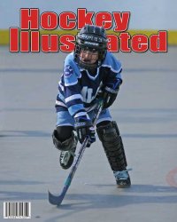
So, as part of a photo gig I have coming up in a week, I am going to be offering a magazine cover for purchase. (It's a job doing a high school ice hockey team's individual and team portraits)

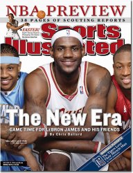
So, I picked up a copy of SI tonight to kind of get ideas and I really loved the font they used on it. Now, I have a font I am already using, Impact, that is really close, but I am more looking for ideas on how to manipulate the font and add effects to it to get it like this one. It has a kind of white outline, outlined in black with a drop shadow onto the inside of the letters. Any help would be great.
 

Attachments

  • 1023_large.jpg
    1023_large.jpg
    93.8 KB · Views: 107

jlcharles

macrumors 6502
Original poster
Mar 30, 2006
345
0
Wenonah, NJ
No, unfortunately I don't own Illustrator. I guess I'll have to try it that way. I was hoping there would be something a bit quicker and easier, oh well.
 

jlcharles

macrumors 6502
Original poster
Mar 30, 2006
345
0
Wenonah, NJ
And here's another question. So, I have a drop shadow on the layer containing the title of my "magazine" and i wanted to see how it looked with an actual picture on it.

I put a sample picture that I have in another layer under the title and i wanted to do what they did with the title on SI, put the player above it, kind of like the title is behind the player, but in front of the background of the picture.

Well, i took the eraser tool and kept shaving away until I was satisfied, but here's the problem, the drop shadow is still there, on top of the player's head. How can I get around this?
 

CanadaRAM

macrumors G5
jlcharles said:
Forgive the simplicity of the question, but how would one go about outlining the text?
Layers, it's all in the layers.

Create your basic text - Track it wider than normal (+25) to make room for your outlines.
Hockey Times1.jpg

Duplicate this layer twice, colour the 2nd layer white and the 3rd (lowest) layer black
Hide layer 1 and 2 and go to the 3rd layer
Hockey Times2.jpg

Choose Layer: Layer Style: Stroke: 5 px: Colour - Black
Hockey Times3.jpg

Now unhide the second layer
Hockey Times4.jpg

Choose Layer: Layer Style: Stroke: 3 px: Colour - White
Hockey Times5.jpg

Now unhide the first layer
Hockey Times6.jpg

Now go back to the third layer and add a drop shadow
Choose Layer: Layer Style: Drop Shadow: Spread 100%: Colour - Black, play with the Distance and Size until it fits.
Hockey Times7.jpg


Well, i took the eraser tool and kept shaving away until I was satisfied, but here's the problem, the drop shadow is still there, on top of the player's head. How can I get around this?

Do it the other way. Close-crop around the player's head and put the "head" layer above the text layer.

If that doesn't work for you, then do what you are doing but make two copies of the text in separate layers.

Text
Player
Text2

Only turn on Drop Shadow on Text2, not Text 1

Thanks
Trevor
CanadaRAM.com
 

apfhex

macrumors 68030
Aug 8, 2006
2,670
5
Northern California
Honestly, looking at the cover of that issue of SI, they didn't do anything with the text that can't be done much more easily with layer effects applied directly to a single live text layer. Drop shadow, inner shadow, stroke, that's it.
 

CanadaRAM

macrumors G5
apfhex said:
Honestly, looking at the cover of that issue of SI, they didn't do anything with the text that can't be done much more easily with layer effects applied directly to a single live text layer. Drop shadow, inner shadow, stroke, that's it.
Yes, you could do it that way, although I find the foreground layer of text to the sharper when it's in its own layer. The Layer Styles have the potential to soften the edges - in this example I'm not happy with the stroke's rounding of the corners. It would be crisper yet if done in Illustrator.

An Inner Shadow would also reduce the weight of the type, so you would have to compensate somehow.
 

jlcharles

macrumors 6502
Original poster
Mar 30, 2006
345
0
Wenonah, NJ
That worked like a charm. Well, I had to tweak it a bunch to get it to look like what I wanted. Your font must have been a bit different, but regardless. I'm impressed with how it looks. And I tried your suggestion for the head of the player with one of my old pictures and it worked great. I used the blur tool to soften up the edges and it looked great.
 

Attachments

  • magazine-cover-sample.jpg
    magazine-cover-sample.jpg
    30 KB · Views: 90
Register on MacRumors! This sidebar will go away, and you'll see fewer ads.