Become a MacRumors Supporter for $50/year with no ads, ability to filter front page stories, and private forums.
Helvetica Neue font on non retina displays
- Thread starter Zombolo
- Start date
- Sort by reaction score
You are using an out of date browser. It may not display this or other websites correctly.
You should upgrade or use an alternative browser.
You should upgrade or use an alternative browser.
It's decent enough on the menubar. However, it's absolutely wretched in some weights and size. In particularly in Calendar and the url bar in Safari. Hopefully they can work on hinting and rendering to make it more non-retina friendly by the time of the release, because right now it's as bad as you'd probably imagine.
The rendering of the new font isn't too bad. If you've used a non-retina iPad mini, the look is quite similar to that.
My main complaint is that some of the font size and weight choices feel a little strange. Some labels and UI elements seem to have become very small. The other thing of course is that everything has changed - and that is going to take a little getting used to.
There's a great deal in Yosemite that seems heavily optimised for retina displays. In that way, I guess it is quite similar to iOS 7.
It's decent enough on the menubar. However, it's absolutely wretched in some weights and size. In particularly in Calendar and the url bar in Safari. Hopefully they can work on hinting and rendering to make it more non-retina friendly by the time of the release, because right now it's as bad as you'd probably imagine.
No idea what you are talking about, but on MBA it looks spot on. It's actually way better than it was before.
Maybe you disabled font smoothening? Cause that certainly can cause some rough edges and font artifacts.
Any NON-retina screenshot please?
lol you realize a screenshot won't matter as you're not seeing the pixels on the LCD. That would be like screenshotting your broken iphone screen...
lol you realize a screenshot won't matter as you're not seeing the pixels on the LCD. That would be like screenshotting your broken iphone screen...
Actually wait. If it's a font rendering issue, that is a software issue, and NOT an result of poor quality LCD, it WILL show up on the screenshot.
For me, it doesn't actually look too bad, not worse than on Mavericks, but to be completely honest I still do prefer crisp font rendering from win8.
Safari font rendering on my MBA:
http://i.imgur.com/EWvdHjk.png
The address bar has very weak font smoothing or disabled it altogether, but that's not a huge deal and everything else is OK. I remember Safari on Mavericks had some similiar issues as well, the fonts on bookmarks bar weren't correctly rendered.
Last edited:
I'm using a non-retina 2013 11" Air and I think the font looks good. In fact, I changed my word processing/writing app, Scrivener, to use it for one of my projects and I am liking it a lot. I will admit that the "thin" or "fine" version of the font is too light for me to see clearly sometimes. But "regular" looks very nice, I think.
kerning is too tight
In my opinion, the font kerning is too tight.
In looking at samples of the same text in both Lucida Grande and Helvetica Neue, I find the spacing of Lucida Grande easier to read.
Using a mid 2011 Mac Mini with an HP 2311x (non-retina 1920x1080) monitor.
In my opinion, the font kerning is too tight.
In looking at samples of the same text in both Lucida Grande and Helvetica Neue, I find the spacing of Lucida Grande easier to read.
Using a mid 2011 Mac Mini with an HP 2311x (non-retina 1920x1080) monitor.
In my opinion, the font kerning is too tight.
In looking at samples of the same text in both Lucida Grande and Helvetica Neue, I find the spacing of Lucida Grande easier to read.
Using a mid 2011 Mac Mini with an HP 2311x (non-retina 1920x1080) monitor.
I agree. That should be the primary function of the system font - its easy to read. Helvetica (particularly thin variants) are undergoing a resurgence in popularity, but that doesn't mean they work as the system font.
I actually love helvetica. I use it all the time in designs and documents - which is actually partly why I don't like it as the system font. The system font should not be a typeface you regularly use elsewhere.
I personally have had zero problems with font visibility under Yosemite, currently on a 2011 13" MBA. The only slight gripe I have is the WiFi indicator, which is a tad to thin IMO (unsure what it is like on retina), but on standard it is certainly too thin
I personally have had zero problems with font visibility under Yosemite, currently on a 2011 13" MBA. The only slight gripe I have is the WiFi indicator, which is a tad to thin IMO (unsure what it is like on retina), but on standard it is certainly too thin
It's the same on retina - the indicator is thin and it looks like you're disconnected.
I don't know if it's the font, or the rendering of the font or the antialias or the chosen sizes, but in non retina screens it's just works. For me it sucks big time, for other people not that much, but one thing is for surre; it's simply worse, in non retina screens, at least in dp1.
Thats not what we are comparing it to.Been using Helvetica Neue on Mavericks/Mountain Lion on my non-retina MBP since forever and it looks much more aesthetically pleasing than the standard Helvetica.
I have been using beta 1 since day 1. The font absolutely blows. I don't care if you are retina or not. I can never tell if I am connected to wireless by looking at it. Is it black or grey!
I am a fan of thin but something about the font annoys me.
I am a fan of thin but something about the font annoys me.
I have been using beta 1 since day 1. The font absolutely blows. I don't care if you are retina or not. I can never tell if I am connected to wireless by looking at it. Is it black or grey!
I am a fan of thin but something about the font annoys me.
What has the font to do with you knowing whether or not you are connected to wireless?
Well title bars need some attention and desktop icons don't look perfect but it's not THAT bad. In Mavericks the fonts were too bold, now they are too thin at times or lacking outline.
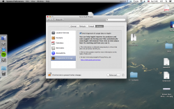
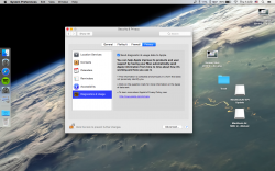
below side by side comparison with Mavericks (you might need to click it once more after enlarging to view in full size).
PS. Regardless of what some might think, you will see exactly how these fonts look on non-retina screens regardless of what you are using right now as DPI per picture won't change with fixed resolution.
Attachments
Last edited:
What has the font to do with you knowing whether or not you are connected to wireless?
The font and Icon Design have that thin look to it. Just tiny to see.
icons have nothing to do with font. That's a different issue.The font and Icon Design have that thin look to it. Just tiny to see.
icons have nothing to do with font. That's a different issue.
I guess my issue is the "theme" of 10.10. They went for all these icons that you have to squint at in the status bar.
I guess my issue is the "theme" of 10.10. They went for all these icons that you have to squint at in the status bar.
What's wrong with other icons?
Wifi icon is buggy, but that's about it.
Register on MacRumors! This sidebar will go away, and you'll see fewer ads.


