Become a MacRumors Supporter for $50/year with no ads, ability to filter front page stories, and private forums.

dubbz

macrumors 68020
Sep 3, 2003
2,284
0
Alta, Norway
thevessels said:
my favorite part is the old dos terminal window thing . i guess thats one thing thats not changing any time soon . DOS .. mwahaha .. that and as mentioned microsoft pain , the exact same crap id play with as a kid 10 years ago .. mwahaha

It's just a command prompt/terminal. No DOS involved. That died a long time ago.

Think they're working on some kind of Pain replacement. Was released as an Alpha some time ago, IIRC... except it wasn't even alpha quality. Doubt they'll get it ready for LH.
 

rockthecasbah

macrumors 68020
Apr 12, 2005
2,395
2
Moorestown, NJ
i love how even in the next gen photos that are supposed to be impressive and show the raw greatness of Longhorn, "cannot find server" callout boxes are still in the window tray...classic. ;)
Link
 

tech4all

macrumors 68040
Jun 13, 2004
3,399
489
NorCal
rockthecasbah said:
i love how even in the next gen photos that are supposed to be impressive and show the raw greatness of Longhorn, "cannot find server" callout boxes are still in the window tray...classic. ;)
Link

Are these screen shots from Microsoft? I thought they were from someone who had a pre release or something.
 

Abstract

macrumors Penryn
Dec 27, 2002
24,837
850
Location Location Location
WinXP is an example of a team of designers at Microsoft trying to capture the essence of ugliness and bring it to the masses. I don't think anything could possibly look worse than WinXP, so this is an improvement. ;)

And all these criticisms of the aesthetic of the icons and fonts and so forth are pointless. The criticisms seem unfair when we know they're not releasing Longhorn looking like this. It just makes you critics of Longhorn's current appearance appear ignorant, like you don't have the slightest clue. Why bother criticising the appearance now? Criticise it a year from now, or whenever the new UI is released. There's time for criticism later, when it may actually be valid.
 

Oryan

macrumors 6502a
Apr 1, 2005
595
0
Lincoln, NE
Phat_Pat said:
that search bar in the start menu feels so out of place....

Yeah, and I bet the Start menu will decide to close itself in the middle of your search.

Wow, this looks like crap.... XP with a facelift.
 

me_94501

macrumors 65816
Jan 6, 2003
1,009
0
Abstract said:
WinXP is an example of a team of designers at Microsoft trying to capture the essence of ugliness and bring it to the masses. I don't think anything could possibly look worse than WinXP, so this is an improvement. ;)

And all these criticisms of the aesthetic of the icons and fonts and so forth are pointless. The criticisms seem unfair when we know they're not releasing Longhorn looking like this. It just makes you critics of Longhorn's current appearance appear ignorant, like you don't have the slightest clue. Why bother criticising the appearance now? Criticise it a year from now, or whenever the new UI is released. There's time for criticism later, when it may actually be valid.
Okay, let's criticize other parts of the UI. ;)

What's up with the position of the menubar in IE? it just introduces (even more) unpredictability with menus in Windows.

Why are multi-row tabs still there? Haven't they got the idea that it's a bad idea by now?

If I understand this right, clicking "all programs" in the Start menu causes the list of all installed apps to replace the pinned items until you click "back." I'm sure MS could have come up with a better way to handle that.

It's hard to see the titlebar text on a dark background. Also, it's hard to see which window is frontmost. I would suggest that MS make the frontomst window opaque and the background windows a little less transparent so that text is easier to read.

These are all things I hope MS addresses before Longhorn is released.
 

tfh1013

macrumors member
Jan 17, 2005
34
0
Somewhere, Overthere
hob said:
And does anyone have an answer to the question that someone asked earlier about Alt+F bringing up File in windows... the equivalent for OS X?

Its not very efficient, but you can hit control+F2 and press the right arrow key twice and hit enter.

For me, I think i'll stick to clicking the file menu... :rolleyes:
 

rockthecasbah

macrumors 68020
Apr 12, 2005
2,395
2
Moorestown, NJ
Everyone here is bashing this as just an XP facelift, which it is. But all we can tell now is prettiness, its not like WE can use the beta version...I think it looks very pretty anyway :) . Now I would never BUY it, but judging from those screen shots, its very very pretty. Yes copying Mac or whatever, regardless i still like how it looks.
 

michaelrjohnson

macrumors 68020
Aug 9, 2000
2,180
5
53132
killuminati said:
One thing I find stupid about windows is that they are still using the same icons that they have been using since Windows 95. Like in this image the icons look so outdated and so out of place.
All of the icons were updated in XP. The Iconfactory was contracted to redesign them. (See below)


My biggest concern is how they choose a dark background and reverse the type out of the form. In this example, the taskbar is black and the normal, sans-serif type is white. This is incredibly difficult to read... add translucency on top of that and it's strains the eye horribly (previously mentioned). Our beloved Mac OS uses a 0-10% grey background and black type. It's much easier on the eyes. There are some reasons (See Universal Access pref pane) why people need to invert the colors, but it's not the majority. Poor design choice in XP, carried over into Longhorn.
 

Attachments

  • mycomp.JPG
    mycomp.JPG
    1.9 KB · Views: 201
  • xpmycomp.JPG
    xpmycomp.JPG
    1.6 KB · Views: 209
michaelrjohnson said:
All of the icons were updated in XP. The Iconfactory was contracted to redesign them. (See below)


My biggest concern is how they choose a dark background and reverse the type out of the form. In this example, the taskbar is black and the normal, sans-serif type is white. This is incredibly difficult to read... add translucency on top of that and it's strains the eye horribly (previously mentioned). Our beloved Mac OS uses a 0-10% grey background and black type. It's much easier on the eyes. There are some reasons (See Universal Access pref pane) why people need to invert the colors, but it's not the majority. Poor design choice in XP, carried over into Longhorn.

I'm a little confused here. My OSX desktop has white type with black drop shadows just like the Longhorn grab and I haven't changed any settings.
 

michaelrjohnson

macrumors 68020
Aug 9, 2000
2,180
5
53132
jayscheuerle said:
I'm a little confused here. My OSX desktop has white type with black drop shadows just like the Longhorn grab and I haven't changed any settings.
Yeah, on the desktop.

I was refferring to the Mac OS Menubar vs. Windows Taskbar. I should have clarified. :)
 

michaelrjohnson

macrumors 68020
Aug 9, 2000
2,180
5
53132
Also, with Mac OS X (Apple's "Revolutionary" OS) they weren't afraid to make big decisions. everything about the OS changed. File structure, system structure, etc. But perhaps one of the biggest UI changes was how Apple modified system preferences. It's was a big jump from individual panels in a folder to a single "app" that manages all properties.

On a very similar note (not exact), this is perhaps one of the more disturbing things about Longhorn, and possibly part of why people call it "a dressed-up XP". Microsoft is refusing to innovate it's properties panels, which are by far one of the most cumbersome parts of the OS. The fact that there are multiple rows of tabs, and that they shift based on selection is very confusing conceptually. But in Longhorn, the same old system exists.
 

Attachments

  • properties.JPG
    properties.JPG
    30.3 KB · Views: 78

michaelrjohnson

macrumors 68020
Aug 9, 2000
2,180
5
53132
michaelrjohnson said:
All of the icons were updated in XP. The Iconfactory was contracted to redesign them.
Speaking of icons... they turned the folder icons sideways!
 

Attachments

  • folders.JPG
    folders.JPG
    199.1 KB · Views: 108

Thomas Veil

macrumors 68030
Feb 14, 2004
2,636
8,862
Much greener pastures
Let me comment on those desktop screenshots individually:

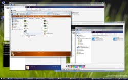
Picture 1: The desktop icons are a HUGE improvement. And I may be alone in this, but I actually find the translucent background windows kind of nice.

Thank God they're finally going to use a new system font! It even looks anti-aliased, and hey, for Windows, that's a huge technical innovation. OTOH, look at the WiMP window in the background: same old clunky font. It may be anti-aliased now, but it's still hard to read, and it's still the same damn font they've been using since Reagan was president.

That Start menu is STILL terrible. After seeing OS X's dock, this is the best they could do???

Picture 2: Nice to see the "Page cannot be displayed" page in IE remains unchanged *chortle* *chortle*. The "Computer Management" window is just as atrocious as ever. That branching system is and always has been clunky, and the icons are still on a par with Mac OS 8.

Picture 5: Oh, dear. That Start menu popup is just as terrible as it ever was. Look at the picture of the guy just to the right of it. He can't even bear to look at it.

Picture 6: Well, IE looks...different. Not better, but different. Wow, they've got tabs...but typically, they've managed to find a way to make it look uglier and clunkier than everybody else's. Hey: the popup dialog box has a drop-shadow. Now where've I seen that before...?

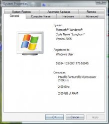
Picture 8: Same damn System Properties window, just looks a tad nicer. I still hate that two-layer tabbed look. The progress bars in the background are nice, but they sure have a, er, ah, OS X look.

Picture 10: Okay, now I've revised my opinion on the translucent windows. What's the point of making the FRONT window transparent? To confuse you???

Overall, it's just about what I expected: a clumsy attempt to imitate OS X. It just goes to prove that they are incapable of doing anything other than copying other companies' stuff -- badly.

I didn't expect to be impressed, and I wasn't disappointed.
 
Proof that Windows was designed by nerds...

I know this is old, but can't they kill the recycle bucket? YES, we realize that we are simply recycling disk space, but do these people not understand the concept of METAPHOR? You toss things in there to get RID of them...

Of course, a toilet metaphor would be more apt since everything sits in the bowl until you flush it. Maybe in OassX...
 

michaelrjohnson

macrumors 68020
Aug 9, 2000
2,180
5
53132
jayscheuerle said:
I know this is old, but can't they kill the recycle bucket? YES, we realize that we are simply recycling disk space, but do these people not understand the concept of METAPHOR? You toss things in there to get RID of them...
I'm fairly certain they're stuck with it because Apple has most likely copywritten "Trash".
 

rockdog

macrumors member
Jul 11, 2005
68
0
N Idaho
It seems like the Longhorn experience will be very similar to XP. But it occurs to me that the reason probably isn't because Microsoft wouldn't like to do something radically different, if not better, than its previous GUIs. Heck, if I am tired of the windows toolbar, icons, ect., then at least some of the windows developers have to be as well I would hope.
The problem is the amount of users that have become accustom to the status quo of the windows GUI. If MS changes the GUI too much, half their userbase wouldn't be able to find their 'My Pictures' folder, which might possibly lead to some sort of chaos. :eek:
 

Hemingray

macrumors 68030
Jan 9, 2002
2,926
37
Ha ha haaa!
raggedjimmi said:
to be frank that does look like somebody took XP and splashed a new theme over it. i know its real, but it looks baaad. M$? no thanks :)


My thoughts exactly. A candy bar wrapper with a dog turd inside. :rolleyes:
 
zap2 said:
it looks like a new theme for XP, MS needs to do what apple did from OS9 to OSX, really change it up.

If you think of OSX as not an evolutionary step from OS9, but as one from NextSTEP (it's direct predecessor), then it's not as great as a leap except in terms of eye candy.

All Microsoft really needs to do is stop the onslaught of bad press over viruses and security issues. If people hear that Longhorn has the type of security features that Windows SHOULD have had in the first place, they'll be happy to buy it regardless of what it looks like. If it can be shown that running Longhorn is less of a pain in the arse than XP is, then the majority of PC users will rejoice. Very few of the people that have dumped Windows in favor of OSX have done so because of eye candy alone. The eye candy is a lot of fun, but THAT can be achieved with skins to a high degree anyhow.

It does look like a shameless rip-off of Tiger's shiny plastic look, but since 99% of Windows users will never have seen Tiger, it doesn't really matter. Remember, they still think that Bill Gates invented the internet and the iPod... :rolleyes:
 
Register on MacRumors! This sidebar will go away, and you'll see fewer ads.