Become a MacRumors Supporter for $50/year with no ads, ability to filter front page stories, and private forums.
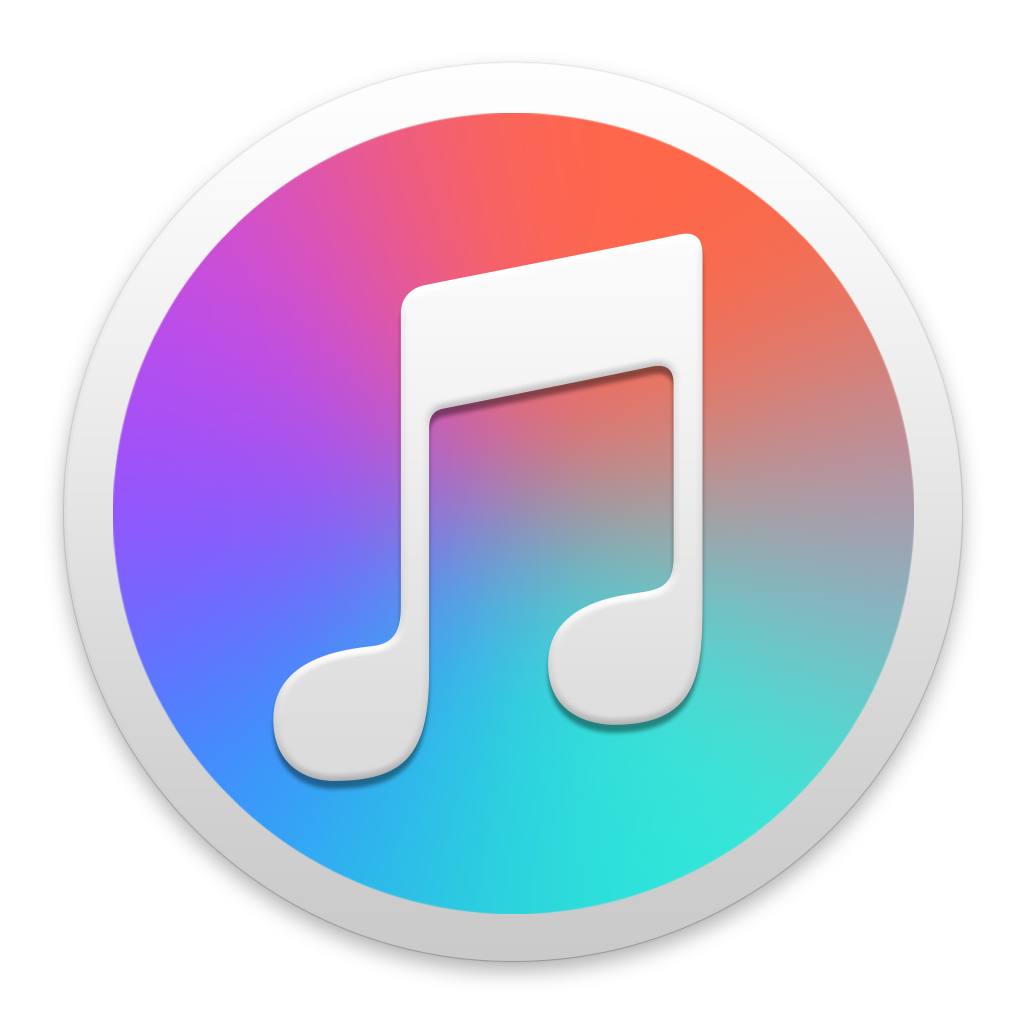
So that new music icon...
- Thread starter kmj2318
- Start date
- Sort by reaction score
You are using an out of date browser. It may not display this or other websites correctly.
You should upgrade or use an alternative browser.
You should upgrade or use an alternative browser.
Apple says iOS 8.4 will add apple music in final version, and iOS 9 will surely add it when it goes to final. Therefore I expect we will see new icons in the formal iOS 8.4 as well as the future upcoming beta.I'm confused by your post. I'm on iOS 9.0 Beta 1 and the music icon is the same. Are you implying they are going to change the icon in 8.4 and then change it again in 9?
I'm confused by your post. I'm on iOS 9.0 Beta 1 and the music icon is the same. Are you implying they are going to change the icon in 8.4 and then change it again in 9?
The icon will probably change with 8.4 GM. And the beta for iOS 9 that comes out around that time will probably get it to. There's no concept of changing it again.
Ha. Classic Steve.
'You're looking at it wrong.' Lol
Anyway, I agree. The old logo looked like it was better designed. The new Music icon just has too much white space. Then again, so does the iPad app so I guess it matches. It just doesn't look like a first party app from Apple. At least I can change the iTunes logo on my logo. As soon as it comes out its getting changed back to red. They have gotten really lazy with the icon designing lately. Just look at the Watch app and Activity app.
It's fugly. Just, just fugly.
I think the new icon would have been better if it were inverted. Having the colors on the outside and a bold white music logo in the middle seems like it could look very good. As well as removing 'just another white app'.

Post if you make it!
I think the new icon would have been better if it were inverted. Having the colors on the outside and a bold white music logo in the middle seems like it could look very good. As well as removing 'just another white app'.
It took me a bit understand what was going on with the gradient, and get something that looked right.

I think the results are ok. Not bad on a white background, but I don't think it would look so good on backgrounds of a different color. I think the gradient is very complex to have so much of it. Apple seems to go by a rule of thumb that when you have a gradient with wide differences in hues, use only a little bit. Like the OS X, iOS, and watchOS icons, are all small slivers of gradients on white. On other icons, gradients that fill up an entire icon do so using similar colors: light green to dark green, light orange to dark orange, sometimes blue goes to purple but that's as far as it goes. That is until I saw the new iTunes icon...
I tried to make what the new one might look like from the shots on apple.com, I'm not sure if I like it. Maybe I'll replace it with the current one to see what it's like after a few days.

I think something like this would be more successful. Sure it doesn't follow the same rules as the other round icons on OS X, but iTunes never follows the interface rules anyway.

Haha sorry for the huge images

In my point of view, I don't really mind which one is better. In fact, I think, if I want to choose one, I prefer the new one presented in WWDC 2015. Yes it looks quite different from its predecessor, but this shows a vibrant and colourful impression of music. Current one looks more mature, and I can easily distinguish it from many apps with similar functionality.It took me a bit understand what was going on with the gradient, and get something that looked right.
![gradmu_zpsvzragk6y.png]()
I think the results are ok. Not bad on a white background, but I don't think it would look so good on backgrounds of a different color. I think the gradient is very complex to have so much of it. Apple seems to go by a rule of thumb that when you have a gradient with wide differences in hues, use only a little bit. Like the OS X, iOS, and watchOS icons, are all small slivers of gradients on white. On other icons, gradients that fill up an entire icon do so using similar colors: light green to dark green, light orange to dark orange, sometimes blue goes to purple but that's as far as it goes. That is until I saw the new iTunes icon...
I tried to make what the new one might look like from the shots on apple.com, I'm not sure if I like it. Maybe I'll replace it with the current one to see what it's like after a few days.
![itunes_zpsgeexkrhw.jpg]()
I think something like this would be more successful. Sure it doesn't follow the same rules as the other round icons on OS X, but iTunes never follows the interface rules anyway.
![ituneslight_zpsu82gu9tg.jpg]()
Haha sorry for the huge images
I guess, Apple design this new icon, because they want to show everyone that music also has colour. It is not a simple rhyme. We listen to various types of music from various artists. We may or may not understand the meaning singers or singer teams conveyed to us, but we all love to listen to music. With the announcement of Apple music, apple think music lovers may find a brand new way enjoying what they love, wherever they live, and whenever they are.
I am afraid some sentences may be hard to understand. Sorry for this.
At first I liked the iOS version, but wasn't so keen on the OS X version, but the OS X version is growing on me.
Replacing icons on El Capitan is buggy right now, I couldn't get the icon to change.
Edit: got it to work. If anybody wants to try it out, here's the png.
![itunes_elcap_zps9rvboigv.png]()
I spent some time really trying to get it close to the one on apple.com. Here's the comparison of my dock and the official one. The new iTunes icon also has a thicker border than the other round icons. ¯\_(ツ)_/¯
![Untitled-1_zpsgh2gsmtn.jpg]()
Edit: got it to work. If anybody wants to try it out, here's the png.
I spent some time really trying to get it close to the one on apple.com. Here's the comparison of my dock and the official one. The new iTunes icon also has a thicker border than the other round icons. ¯\_(ツ)_/¯

Last edited:
More importantly. Who cares? It's an icon. First world problems at their peak.
Looks really similar! Excellent work!Replacing icons on El Capitan is buggy right now, I couldn't get the icon to change.
Edit: got it to work. If anybody wants to try it out, here's the png.
![itunes_elcap_zps9rvboigv.png]()
I spent some time really trying to get it close to the one on apple.com. Here's the comparison of my dock and the official one. The new iTunes icon also has a thicker border than the other round icons. ¯\_(ツ)_/¯
![Untitled-1_zpsgh2gsmtn.jpg]()
Looks terrible especially when taking into account how other apps look in iOS and OS X. It was always so simple and easy to notice:
red = music
blue = apps
orange = books
Now it reminds me of something Samsung would cook up.
red = music
blue = apps
orange = books
Now it reminds me of something Samsung would cook up.
It's not terrible on iOS, but the equivalent iTunes logo is horrid.
I disagree. The use of color seems gratuitous. Lacking purpose.The iTunes logo looks top notch in El Capitan.
And it's visually weak. It's like they couldn't agree on a dominant color, so they just used a bunch with a fade. A few more icons like that in the dock and they're going to be hard to tell apart.
Last edited:
Yep. I think that is what they will do because the new app isn't officially released yet.I'm confused by your post. I'm on iOS 9.0 Beta 1 and the music icon is the same. Are you implying they are going to change the icon in 8.4 and then change it again in 9?
Replacing icons on El Capitan is buggy right now, I couldn't get the icon to change.
Edit: got it to work. If anybody wants to try it out, here's the png.
I spent some time really trying to get it close to the one on apple.com. Here's the comparison of my dock and the official one. The new iTunes icon also has a thicker border than the other round icons. ¯\_(ツ)_/¯
Apple design is pretty un-unified right now. Hopefully they can unify it and fix some of the details. But seriously...they should at least change the App Store and iBook Store logos to fit the new iTunes one on OS X.
I disagree. I feel it has the same impact as the iOS music app. It's no longer just about your music. It's about choice, what you want to hear, and what you can have , instead of what you just do have. I also feel that there shouldn't be any apps similar to the iTunes app on OS X, since no other apps are like iTunes.I disagree. The use of color seems gratuitous. Lacking purpose.
And it's visually weak. It's like they couldn't agree on a dominant color, so they just used a bunch with a fade. A few more icons like that in the dock and they're going to be hard to tell apart.
I disagree. I feel it has the same impact as the iOS music app. It's no longer just about your music. It's about choice, what you want to hear, and what you can have , instead of what you just do have. I also feel that there shouldn't be any apps similar to the iTunes app on OS X, since no other apps are like iTunes.
So many of us wanted iTunes to be broken up but that'll probably not happen.
But your post gave me an idea. All those colors represent something. Red is music, purple is iTunes Store, bright blue/green is videos, etc. It makes a lot of sense. Sadly that idea breaks down because the music app has the same gradient. Would be nice for iTunes and Music to be more differentiated, this would have been a good chance. Leave the Music app red and it would have been clear why the iTunes icon is multicolor.
Register on MacRumors! This sidebar will go away, and you'll see fewer ads.