Got a tip for us?
Let us know
Become a MacRumors Supporter for $50/year with no ads, ability to filter front page stories, and private forums.
Sophisticated/Elegant Font Types?
- Thread starter bluetooth
- Start date
- Sort by reaction score
You are using an out of date browser. It may not display this or other websites correctly.
You should upgrade or use an alternative browser.
You should upgrade or use an alternative browser.
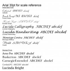
Made a quick image up with some of the ones I would class as more elegant.
Some are the more standard type fonts but focused more on the handwritten/scripty ones as you mentioned formal invite (I always associate handwritten style with invites for some reason - doesn't have to be obviously but you get the idea") ).
).
EDIT: changed sample size to save bandwidth
Some are the more standard type fonts but focused more on the handwritten/scripty ones as you mentioned formal invite (I always associate handwritten style with invites for some reason - doesn't have to be obviously but you get the idea
).EDIT: changed sample size to save bandwidth
Attachments
I consider Lucida Grande and Handwriting to both be tacky.
Depends on what you mean by elegant. Almost any font can be elegant of the typography is done properly.
As for formal invites, I'd imagine more serif fonts but not necessarily too fancy handwriting fonts unles you're making up a wedding invite and you're only inviting 1/2 the people to be polite. So use an ornate cursive font to discourage them from coming.
Any font can be tacky, its how its used which makes it look good or bad.I consider Lucida Grande and Handwriting to both be tacky.
hey - thanks a lot for the feedback guys. I have attached a few more that I found on a couple fonts sites...I actually kind of like the Edwardian script that weblogik suggested. Haven't found the Felix Tilting yet though...
I think the others may be a little over the top now that I look at them next to each other, it's not a wedding, but going to be more of a formal dinner/banquet etc.
![]()
I think the others may be a little over the top now that I look at them next to each other, it's not a wedding, but going to be more of a formal dinner/banquet etc.

Any font can be tacky, its how its used which makes it look good or bad.
Garamond Narrow on a leading of 2x point size.
This was Apple's font of choice for years, and I can see why: quiet, classy and elegant. Remember that talent borrows and genius steals ... and then nick it.
Cheers!
Jim
Any font can be tacky, its how its used which makes it look good or bad.
Right, I said "almost" any font. The problem with fonts like Lucida Handwriting is that so many people use them improperly that they are virtually tacky in my opinion. Same with stuff like Comic Sans. In most cases, I think they just look more tacky than elegant.
Edwardian is nice. Depends on how formal of a dinner it is. For most things, I prefer a minimalist invite with a serif (non cursive) font.
For graduation, religious ceremony and rites of passage type things I guess I could see Edwardian.
Even I'll admit that maybe the ones I selected were a little over the top for a formal dinner
Check out the Bernhard font. A simple and elegant font designed by my grandfather. He sold it many years ago, so I don't get any royalties or anything
Blue Velvet said:Gill Sans Light
I like the way you're thinking.
I'd stay away from anything script based, (far too cliché).
Personally, I'd maybe consider a superlight, and a sans too. Something that is perhaps reminiscent of the modernist '20's (arguably the most sophisticated and achingly elegant of all the movements). Maybe something like Kabel Light, whilst I won't deny that it requires a degree of rigour to overcome it's inconsistencies, there is beauty to be found in that inconsistency.
The Q alone is a thing of beauty for example.
I'd stay away from anything script based, (far too cliché).
Too bad even professionals use them. My university graduation invites used fancy cursive fonts, which of course my parents weren't able to read.
But i think people have this feeling that if it's an important event or ceremony, they MUST use cursive fonts.
Gill Sans Light
Good call. The Gill Sans family is a definite stalwart ... if you told me I could only have three sans serif families, I reckon they'd be Helvetica, Gill Sans and Futura.
Cheers
Jim
Register on MacRumors! This sidebar will go away, and you'll see fewer ads.