Become a MacRumors Supporter for $50/year with no ads, ability to filter front page stories, and private forums.
Weekly Photo Contest (January 17-24)
- Thread starter GT41
- Start date
- Sort by reaction score
You are using an out of date browser. It may not display this or other websites correctly.
You should upgrade or use an alternative browser.
You should upgrade or use an alternative browser.

My first post...
Winter afternoon...
![jkwinchester1]()
OK, so that didn't work. Before I tried this I did a search ( actually many searches...'how to post', 'post pictures', 'pictures posting', etc, etc. on all forums I could think of ) but nothing telling me 'how to post your picture.
So I thought, well, I'll just open a new thread and see how it goes. Clicked on the 'insert image' icon an it asked for a http link. So I uploaded the image to my .mac gallery and included the link. That is the little blue box with the 'question mark' inside it above.
So anyone got some suggestions? There are lots of folks posting photos so I know it CAN be DONE...Just not by newbies like me :-(
Jim
Winter afternoon...
OK, so that didn't work. Before I tried this I did a search ( actually many searches...'how to post', 'post pictures', 'pictures posting', etc, etc. on all forums I could think of ) but nothing telling me 'how to post your picture.
So I thought, well, I'll just open a new thread and see how it goes. Clicked on the 'insert image' icon an it asked for a http link. So I uploaded the image to my .mac gallery and included the link. That is the little blue box with the 'question mark' inside it above.
So anyone got some suggestions? There are lots of folks posting photos so I know it CAN be DONE...Just not by newbies like me :-(
Jim
So anyone got some suggestions? There are lots of folks posting photos so I know it CAN be DONE...Just not by newbies like me :-(
Jim
http://gallery.me.com/jkwinchester1/100208/IMG_0175/web.jpg
paste this instead.
Winter afternoon...
![jkwinchester1]()
OK, so that didn't work. Before I tried this I did a search ( actually many searches...'how to post', 'post pictures', 'pictures posting', etc, etc. on all forums I could think of ) but nothing telling me 'how to post your picture.
So I thought, well, I'll just open a new thread and see how it goes. Clicked on the 'insert image' icon an it asked for a http link. So I uploaded the image to my .mac gallery and included the link. That is the little blue box with the 'question mark' inside it above.
So anyone got some suggestions? There are lots of folks posting photos so I know it CAN be DONE...Just not by newbies like me :-(
Jim
The problem might be that the link you posted is not an image url (doesn't end with .jpg or .png or what have you). It looks as though you're trying to post to an image of trees in a snowy landscape, which would be http://gallery.me.com/jkwinchester1/100208/IMG_0175/web.jpg. Use that URL instead of http://gallery.me.com/jkwinchester1#100208
OK, here goes again...
Now I'm wishing I had a really smashing image to blow everyone away ( ego, ego, ) instead of my little reminder of this afternoons x-country ski.
However we all start somewhere and its the fact that I now know 'how' to post the pictures and also the fact that I gathered up the courage to do it...considering the absolutly outstanding images that are regularly put up for critique, that I'm happy about .
thanks, Jim
![web.jpg]()
Now I'm wishing I had a really smashing image to blow everyone away
( ego, ego, ) instead of my little reminder of this afternoons x-country ski.However we all start somewhere and its the fact that I now know 'how' to post the pictures and also the fact that I gathered up the courage to do it...considering the absolutly outstanding images that are regularly put up for critique
, that I'm happy about .thanks, Jim


Home!
Nice to see a fellow Newfoundlander taking snaps! Where was this shot taken ?
This photo is from an abandoned community in Newfoundland that was part of the 60's era resettlement program. Amazing that it was still standing while everything else had collapsed. Took this with point and shoot sony cybershot!
Nice to see a fellow Newfoundlander taking snaps! Where was this shot taken ?


Old paper mill, Oregon
Old industry at Willamette Falls, on the Willamette River between Oregon City and West Linn, Oregon. Part of a photographic series about the area. (35 mm B/W film, scanned from print.)
![willamette%20falls%20panorama.jpg]()
Old industry at Willamette Falls, on the Willamette River between Oregon City and West Linn, Oregon. Part of a photographic series about the area. (35 mm B/W film, scanned from print.)


OK... the contest is over. Thanks for all the submissions. I will have my comments and a decision on the winner in the morning. I am a bit too tired to be able to judge competently at this time.
Winner Announced.
Hi All,
Thanks for posting pictures this week. I liked the diversity of the photos submitted as it covered a wide range of what might be "Historic". Though I'm not a professional by any means I'll try to add a few comments to each of the photographs with my reasons for why I liked or disliked them.
shady825: I liked the concept, it really made me feel like I was in a western. My complaint would be that the whole town is in focus behind the carriage and that is a bit distracting. Also the lighting on the driver is a bit dark and it takes away from the carriage (which is in my mind the main subject of the photo).
anubis: I love the ornate altars of old churches and this one looks very detailed and nice. I wish you would have centered the photo and not had the distractive moulding in the forground. Also it would have been nice to capture the altar as a whole instead of the roof, as it would have completed the whole scene. I figure you were using the column as support however which explains your position.
DaveOZ: Indeed a very historic site. I like the mix of every day life next to the old here. I wish the building on the right didn't cut off part of the Pantheon. Too bad there was a such a range of light from the sky to the people's faces in the street that you got a bit of blow out.
LittleCanonKid: I appreciate the submission however I think you tried to convince yourself that this really fit the category rather than picking a picture that truly reflected "History". Technically I wish that you used a higher f-stop and got more of the picture in sharp focus or used a slower shutter speed to give the water some dynamics.
IndyDenny: I'm a bit conflicted with your photo. It is what it says "an aquaduct"... and I like the ocean in the background. The colours are really great in my mind. I think what sorta puts me off though is that there is no point of interest, my eyes just keep wandering around the image rather than being drawn to any specific point.
NintendoChick: I think you've posted this in Pictures of the Day thread before and I really liked it. This to me shows human history vs the historic earth. I find the sky has a bit odd a colour, I wish it was more blue and less cyan.
dukeblue91: Not sure where or what this is but it shows history as well as decay. I like the somewhat faded colours though to may there may be a bit too much greenery around. The burnt out overcast sky is also a bit distracting.
jodelli: I can't tell what your subject is. There are lots of items in the background but none of them really attract my attention. And the railing in the forground is too dark in my opinion to be the subject. I think this photo could have used a bit more thought in composition to make it clear what you were seeing.
volvoben: Love the concept and the "title" if you want to call it that. The subject is close to my heart as I am a design engineer for refineries. I wish the fence wasn't in the photo, but that is a requirement... Also the sky dominates this picture a bit too much for my liking, so much so that it draws my attention away from the ground every time I look at it.
Keebler: I think you are right, this photo could have benefited lots from an SLR as you could have picked a narrower depth of field and really caught one's attention with the horseshoes. Also I would have teken the time to get rid of that little pine branch which cuts away the view of the horseshoes.
MaddMacs: I love both the sky with the clouds and nice blues going off to infinity as well as the foreground of the ground with sparse greenery. However I don't know about the middle of the picture. The rocks on the right attract my attention but it doesn't say anything to me. The house in the middle is a bit too far. I think both these subjects with the sky could make fantastic photos, but the two together just doesn't do it for me.
johnnytraveler: I like the horses going off into the background, however I'd like more context (show the vast scale of this great chinese project)... Also I would have made sure to capture the bottom lip of the first horse.
AlaskaMoose: I always appreciate your pictures, they tend to be very stunning and you live in a very interesting part of the world, however I don't think this photo really shows history. Technically I think the sky could use a slight bit of brightening IMHO.
raxafarian: I really like this old lighthouse. The exposure seems very good and I like that there is some texture in the sky with that one cloud. Also the kinda off colour gives the picture an extra old feeling. The one thing I don't really like is the first band of brightly lit rocks followed by a band of dark. I don't know what happened there but it throws me off a bit.
dan.mac: Definitely old, but it doesn't do it for me. I think if you would have zoomed into the back section it would have made for a more interesting picture. Also your flash added too much light to the foreground.
luOs3r322: I'm gonna assume this is the great wall. I like the haze and the hills in the background, but the wall itself seems to cut across the picture in a very odd way. I lose my bearings for what is level. Also to me the greenery is too dark in the foreground. It took me a long time to realize you can see the wall off in the distance in the bottom right hand side of the image... this is a great feature that would have been better suited in a location that draws the eye.
ftaok: I like the colour and the focus on the hill. I think you got a great perspective, but it doesn't feel historic or old to me. Also I think you could have tried to do a bit of work to bring the sky out more when converting to black and white, but that's just me... I hate the dull grey sky look in B&W photos.
Lord Blackadder: Neat immage. I like the cascading water and the bridge is of very interesting design. I think you really got the lighting right too the the mid-afternoon sun were you get shadows and the water glistens. I would have tried to avoid the tree in the left and top right of the photo.
cosmokanga2: I love the composition of 99.9% of this photo. The one thing that bugs me is the way the top of the window is cut funny. The face is brilliant and the flowers give it a great mix of colour and dark. Complaint... I don't think of this as History.
Chokladkakan: I think this image is too dark and the table leg really distracts me. I can see how it might remind you of your younger days but its not History to me because its a capture of that time with nothing showing its age unless its put next to the image of the person now.
ClassicFan: I think this is classic history however its not a photo which comes across as being anything more than a snapshot unfortunately. I feel slightly tilted to the left and the feet of the Sphinx are cut off. I think you should have tried a totally different angle at this to get away from a rather cliché image.
Iluisitu: I like the mix of the new and the old as well as the night lighting, however I would have worked on getting the dome fully into the picture.
TheCodfather: I too am amazed that this is still standing. It captures what I was imagining, however to me the sky is a bit too blown out and the house dominates the photo not giving it context of the settlement that once stood here.
lucarelli: Love the concept with the old monk. Also your background and sky are stunning in my opinion. I would love to have seen the entire top of the gate included in the image. Also I am not an HDR fan, but that is a personal choice.
jakfrost: I'm glad you figured out how to post, but this picture does not seem to indicate any sense of History. I do like the shadows of the trees and the look into a winter forest however the sun is too bright and takes away from the photo. I would have blocked the sun or cropped the photo just below the sun.
ipodtouher: I think this image is cropped wrong. You have cut off the guards hands, the bottom of the stand and the top frame of the tomb. I think the concept is good with the picture moving from left to right as it comes forward, but more detail on the tomb's inscription would have been nice.
endingstart: I'll have to wander down to the lake shore and see this building as it looks to have some interesting construction, however to me this is not very historic despite the B&W and the older structure. Also the tree really grabs my attention against the sky and I really want to ignore the corner of the building all together.
apearlman: Great location. I really get a sense that this was once a grand civilized location which has decayed over time. I might have cropped a bit off of the left side as the last jag in the wall makes me wand to know why the wall jumped out like that. Also seeing the full beam on the top would have really given closure to the size of the building. Well done though.
Owen Hyatt: Cute. I see this as a great idea but again the cropping isn't great. I would have removed the desk or whatever that is out of the background and just focused on the car. Also the back left corner of the car is not as sharp as I would have liked. In any case a very creative way of showing history.
pdxflint: Your scan turned out very well. I like the faded colour and the sense of motion in the picture with the river. However for some reason here too I have a hard time finding focus with my eyes. I don't know whether to look at the mill, the logs in the water, the water fall in the left or even the tree in the bottom left corner. I think this image could have used a greater focus on any one aspect of the area.
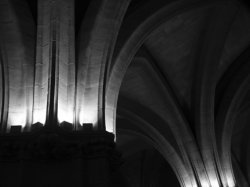
PeteB: Nice dark hallway. The light coming in on the side doesn't really show direction, it looks a bit distracting, though it makes for a dark/light/dark composition which gives a good sense of depth. I think the dark parts could be a bit lighter to give more of the texture on the roof especially in the foreground.
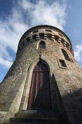
dewailang: The angle is very unfortunate as the whole building is leaning back, I know this is always a problem photographing up at tall buildings. Also you caught a time of day when the sun created an evil shadow right across the door of the tower, which takes away from the otherwise beautiful door.
AlexH: Nice shed which has seen better days. Again here a fence interferes with the image and there seems to be too much HDR-ing for my liking. Also the greens are a bit faded in what I think is an attempt at aging the photo however I don't think it is warranted here.
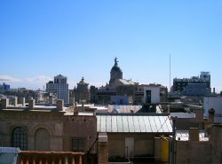
remmy I think the photo is distracting with too many roof tops and not enough of anything to really come across as a clear subject. Especially the roof in the foreground is distracting as it is reflecting light making it too bright for the rest of the photo.
Fuzzy14: The title says it all. I would have been nice had the engineer been looking towards the photo or if there was a bit of the kid's profile to see his eyes looking intently back. I also like the creative use of the colour and B&W. Well done.
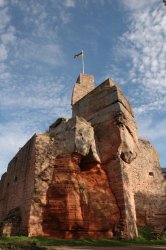
CK Williams That is a neat mix of natural features and a castle built into it. The rock also has a very nice colour. I think the shadow of the trees takes a bit away from this. I think had you moved back you would have captured a bit more stunning view of the castle not so much of the natural feature.
hudsora: I feel like the sky is a bit blown out and the trees obstruct the writing to the point where it is very difficult to see exactly what the picture is of. The concept is neat, but the execution just doesn't do it for me.
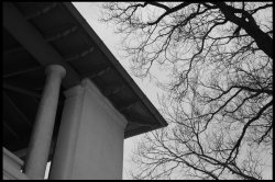
JDDavis: I like the column but I wish there was a bit more to them. The picture is a bit dark for my liking.
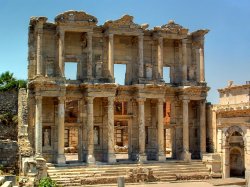
Chappers The library at Ephesus is truly a great world wonder. I think you captured this very nicely. The colours are great and the detail is enough to show you what was at one point the greatest collection of information in the world. I would have found a way to get the column at the bottom center to not be in the photo but overall very nice.
Nicholie: This captures rust and age beautifully. The place looks unkept and in the midst of deteriorating. I think I would have focused more on the bike and the floor boards as the barrel and lattice in the left quarter of the picture are a bit too much of a distraction and a bit too well kept for the History value in the rest of the image.
Lots of great submissions and hopefully I have made some suggestions to everyone. Please feel free to comment back if you totally disagree with any of my comments, as I said I'm not a professional but I am picky.
So this weeks winner is... raxafarian... I really liked the dark old film look of the image and it was really simple old-world light house showing its sign of age. I liked the mix of old and old looking photo technique as a mix of both the subject and the style.
Honorable mentions in alpha order to: Chappers' Ephesus, DaveOZ's Pantheon, NintendoChick's truck in the Sierras, and volvoben's American Industry.
I look forward to raxafarian's topic for next week.
Hi All,
Thanks for posting pictures this week. I liked the diversity of the photos submitted as it covered a wide range of what might be "Historic". Though I'm not a professional by any means I'll try to add a few comments to each of the photographs with my reasons for why I liked or disliked them.
shady825: I liked the concept, it really made me feel like I was in a western. My complaint would be that the whole town is in focus behind the carriage and that is a bit distracting. Also the lighting on the driver is a bit dark and it takes away from the carriage (which is in my mind the main subject of the photo).
anubis: I love the ornate altars of old churches and this one looks very detailed and nice. I wish you would have centered the photo and not had the distractive moulding in the forground. Also it would have been nice to capture the altar as a whole instead of the roof, as it would have completed the whole scene. I figure you were using the column as support however which explains your position.
DaveOZ: Indeed a very historic site. I like the mix of every day life next to the old here. I wish the building on the right didn't cut off part of the Pantheon. Too bad there was a such a range of light from the sky to the people's faces in the street that you got a bit of blow out.
LittleCanonKid: I appreciate the submission however I think you tried to convince yourself that this really fit the category rather than picking a picture that truly reflected "History". Technically I wish that you used a higher f-stop and got more of the picture in sharp focus or used a slower shutter speed to give the water some dynamics.
IndyDenny: I'm a bit conflicted with your photo. It is what it says "an aquaduct"... and I like the ocean in the background. The colours are really great in my mind. I think what sorta puts me off though is that there is no point of interest, my eyes just keep wandering around the image rather than being drawn to any specific point.
NintendoChick: I think you've posted this in Pictures of the Day thread before and I really liked it. This to me shows human history vs the historic earth. I find the sky has a bit odd a colour, I wish it was more blue and less cyan.
dukeblue91: Not sure where or what this is but it shows history as well as decay. I like the somewhat faded colours though to may there may be a bit too much greenery around. The burnt out overcast sky is also a bit distracting.
jodelli: I can't tell what your subject is. There are lots of items in the background but none of them really attract my attention. And the railing in the forground is too dark in my opinion to be the subject. I think this photo could have used a bit more thought in composition to make it clear what you were seeing.
volvoben: Love the concept and the "title" if you want to call it that. The subject is close to my heart as I am a design engineer for refineries. I wish the fence wasn't in the photo, but that is a requirement
... Also the sky dominates this picture a bit too much for my liking, so much so that it draws my attention away from the ground every time I look at it.Keebler: I think you are right, this photo could have benefited lots from an SLR as you could have picked a narrower depth of field and really caught one's attention with the horseshoes. Also I would have teken the time to get rid of that little pine branch which cuts away the view of the horseshoes.
MaddMacs: I love both the sky with the clouds and nice blues going off to infinity as well as the foreground of the ground with sparse greenery. However I don't know about the middle of the picture. The rocks on the right attract my attention but it doesn't say anything to me. The house in the middle is a bit too far. I think both these subjects with the sky could make fantastic photos, but the two together just doesn't do it for me.
johnnytraveler: I like the horses going off into the background, however I'd like more context (show the vast scale of this great chinese project)... Also I would have made sure to capture the bottom lip of the first horse.
AlaskaMoose: I always appreciate your pictures, they tend to be very stunning and you live in a very interesting part of the world, however I don't think this photo really shows history. Technically I think the sky could use a slight bit of brightening IMHO.
raxafarian: I really like this old lighthouse. The exposure seems very good and I like that there is some texture in the sky with that one cloud. Also the kinda off colour gives the picture an extra old feeling. The one thing I don't really like is the first band of brightly lit rocks followed by a band of dark. I don't know what happened there but it throws me off a bit.
dan.mac: Definitely old, but it doesn't do it for me. I think if you would have zoomed into the back section it would have made for a more interesting picture. Also your flash added too much light to the foreground.
luOs3r322: I'm gonna assume this is the great wall. I like the haze and the hills in the background, but the wall itself seems to cut across the picture in a very odd way. I lose my bearings for what is level. Also to me the greenery is too dark in the foreground. It took me a long time to realize you can see the wall off in the distance in the bottom right hand side of the image... this is a great feature that would have been better suited in a location that draws the eye.
ftaok: I like the colour and the focus on the hill. I think you got a great perspective, but it doesn't feel historic or old to me. Also I think you could have tried to do a bit of work to bring the sky out more when converting to black and white, but that's just me... I hate the dull grey sky look in B&W photos.
Lord Blackadder: Neat immage. I like the cascading water and the bridge is of very interesting design. I think you really got the lighting right too the the mid-afternoon sun were you get shadows and the water glistens. I would have tried to avoid the tree in the left and top right of the photo.
cosmokanga2: I love the composition of 99.9% of this photo. The one thing that bugs me is the way the top of the window is cut funny. The face is brilliant and the flowers give it a great mix of colour and dark. Complaint... I don't think of this as History.
Chokladkakan: I think this image is too dark and the table leg really distracts me. I can see how it might remind you of your younger days but its not History to me because its a capture of that time with nothing showing its age unless its put next to the image of the person now.
ClassicFan: I think this is classic history however its not a photo which comes across as being anything more than a snapshot unfortunately. I feel slightly tilted to the left and the feet of the Sphinx are cut off. I think you should have tried a totally different angle at this to get away from a rather cliché image.
Iluisitu: I like the mix of the new and the old as well as the night lighting, however I would have worked on getting the dome fully into the picture.
TheCodfather: I too am amazed that this is still standing. It captures what I was imagining, however to me the sky is a bit too blown out and the house dominates the photo not giving it context of the settlement that once stood here.
lucarelli: Love the concept with the old monk. Also your background and sky are stunning in my opinion. I would love to have seen the entire top of the gate included in the image. Also I am not an HDR fan, but that is a personal choice.
jakfrost: I'm glad you figured out how to post, but this picture does not seem to indicate any sense of History. I do like the shadows of the trees and the look into a winter forest however the sun is too bright and takes away from the photo. I would have blocked the sun or cropped the photo just below the sun.
ipodtouher: I think this image is cropped wrong. You have cut off the guards hands, the bottom of the stand and the top frame of the tomb. I think the concept is good with the picture moving from left to right as it comes forward, but more detail on the tomb's inscription would have been nice.
endingstart: I'll have to wander down to the lake shore and see this building as it looks to have some interesting construction, however to me this is not very historic despite the B&W and the older structure. Also the tree really grabs my attention against the sky and I really want to ignore the corner of the building all together.
apearlman: Great location. I really get a sense that this was once a grand civilized location which has decayed over time. I might have cropped a bit off of the left side as the last jag in the wall makes me wand to know why the wall jumped out like that. Also seeing the full beam on the top would have really given closure to the size of the building. Well done though.
Owen Hyatt: Cute. I see this as a great idea but again the cropping isn't great. I would have removed the desk or whatever that is out of the background and just focused on the car. Also the back left corner of the car is not as sharp as I would have liked. In any case a very creative way of showing history.
pdxflint: Your scan turned out very well. I like the faded colour and the sense of motion in the picture with the river. However for some reason here too I have a hard time finding focus with my eyes. I don't know whether to look at the mill, the logs in the water, the water fall in the left or even the tree in the bottom left corner. I think this image could have used a greater focus on any one aspect of the area.
PeteB: Nice dark hallway. The light coming in on the side doesn't really show direction, it looks a bit distracting, though it makes for a dark/light/dark composition which gives a good sense of depth. I think the dark parts could be a bit lighter to give more of the texture on the roof especially in the foreground.
dewailang: The angle is very unfortunate as the whole building is leaning back, I know this is always a problem photographing up at tall buildings. Also you caught a time of day when the sun created an evil shadow right across the door of the tower, which takes away from the otherwise beautiful door.
AlexH: Nice shed which has seen better days. Again here a fence interferes with the image and there seems to be too much HDR-ing for my liking. Also the greens are a bit faded in what I think is an attempt at aging the photo however I don't think it is warranted here.
remmy I think the photo is distracting with too many roof tops and not enough of anything to really come across as a clear subject. Especially the roof in the foreground is distracting as it is reflecting light making it too bright for the rest of the photo.
Fuzzy14: The title says it all. I would have been nice had the engineer been looking towards the photo or if there was a bit of the kid's profile to see his eyes looking intently back. I also like the creative use of the colour and B&W. Well done.
CK Williams That is a neat mix of natural features and a castle built into it. The rock also has a very nice colour. I think the shadow of the trees takes a bit away from this. I think had you moved back you would have captured a bit more stunning view of the castle not so much of the natural feature.
hudsora: I feel like the sky is a bit blown out and the trees obstruct the writing to the point where it is very difficult to see exactly what the picture is of. The concept is neat, but the execution just doesn't do it for me.
JDDavis: I like the column but I wish there was a bit more to them. The picture is a bit dark for my liking.
Chappers The library at Ephesus is truly a great world wonder. I think you captured this very nicely. The colours are great and the detail is enough to show you what was at one point the greatest collection of information in the world. I would have found a way to get the column at the bottom center to not be in the photo but overall very nice.
Nicholie: This captures rust and age beautifully. The place looks unkept and in the midst of deteriorating. I think I would have focused more on the bike and the floor boards as the barrel and lattice in the left quarter of the picture are a bit too much of a distraction and a bit too well kept for the History value in the rest of the image.
Lots of great submissions and hopefully I have made some suggestions to everyone. Please feel free to comment back if you totally disagree with any of my comments, as I said I'm not a professional but I am picky
.So this weeks winner is... raxafarian... I really liked the dark old film look of the image and it was really simple old-world light house showing its sign of age. I liked the mix of old and old looking photo technique as a mix of both the subject and the style.
Honorable mentions in alpha order to: Chappers' Ephesus, DaveOZ's Pantheon, NintendoChick's truck in the Sierras, and volvoben's American Industry.
I look forward to raxafarian's topic for next week.
nice job...
Thanks for commenting on all the shots. Great feedback, and congrats to the winner. Looking forward, also... to the next topic.
Thanks for commenting on all the shots. Great feedback, and congrats to the winner. Looking forward, also... to the next topic.
I'm glad you liked my photo. There were some great ones this week!
The picture is of the old Spelunk lighthouse on the island of Bonaire which is near Aruba. It was close to sunset giving a nice soft light. I used one of the presets in lightroom called antique greyscale to give it that old time look.
Here's the original pic and the contest pic below it:
![spelunk109orig.jpg]()
![spelunk109.jpg]()
The picture is of the old Spelunk lighthouse on the island of Bonaire which is near Aruba. It was close to sunset giving a nice soft light. I used one of the presets in lightroom called antique greyscale to give it that old time look.
Here's the original pic and the contest pic below it:


Register on MacRumors! This sidebar will go away, and you'll see fewer ads.