Become a MacRumors Supporter for $50/year with no ads, ability to filter front page stories, and private forums.

kmj2318

macrumors 68000
Original poster
Aug 22, 2007
1,669
712
Naples, FL
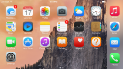
I'm starting a theme that makes iOS look a little bit more like OS X. Less extreme colors that match Yosemite, and a little bit more shading and shadows. Some of the changes are extremely subtle like the Maps icon.

I have 8.1.3 on my my phone so I can't jailbreak, but I figured I'd share it here. Most of the icons are made out of vector tracings that I collected from iOS, and applied a gradient and shadow to look like Yosemite. Others, like Settings, I used the icons from the Mac app and tweaked it a bit to fit in the icon.

yostheme_zps4fbxlyos.jpg
 
Last edited:
  • Like
Reactions: Feyl and silvertech

MacDevil7334

Contributor
Oct 15, 2011
2,527
5,717
Austin TX
Those are very nice! I have actually been working on something similar for the past few weeks. Only a few more icons to go! Like your set, many of my changes are subtle. But, it's amazing how far the extra shading and slight drop shadow go toward making these icons feel more "finished" than the default iOS 7/8 set.

attachment.php

attachment.php
 

Attachments

  • IMG_0280_alt.png
    IMG_0280_alt.png
    3.2 MB · Views: 3,600
  • IMG_0281.PNG
    IMG_0281.PNG
    278 KB · Views: 1,534
  • Like
Reactions: Feyl and silvertech

Menel

Suspended
Aug 4, 2011
6,351
1,356
Now ditch the rounded square icons.

Move to the more freeform of Yosemite e.g. iMovie star, Mail stamp, and all the others that are just round.
 

kmj2318

macrumors 68000
Original poster
Aug 22, 2007
1,669
712
Naples, FL
Those are very nice! I have actually been working on something similar for the past few weeks. Only a few more icons to go! Like your set, many of my changes are subtle. But, it's amazing how far the extra shading and slight drop shadow go toward making these icons feel more "finished" than the default iOS 7/8 set.

Image
Image

Nice! I'm unfamiliar with actually making an icon set that I can use. And since I'm on 8.1.3, I can't try it out. Is it difficult turning the images into a set?

----------

Now ditch the rounded square icons.

Move to the more freeform of Yosemite e.g. iMovie star, Mail stamp, and all the others that are just round.

Has this been done? I think it'd look really nice and wouldn't be difficult to design because you can just get the icons from the app package contents. I looked for an example of someone doing this, but haven't found anything.
 

three

Cancelled
Jan 22, 2008
1,484
1,225
What a difference, holy cow. The extra shading and slight drop shadow could probably be done with an iconOmatic theme of some sort I'd think. I'd love to see a released icon set of this at some point. It looks so much better than stock.
 

MacDevil7334

Contributor
Oct 15, 2011
2,527
5,717
Austin TX
What a difference, holy cow. The extra shading and slight drop shadow could probably be done with an iconOmatic theme of some sort I'd think. I'd love to see a released icon set of this at some point. It looks so much better than stock.

I just have a few more icons to render before I release the set. Hopefully I'll have them done this weekend.
 

three

Cancelled
Jan 22, 2008
1,484
1,225
I just have a few more icons to render before I release the set. Hopefully I'll have them done this weekend.

Awesome! I'm looking forward to them! I'll probably use 'em on my Android setup if that's okay with you. :D
 
Register on MacRumors! This sidebar will go away, and you'll see fewer ads.