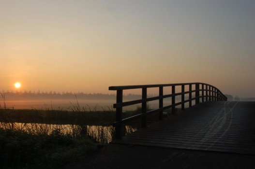
To me, a photo has to be pretty bad to consider it "not working." This image in no way doesn't work; it has a lot of interesting details. 🙂
That said, while the sun being in the middle doesn't really bother me, the horizon line being in the middle does. When you have the horizon right in the middle, the viewer gives equal weight to both halves and it's difficult to discern what the photographer deemed as important. For me personally, I like the bottom portion of this image because, while the colors in the sky are really pretty, there's nothing there to hold my attention. By contrast, there is a lot of stuff going on in the bottom of the frame.
And speaking of contrast, for me personally, I like more dynamic range. This is a highly personal opinion, and there will be others here who disagree with this and like the contrast as is. But I first saw this image on my phone, and I didn't realize there are little bridge structures and that the dark bit between the tidal pool (?) and lake (?) has details. The shadows are all blocked and I want to know what all that stuff is.
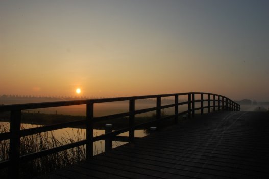
Here is a really quick play. I recropped it to move the horizon higher (and had to content aware some of the bottom bit to make up for it). I also tried to keep the same brightness levels for the sky and foreground water (but it might be slightly brighter overall), but added in some light to the areas that are mostly black in your original. A slight brighten and crop let the little bridge structure fall on the left ROT line, and the horizon line is pretty close to the upper ROT line. This gives the eye space to wander and rest as it looks through the frame. I was careful to try to keep with the original low light feel of this, and did not move it to bright any air, but now there is better separation of the grasses and ground area.
View attachment 2131229
forums.macrumors.com