Become a MacRumors Supporter for $50/year with no ads, ability to filter front page stories, and private forums.

Does yosemite looks good or not


  • Total voters
    43
  • Poll closed .

Tankmaze

macrumors 68000
Original poster
Mar 7, 2012
1,707
351
Hi,
Been reading the forum lately that seems a bit polarizing about yosemite, some thinks that its good but I assume they are using retina mac, or someone that thinks its ugly cause they are on non retina mac.

So I decided to create yet another poll regarding yosemite the options are :

Yosemite looks great, I use retina mac
Yosemite looks great, I use non-retina mac
Yosemite looks teribble, I use retina mac
Yosemite looks teribble, I use non-retina mac
I like cheese
 

tkermit

macrumors 68040
Feb 20, 2004
3,582
2,909
I think Yosemite overall looks pretty nice on non-Retina displays. I would imagine that it looks absolutely fantastic on Retina displays. Although readability might still be an issue in places.
 

grahamperrin

macrumors 601
Jun 8, 2007
4,942
648
I have a top-of-the-range notebook from 2009 with Mavericks, looking good.

Next week I expect to get a 15-inch MacBook Pro with Retina display and 512 GB PCIe-based Flash Storage (around £200 more costly than the default 256 GB). The purchase is timed to avoid a requirement for Yosemite; the model (MacBookPro11,2) was introduced in July.

Not quite top of the range – I'm not greedy with money that's not my own – but it's value for money. I expect the hardware to be good (with Mavericks, not with OS X 10.10) for at least six years.

From occasional use of pre-release Yosemite on the 17" at 1920 x 1200 pixels, I know that released 10.10 will look equally bad on the 15" at 2880 by 1800 pixels.

(For me, the overwhelming complaint about looks is not the suboptimal appearance of Helvetica Neue. My complaints focus on a change of design that Apple has bulldozed through with no known workaround.)

I'll get some cheese to go with my cider.
 

Tankmaze

macrumors 68000
Original poster
Mar 7, 2012
1,707
351
I think Yosemite overall looks pretty nice on non-Retina displays. I would imagine that it looks absolutely fantastic on Retina displays. Although readability might still be an issue in places.

Yup that's the thing, I assume yosemite is destined to look great on retina display with thin font and translucent background. I still haven't upgrade, but by the looks of it, non-retina mac would likely be a second class citizen.

----------

Not quite top of the range – I'm not greedy with money that's not my own – but it's value for money. I expect the hardware to be good (with Mavericks, not with OS X 10.10) for at least six years.

That's good for you, I think Mavericks could be the new Snow Leopard. With it's last "good design", and no known issues. Haven't have much trouble with mavericks, been using it since 10.9.0.
 

grahamperrin

macrumors 601
Jun 8, 2007
4,942
648
Questioning the assumption that the appearance of OS X 10.10 will be fine with Retina

… assume yosemite is destined to look great on retina …

It's a reasonable and popular assumption, but some of the post-release comments make that assumption increasingly questionable. Examples, from the 'terrible' topic:

https://forums.macrumors.com/showthread.php?p=20137719#post20137719

https://forums.macrumors.com/showthread.php?p=20140328#post20140328

In the same topic:

Apple's use of a Helvetica Neue, and top-of-the-range pre/non-Retina hardware: links
 

grahamperrin

macrumors 601
Jun 8, 2007
4,942
648
… (For me, the overwhelming complaint about looks is not the suboptimal appearance of Helvetica Neue. My complaints focus on a change of design that Apple has bulldozed through with no known workaround.)

I'll get some cheese to go with my cider.


Sorry, I should have been explicit about the focus of my complaints:
  • removal of the title bar from Safari.
(Maybe difficult to believe, considering the recent noise from me: I'm trying to not mention those words too often.)

To put things another way, verbosely, with reference to the subject line (and an emphasis from me) –

'do yosemite looks great or terrible because you use retina display or not'​

– from use on the MacBookPro5,2, I know that Yosemite will also look terrible to me on the most recent type of MacBook Pro with a Retina display; but that trouble with the appearance of OS X 10.10 is not because of the display.
 

Tankmaze

macrumors 68000
Original poster
Mar 7, 2012
1,707
351
I think Yosemite looks great on my rMBP, but it's a very subjective thing.

That's the thing, if you have the hardware (retina display) would yosemite look good to you. or if you don't have the hardware would you still think yosemite looks good ?

So even though it is very subjective, it is still an interesting poll and maybe we could make an objective assumption if enough people vote for it.
 

theSeb

macrumors 604
Aug 10, 2010
7,466
1,893
none
That's the thing, if you have the hardware (retina display) would yosemite look good to you. or if you don't have the hardware would you still think yosemite looks good ?

So even though it is very subjective, it is still an interesting poll and maybe we could make an objective assumption if enough people vote for it.

Well, I have just updated the nMP where I use a dual setup with "normal" monitors. I would say that it does not look as great as it does on the rMBP, but it still looks very nice. I am currently running a virtual machine in Yosemite, which is hosting Mavericks on a standard display, so the comparison between Yosemite and Mavericks is very obvious and I think Yosemite looks good.

It takes a couple of minutes or hours, but you soon forget about Mavericks.
 

Tankmaze

macrumors 68000
Original poster
Mar 7, 2012
1,707
351
Well, the general consensus seems to be that yosemite looks good no matter if you have retina or not. Case closed.
 

grahamperrin

macrumors 601
Jun 8, 2007
4,942
648
A quick roundup of some of the topics from before this poll began:
– there may be more, but I'll not request mergers.

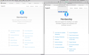
From a recent topic about the new Apple Developer Program:

A screenshot one of the forum pages – to the left, as Apple would like the content to be seen:


Vaguely reminiscent of the bright, low-contrast interface of Yosemite.

To the right, a third party fix that increases legibility. It's a broad fix, not targeted at Apple content, but I find it sad that Apple sets examples such as that to its developer community.

The thin font on the left looks much, much better on Retina. If anything, it's encouraging developers to optimize their content for Retina, which is a good thing :)

I don't know the percentage now but a few months ago, I was reliably informed that more than ninety percent of Mac users have non-Retina devices.

Developers should both (a) take a sane approach to designs that are optimised for the norm; and (b) be prepared for a future in which Retina-only environments are the norm. …

… the fonts on Apple's website do look good on both, just slightly more legible/crisp on Retina.

Hand on heart, I can't describe https://developer.apple.com/support/membership/ as looking good on a 17" MacBook Pro. On the same Mac, https://discussions.apple.com/community/tutorials looks much better than Apple's new approach.
 
  • Like
Reactions: ABC5S

redheeler

macrumors G3
Oct 17, 2014
8,423
8,845
Colorado, USA
Hand on heart, I can't describe https://developer.apple.com/support/membership/ as looking good on a 17" MacBook Pro. On the same Mac, https://discussions.apple.com/community/tutorials looks much better than Apple's new approach.
Let me take another look at this.
Font-Comparison.png

I agree the choice of using a light gray text color is a poor one, especially on non-Retina and non-IPS displays such as the one on my 2008 MacBook Air here. The darker gray used on most of the site looks much better.

In addition, it would be nice if font smoothing could be left enabled for non-Retina. This was a feature designed to increase legibility on LCD displays, and without it legibility is decreased.
Font-Smoothing.png

But with just the color change it looks fine on non-Retina, at least to me.
 
Last edited:

bobbie424242

macrumors 6502
May 16, 2015
352
629
Yosemite looks horrible on non-retina screens. Windows font rendering is so much better on such screens.
On retina screens, Yosemite is OK.
 

redheeler

macrumors G3
Oct 17, 2014
8,423
8,845
Colorado, USA
Last edited:
Register on MacRumors! This sidebar will go away, and you'll see fewer ads.