Got a tip for us?
Let us know
Become a MacRumors Supporter for $50/year with no ads, ability to filter front page stories, and private forums.
Yosemite looks terrible!
- Thread starter OldGuyTom
- Start date
- Sort by reaction score
You are using an out of date browser. It may not display this or other websites correctly.
You should upgrade or use an alternative browser.
You should upgrade or use an alternative browser.
- Status
- Not open for further replies.
Re:
As an Apple user since the 80's I'm torn on this. I love the additional features Yosemite has added as well as the system improvements and even some of the looks. But the rest of the looks I despise completely.
Then again I hate Jony Ive and his flat pastel looking garbage. I'm enjoying using Yosemite but I'm spending the weekend getting the icons back to older OS looks (the iTunes with the CD and the note, older trash can, older safari icon, etc). Along with working on trying to bring my beloved iOS 6 skeuomorphism back to other icons. I want my felt and paper back!
There is a whole science dedicated to making user interfaces that are easy to interact with. Depth greatly helps improve UI element recognition in humans. That isn't an opinion, it's a fact. Flattening everything out is bad for a UI. That is a fact.
We have to be careful though not to confuse our personal distaste with genuine UX concerns in order to elevate our opinions. Mavericks certainly had plenty of cosmetic elements that weren’t necessary for the UX either. Mavericks had more bevels on buttons and panels which are not as pronounced anymore in Yosemite, but they have been tackled differently though colour and shadows. Likewise many controls like radio buttons and checkboxes retain a certain depth and interactivity. I am actually very pleased with the window toolbars: the traffic lights are still characteristic and give hover responses and the buttons are still clearly demarcated. It’s not like the traffic lights were ever a UX hallmark anyway.
Flatness and user experience (UX)
I'll treat 'total flattening of a user interface' (a paraphrase) as undeniably bad in the context of OS X. From the accepted (and most popular) answer to What kind of design do users like the most at the time of this question, 'Flat' or 'Skeuomorphic'?:
User experience: some links
There is a whole science dedicated to making user interfaces that are easy to interact with. Depth greatly helps improve UI element recognition in humans. That isn't an opinion, it's a fact. Flattening everything out is bad for a UI. That is a fact.
I'll treat 'total flattening of a user interface' (a paraphrase) as undeniably bad in the context of OS X. From the accepted (and most popular) answer to What kind of design do users like the most at the time of this question, 'Flat' or 'Skeuomorphic'?:
Charles Wesley said:… the current trend is not an abandonment of moderate skeumorphism requiring a totally flat design. …
User experience: some links
could problems could be related to whether viewing on retina screen or regular screen
I wonder if the hate/love issues about the look of yosemite osx are related to whether viewing on retina screen or normal screen? I've heard that it looks strange, flat on regular monitor, but looks great on retina screen.
I wonder if the hate/love issues about the look of yosemite osx are related to whether viewing on retina screen or normal screen? I've heard that it looks strange, flat on regular monitor, but looks great on retina screen.
Apple's use of a Helvetica Neue, and top-of-the-range pre/non-Retina hardware: links
At great expense, I got the best possible notebook. Yosemite appears to give lowest-class treatment to that first-class Mac.
Helvetica Neue font on non retina displays
Is Yosemite optimised for retina?
blurry menus - Yosemites war on non retina -
What do you think of Lucida Grande + OS X Yosemite this poll is open; its discussion includes links to a workaround for what seems to be a troublesome decision by Apple.
viewing on retina screen or regular screen I wonder if the hate/love issues about the look of yosemite osx are related to whether viewing on retina
At great expense, I got the best possible notebook. Yosemite appears to give lowest-class treatment to that first-class Mac.
Helvetica Neue font on non retina displays
Is Yosemite optimised for retina?
blurry menus - Yosemites war on non retina -
What do you think of Lucida Grande + OS X Yosemite this poll is open; its discussion includes links to a workaround for what seems to be a troublesome decision by Apple.
While the translucency in Yosemite generally hasn't bothered me, after doing work in it for a few hours I'd have to say that making sidebar panels in every application translucent was a huge mistake. Finder windows are tolerable because the sidebars are small and generally used for quick tasks, but I've been coding in Xcode and the translucency in the file browser panel was making me nauseous. I finally had to check Accessibility's "Reduce transparency" option.
And that's a shame, because it's overkill. I'd just like the option to turn off translucency in applications, or at least flag specific apps whose sidebars should be opaque.
Frankly, from a UX point-of-view, I don't buy Apple's design intent for this feature that they wanted to convey depth and let content sift through. From Apple's Yosemite page, "And a translucent sidebar gives you a glimpse of what’s behind the active window." No one needs to 'glimpse' what's behind UI elements. They want to see the UI elements. It's an after-the-fact rationale and it's indefensible. I just think they thought the flat walls of grey interface elements were too spartan and cold, and wanting to make the interface feel warm and less industrial. But in doing so, they've made UI harder to read, cluttered, or in my case, nausea-inducing.
I love the look of Yosemite on my 2012 MacBook Air. Lion, Mountain Lion and even Mavericks looked old on this relatively low-res laptop. For some reason, Yosemite makes my "old" Air look a lot better. It's a lot cleaner. I especially like dark mode.
I've already made good use of the calculator widget. I'm looking for other great widgets to add.
I've already made good use of the calculator widget. I'm looking for other great widgets to add.
I've already made good use of the calculator widget
Why use a widget when you can calculate directly in Spotlight (via command + spacebar)?
Calculator widget seems pointless.
I wonder if the hate/love issues about the look of yosemite osx are related to whether viewing on retina screen or normal screen? I've heard that it looks strange, flat on regular monitor, but looks great on retina screen.
Nope. It looks like crap in the same way iOS 7 and iOS 8 look like crap. It's flat and pastelly. I keep my old 3GS around as a spare/backup phone. The look of the old iOS is so much better.... But then again I just spent the evening replacing the Yosemite icons and images back to the previous OSX looks and the skeuomorphic looks in the older OS's... They all look SO much better. Unfortunately I can't change the entire look to bring back the paper, leather, felt, pages, and all the rest. And it's too bad because other than looking terrible Yosemite is a fantastic OS. It just looks awful. If someone skinned it to make it look like the old I'd have that added the second after it came out.
A not entirely enjoyable new experience; avoiding the word 'modern'
Does Yosemite successfully convey an acceptably modern appearance to a broad range of users? …
") … still, Apple's use of the word modern puzzles me. There's more play with words below, but it's play with a serious edge.
… still, Apple's use of the word modern puzzles me. There's more play with words below, but it's play with a serious edge.
Not all app icons have a fresh, modern appearance
Visible:
Not visible in the screenshot below (and I don't understand HTML enough to quickly explain the invisibility of what's in that source code for the Design page):
If that is avoidance of the word modern, then I guess that (amongst other things) for Mac most users, what's in their Docks – maybe a minority of Apple apps, if the viewer selects then uses a few from the thousands available – is a potentially jarring mix of normality and novelty.
In the http://www.apple.com/osx/ area, I find only one use of the word modern visible without showing source code:
I see enough complaints for me to believe that the optimised version of Helvetica Neue is not as optimal for Macs as Lucida Grande, the essence of which is Lucida Sans Unicode c.1993.
Helvetica Neue: essentially less modern?
Whilst the optimisation for Yosemite may be modern, Helvetica Neue is not as modern as Lucida Grande. If the resources linked from Typography for Macs: a brief history are reliable, then the periods associated with Helvetica Neue (a.k.a. Neue Helvetica?) seem to be 1990, 1983 and 1956-58 … all three of which may fit a definition of modern, but all are pre-1993.
Personally, I shouldn't care whether a font fits a definition of modern. I care deeply about a font's fitness for purpose. With pre-release Yosemite on my well-specified Mac I found that parts of the UI were designed around use of an unfit font; some of those problem areas seem to be not improvable when a more legible font is preferred. For someone who uses a Mac as much as I do, that is a hideous development by Apple.
System fonts: a little context
iOS used first Helvetica then Helvetica Neue as its system font. All releases of Mac OS X prior to OS X Yosemite used Lucida Grande as the system font. The version of Helvetica Neue used as the system font in OS X 10.10 is specially optimised; Apple's intention is to provide a consistent experience for people who use both iOS and OS X.
Themes, skins, making good a mess
A keyword from Apple's revised HIG: masterly. I see enough post-release complaints for me to argue that Apple's idea of the ideal one-for-all theme is not masterly. There's an excess of mess about Apple's theme.
https://twitter.com/search?src=typd&q=Yosemite ugly
https://twitter.com/search?q=Yosemite awful
https://twitter.com/mgalicki/status/522825168519839744
More overtly potty-mouthed: https://twitter.com/_monibon_/status/523205942771716096
… and so on. I'm not counting but these levels of negativity – in response to a supposed Apple improvement for Macs – is surely unprecedented. The "more users now than in 2000" argument alone can not explain the high levels. Around the times of past upgrades to the OS, pre-release and in the days following release, I quietly but very closely observed public fora. (Detailed reasons for me doing so are off-topic; essentially it was to bring an experienced response to recognisably difficult or misinterpreted problems within my then areas of expertise.)
Observations on post-release reports about Yosemite: a predictable range of familiar problems, a sadly predictable range of complaints.
If that's how things such as stacks appear by default in the release of Yosemite, it's simply ridiculous.
Yesterday: at the Mac with Mavericks for more than a few hours. Pretty much round the clock and beyond. I don't recommend spending so much time at a computer, but doing so with Mavericks is painless for me.
A comparable attempt with Yosemite would be literally painful, and I'm not alone:
I accept that some users will enjoy Apple's blending of content with non-content. Very difficult to defend: the ways in which so-called 'vibrancy' (another area of contradiction in last weeks edition of the human interface guidelines) causes more difficulty than pleasure for many people.
On one hand, partly supporting a prediction that any alternative to Apple's 10.10 theme would mess up the user interface:
On the other hand, immediate rejection of Apple's skinning; a wish for it to not look like Apple's idea of good-looking:
Closing thoughts for this post
There's careless, and there's careless.
Questions such as this tickle me –
– but I can't criticise careless, carefree customers
We can criticise careless companies!
Within Apple: someone, or some group of people, has driven a ****-you theme bulldozer over and around a few basic requirements of some the company's most loyal customers. That, that is shameful. Driven without due care and attention. DUI, under the influence who of I don't know, but a collective virtual boot in the backside is timely and appropriate. A Yosemite car crash is not what I wanted for the thirtieth anniversary of the Mac.
Postscript, 2014-10-25
I found one Apple use of the word 'modern' in relation to the appearance.
Apple - Press Info - OS X Yosemite Available Today as a Free Upgrade (2014-10-16)
Does Yosemite successfully convey an acceptably modern appearance to a broad range of users? …
… Users wanted a modern look (they got it) … Sure, this list and my argumentation here is completely silly and one-sided, but so is yours.
… still, Apple's use of the word modern puzzles me. There's more play with words below, but it's play with a serious edge. Not all app icons have a fresh, modern appearance
Visible:
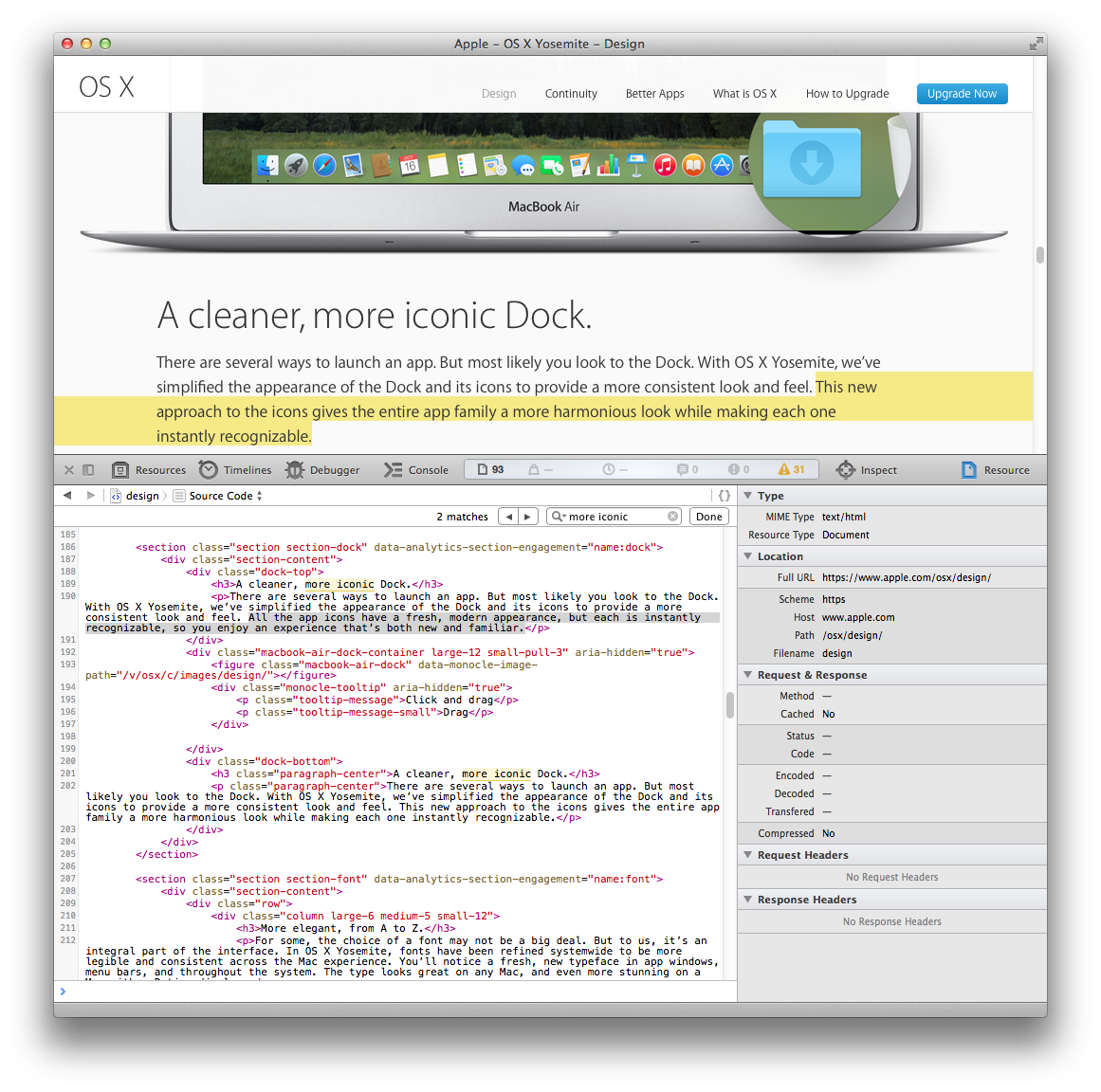
"This new approach to the icons gives the entire app family a more harmonious look while making each one instantly recognizable."
Not visible in the screenshot below (and I don't understand HTML enough to quickly explain the invisibility of what's in that source code for the Design page):
"All the app icons have a fresh, modern appearance, but each is instantly recognizable, so you enjoy an experience that’s both new and familiar."
If that is avoidance of the word modern, then I guess that (amongst other things) for Mac most users, what's in their Docks – maybe a minority of Apple apps, if the viewer selects then uses a few from the thousands available – is a potentially jarring mix of normality and novelty.
In the http://www.apple.com/osx/ area, I find only one use of the word modern visible without showing source code:
"… modern, easy-to-read font throughout the system …"
I see enough complaints for me to believe that the optimised version of Helvetica Neue is not as optimal for Macs as Lucida Grande, the essence of which is Lucida Sans Unicode c.1993.
Helvetica Neue: essentially less modern?
Whilst the optimisation for Yosemite may be modern, Helvetica Neue is not as modern as Lucida Grande. If the resources linked from Typography for Macs: a brief history are reliable, then the periods associated with Helvetica Neue (a.k.a. Neue Helvetica?) seem to be 1990, 1983 and 1956-58 … all three of which may fit a definition of modern, but all are pre-1993.
Personally, I shouldn't care whether a font fits a definition of modern. I care deeply about a font's fitness for purpose. With pre-release Yosemite on my well-specified Mac I found that parts of the UI were designed around use of an unfit font; some of those problem areas seem to be not improvable when a more legible font is preferred. For someone who uses a Mac as much as I do, that is a hideous development by Apple.
System fonts: a little context
iOS used first Helvetica then Helvetica Neue as its system font. All releases of Mac OS X prior to OS X Yosemite used Lucida Grande as the system font. The version of Helvetica Neue used as the system font in OS X 10.10 is specially optimised; Apple's intention is to provide a consistent experience for people who use both iOS and OS X.
– https://en.wikipedia.org/w/index.php?title=Helvetica&diff=630130642&oldid=629822678, with my emphasis
Themes, skins, making good a mess
OS X never had theme support and I doubt it will ever have. A big issue with themes is that they mess up UI design …
A keyword from Apple's revised HIG: masterly. I see enough post-release complaints for me to argue that Apple's idea of the ideal one-for-all theme is not masterly. There's an excess of mess about Apple's theme.
https://twitter.com/search?src=typd&q=Yosemite ugly
https://twitter.com/search?q=Yosemite awful
https://twitter.com/mgalicki/status/522825168519839744
More overtly potty-mouthed: https://twitter.com/_monibon_/status/523205942771716096
… and so on. I'm not counting but these levels of negativity – in response to a supposed Apple improvement for Macs – is surely unprecedented. The "more users now than in 2000" argument alone can not explain the high levels. Around the times of past upgrades to the OS, pre-release and in the days following release, I quietly but very closely observed public fora. (Detailed reasons for me doing so are off-topic; essentially it was to bring an experienced response to recognisably difficult or misinterpreted problems within my then areas of expertise.)
Observations on post-release reports about Yosemite: a predictable range of familiar problems, a sadly predictable range of complaints.
Mavericks is legible … the Yosemite font fading and background makes it so much worse. … hurts my head by the end of the day.
… legibility. These examples express my complaint. In all the arguments about OS X, or OS 9 for that fact, I don't ever recall people complaining about poor typography on any Mac until Yosemite.
… Mavericks, Yosemite … No one can convince me Yosemite is easier to read. I think that lack of contrast and pixelation (if you look close) is what causes the eye strain complaints. …
If that's how things such as stacks appear by default in the release of Yosemite, it's simply ridiculous.
Yesterday: at the Mac with Mavericks for more than a few hours. Pretty much round the clock and beyond. I don't recommend spending so much time at a computer, but doing so with Mavericks is painless for me.
A comparable attempt with Yosemite would be literally painful, and I'm not alone:
… after doing work in it for a few hours I'd have to say that making sidebar panels in every application translucent was a huge mistake. … tolerable because the sidebars are small and generally used for quick tasks, but … translucency in the file browser panel was making me nauseous. … overkill. I'd just like the option to turn off translucency in applications, or at least flag specific apps whose sidebars should be opaque.
Frankly, from a UX point-of-view, I don't buy Apple's design intent for this feature that they wanted to convey depth and let content sift through. From Apple's Yosemite page, "And a translucent sidebar gives you a glimpse of what’s behind the active window." No one needs to 'glimpse' what's behind UI elements. They want to see the UI elements. It's an after-the-fact rationale and it's indefensible. … made UI harder to read, cluttered, or in my case, nausea-inducing.
I accept that some users will enjoy Apple's blending of content with non-content. Very difficult to defend: the ways in which so-called 'vibrancy' (another area of contradiction in last weeks edition of the human interface guidelines) causes more difficulty than pleasure for many people.
… A big issue with themes is that they mess up UI design and such design-conscious company as Apple is certainly averse to that. …
On one hand, partly supporting a prediction that any alternative to Apple's 10.10 theme would mess up the user interface:
OMG... Do Not download Yosemite.
It looks terrible, as soon as i saw it it reminded me of those skins i used to download when i was a kid to make my desktop and icons look cool, its seriously ugly.
Save Yourself's!!
On the other hand, immediate rejection of Apple's skinning; a wish for it to not look like Apple's idea of good-looking:
… a fantastic OS. It just looks awful. If someone skinned it to make it look like the old I'd have that added the second after it came out.
Closing thoughts for this post
… Given all the "beautiful" type postings for Yosemite that feature BACKGROUND PICTURES and NOT the GUI, I'm not even sure your average fan of Yosemite on here knows what a GUI is or why people don't care for the changes to begin with.
There's careless, and there's careless.
Questions such as this tickle me –
How does Yosemite look when you start using some of the apps that are in the Dock?
– but I can't criticise careless, carefree customers
We can criticise careless companies!
Within Apple: someone, or some group of people, has driven a ****-you theme bulldozer over and around a few basic requirements of some the company's most loyal customers. That, that is shameful. Driven without due care and attention. DUI, under the influence who of I don't know, but a collective virtual boot in the backside is timely and appropriate. A Yosemite car crash is not what I wanted for the thirtieth anniversary of the Mac.
Postscript, 2014-10-25
I found one Apple use of the word 'modern' in relation to the appearance.
Apple - Press Info - OS X Yosemite Available Today as a Free Upgrade (2014-10-16)
… fresh, modern look …
Attachments
Last edited:
Everyone is a critic!
It is free, you do not like it, just do not use it. Stop whining!
The problem with this philosophy is that simply not using it isn't going to be an option for certain people.
Eventually, Apple will do as they always have done, and require you to update to the latest version of their operating system (Yosemite) to continue using their development tools (to build for the latest version of iOS for instance). As an iOS developer myself, it is inevitable that at some stage I will be forced into upgrading.
Why use a widget when you can calculate directly in Spotlight (via command + spacebar)?
Calculator widget seems pointless.
Why use command + spacebar just to get to a calculator on the NC when I can just use a middle mouse button to trigger Dashboard, or just press F4...?
Steve Jobs: "Boom...! get the info I want from Dashboard... Boom, get out... Pretty simple..."
Has anyone remembered Steve's keynote back in early 2005...?
Right now Apple has just lost its way... Requiring users to get 2 or more actions just to perform one task - all these Yosemite (and post-SL) crap, how can they be called simplistic and minimalist...?
EDIT:
Btw, I can have 2 or more Calculator widgets to perform more sets of calculations... Can the calculator from NC do that...?
Why use a widget when you can calculate directly in Spotlight (via command + spacebar)?
Calculator widget seems pointless.
I think its more to do with how you use your computer. For me the dock is a relic of the past. I have it hidden. All of my apps are open on their respective desktops. I swipe 3 fingers to go between them. So to me swiping two fingers from the side to reveal today view/notification centre is faster and more congruent with how I work. I can put the calculator at the top so its there instantly. If I'm typing I can hit cmd-space which i kinda like except would like x instead of * for times/multiplication to speed things up, or I can f4 which is not as fluent because I have to move the mouse to find calculator. Anyway I wouldn't use f4 because I use trackpad and would just four finger pinch to reveal.
Has anyone noticed how the f keys actions correspond to the finger pinches. And can you help me with the f12 cause I'm having trouble
/jkThe problem with this philosophy is that simply not using it isn't going to be an option for certain people.
Eventually, Apple will do as they always have done, and require you to update to the latest version of their operating system (Yosemite) to continue using their development tools (to build for the latest version of iOS for instance). As an iOS developer myself, it is inevitable that at some stage I will be forced into upgrading.
i agree with you but to be fair to the guy you replied to, he posted that back in July when it was beta-release

OP is spot on and I feel the same. I never liked iOS7 so my iPad is still on iOS6 (iPad 4) which is probably my last iPad. Yosemite looks as ugly as iOS 8. So I will stay on Mountain Lion. Guess I'm just old school, but I can't get with the pastel look.
It's clear as day to me, Yosemite looks like ****. Who designed it, a 10 year old?
Sadly, it's a 47 year old...
Repost from grahamperrin...
Dear Apple, please bring the option to go back to the old theme in Yosemite
It comes down to this for me: Yosemite makes my 27" iMac, which by almost all non-retina standards still runs at a pretty damn high resolution, look terrible. And it makes my retina MacBook Pro look stunningly average and not as "special" as it did on Mavericks. The retina display, on Yosemite, becomes a standard necessity, not an added luxury. The biggest comparison to Yosemite is clearly the iOS UI, but I don't think Yosemite's UI looks nearly as good as iOS 8. iOS's colours are deeper and less flourescently vibrant. Transparency on Yosemite is absolutely atrocious, whereas on iOS, it's a beautiful, subtle addition that pleases the eye. I think iOS's transparency effects benefit from how static the UI is - something that isn't the case with a fully-functioning desktop OS.
For these reasons and more, I have reverted both my iMac and my MacBook Pro to Mavericks, and I am extremely happy with the result. After three days of using Yosemite, I have come to appreciate many of the UI elements of Mavericks even further. I firmly believe it is the absolute greatest version of OS X. (I have my qualms with one particular functional element: regardless, if I could tweak this particular back to its former pre-Lion functionality, it would be the ultimate operating system in my opinion.)
My only regret was jumping headfirst into iCloud Drive on my iPhone the moment I "upgraded" my computers to Yosemite. That was a massive mistake on my part. But, regardless, it's something I can live with. I mainly used iCloud to transfer documents from one device to another, and there are many ways to get around that - airdrop, dropbox, even email.
From a UI standpoint, Mavericks is far superior in almost every way. I can also get into how Yosemite also interrupted my workflow but I understand that this is a UI thread, not a functionality thread. I am one of the few people who actually really likes iOS 8, though, so I can imagine that future iterations (and even future 10.10.x releases) may fix some of the issues I had with the Yosemite UI. There's always room for improvement.
If Apple were the 70's Kremlin, this phrase would translate as "We won the bloody battle. All our enemies heads are now impaled on pikes outside the gates, and we will now proceed to cover our actions with a soothing balm of vacuous wordplay".I don't buy Apple's design intent for this feature that they wanted to convey depth and let content sift through
Urgent Need
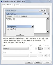
Apple needs to create a setting in System Preferences where the user can select which elements they want translucent and which ones they don't want translucent.
The attached file is from Windows 7. Apple could do something similar for selecting which elements should or should not be transparent.
If you agree, may I suggest you contact both Tim Cook and Craig Federighi on Twitter (They are easy to find)
Also submit a feature request to Apple at:
https://www.apple.com/feedback/macosx.html
Attachments
Yosemite looks horrible
After installing Yosemite yesterday, I'm truly by its giant step backward in cosmetic appearance. Everything looks so "flat," like the Finder's icon colors and the windows' red, yellow and green buttons and the dock's lack of 3D effect with only a flat rectangle as background for icons with no shadows or reflections. What was  thinking? It's like they're trying to make Macs look like Windows o)!
After installing Yosemite yesterday, I'm truly
by its giant step backward in cosmetic appearance. Everything looks so "flat," like the Finder's icon colors and the windows' red, yellow and green buttons and the dock's lack of 3D effect with only a flat rectangle as background for icons with no shadows or reflections. What was thinking? It's like they're trying to make Macs look like Windows o)!- Status
- Not open for further replies.
Register on MacRumors! This sidebar will go away, and you'll see fewer ads.