Become a MacRumors Supporter for $50/year with no ads, ability to filter front page stories, and private forums.

What do you think of Lucida Grande + OS X Yosemite

  • Lucida Grande looks amazing as a UI Font on all Macs

    Votes: 74 34.4%
  • Lucida Grande looks amazing as a UI Font on non-retina Macs

    Votes: 29 13.5%
  • Lucida Grande looks just fine with Yosemite's UI

    Votes: 48 22.3%
  • Lucida Grande looks terrible with Yosemite's UI

    Votes: 64 29.8%

  • Total voters
    215

macenied

macrumors 6502a
Aug 20, 2014
637
29
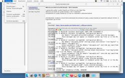
I voted Option 2 thus I cannot compare with retina displays, I don't own one :) . My MBP has a 1280 x 800 display resolution.

The Lucida Grande font helps a lot in terms of readability, I installed it ( version 1.2 on Yosemite public ) together with the LCD rendering off and reduced trancparancy options.

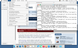
Second picture is using the increased contrast option, which I prefer.

Thank you all for the development, distribution and guiding for this solution !
 

Attachments

  • attachment.png
    attachment.png
    271.9 KB · Views: 1,410
  • Bildschirmfoto 2014-10-25 um 15.40.26.png
    Bildschirmfoto 2014-10-25 um 15.40.26.png
    357 KB · Views: 1,401
Last edited:

bnwimmer

macrumors newbie
Oct 25, 2014
1
0
Great

I like the Script and it works very well. Is there a solution to modify this script to use with Fira or Roboto? Actually I think these fonts are very good display fonts. Or does anybody know how to convert a font to a OS X system font? A tool or script? I am really interested in converting Fira and Roboto to a OS X Systemfont... Ideas? Anyone?
 

dmj102

macrumors 6502
Oct 30, 2013
253
46
Canada
Thank you for the LG script. OMG, that is so much better re: legibility on my non-retina MBP. :)

I don't mind Helvetica Neue, the regular one but at a decent size, and use it in some apps, but the one with Yosemite system wide is way too light, tiny, and hard to read.

I still have increased contrast on and reduce transparency on.
 

SmOgER

macrumors 6502a
Jun 2, 2014
805
89
I'm so thankful for this my eyes aren't bleeding anymore. I'm sure Helvetica looks good on retina displays but it made my head hurt when using my external monitor.

Can you make some screenshots? I thought Apple fixed the majority of font issues, at least I don't experience them anymore and find new fonts to be even better than LG on Mavericks.

PS. Maybe the problem is with retina-like scaled displays, let's say 1280x800, in which case I guess it's possible that Apple optimized this particular font scale favoring the retina devices, but I'am not too keen in believing this.

That's how the fonts look on my MBA:
 

Attachments

  • Screen Shot 2014-10-26 at 00.12.28.png
    Screen Shot 2014-10-26 at 00.12.28.png
    306.8 KB · Views: 822

davidlv

macrumors 68020
Apr 5, 2009
2,291
874
Kyoto, Japan
Font book complains of duplicate LG fonts

Download : https://drive.google.com/uc?export=download&id=0B_u6AjwB3JxSdVR5SzhTclRkZUE

This is an Automator script which patches the default Lucida Grande font and copies it to /Library/Fonts. No system files are changed. The original font isn't included in this package, hence it's not redistribution of copyrighted Apple :apple: content.
Use with caution! I'm not liable for any damages, as stated in the license (BSD).
You can use the Automator.app to see the source code (Apple Script + Shell with embedded Apple Script) .

I'm planning to publish this thing on GitHub, too.

Let me hear whether or not this works for you (especially people using the Developer Previews).
I tested it on my Yosemite Public Beta 2 system.

The patch was created using 'bsdiff', a binary patch creation tool.
I ran 'bsdiff' to create a binary patch containing the difference between the original Lucida Grande font and vista980622' patched font.
'bspatch' is used in the script to apply the patch and move the newly created font to '/Library/Fonts'
Thank you very much, vista980622!

Best regards,
schreiberstein


I just tested it on a fresh Yosemite Public Beta 2 installation. Works fine for me.

EDIT2: GitHub : https://github.com/schreiberstein/lucidagrandeyosemite

EDIT3: Facebook page : https://www.facebook.com/systemfontyos
LATEST download link : https://drive.google.com/uc?export=download&id=0B_u6AjwB3JxSRWRzVDRjanpzYXc
After installing via the script, Font book complains of duplicate LG fonts.
Is that a problem?
BTW, thanks for the script, my ancient eyes appreciate it on my Mac mini with an old TNF 23" monitor!
 

grahamperrin

macrumors 601
Jun 8, 2007
4,942
648
Maybe relevant

… Is there a solution to modify this script to use with Fira or Roboto? Actually I think these fonts are very good display fonts. … Ideas? Anyone?

Maybe relevant: post #1464, and some of the responses thereto, under 'Yosemite looks terrible'.

HTH but if that's not relevant, sorry; I'm using Mavericks (can't easily test the effects on Mashemite).
 

JurgenV

macrumors member
Jul 24, 2011
44
13
Utrecht, The Netherlands
Can you make some screenshots? I thought Apple fixed the majority of font issues, at least I don't experience them anymore and find new fonts to be even better than LG on Mavericks.

PS. Maybe the problem is with retina-like scaled displays, let's say 1280x800, in which case I guess it's possible that Apple optimized this particular font scale favoring the retina devices, but I'am not too keen in believing this.

That's how the fonts look on my MBA:

Well I'll explain my situation a little. I got a Macbook Pro 15 inch from late 2008 on the Macbook display it looks decent but I got it hooked up to my Samsung SyncMaster 223 BW and for some reason from the moment I installed Yosemite I just got a headache using that monitor.

I've never had the same experience with Mavericks or all the older OS X's. I think it's the font (although I also notice some flickering in some windows which I didn't have at all in Mavericks) because my headache has not returned since installing the Lucida Grande patch. If you really want I can still make screenshots just give a shout out. :)
 

SmOgER

macrumors 6502a
Jun 2, 2014
805
89
Well I'll explain my situation a little. I got a Macbook Pro 15 inch from late 2008 on the Macbook display it looks decent but I got it hooked up to my Samsung SyncMaster 223 BW and for some reason from the moment I installed Yosemite I just got a headache using that monitor.

I've never had the same experience with Mavericks or all the older OS X's. I think it's the font (although I also notice some flickering in some windows which I didn't have at all in Mavericks) because my headache has not returned since installing the Lucida Grande patch. If you really want I can still make screenshots just give a shout out. :)

Are you using DVI connection/adapter? Cause I see your monitor has both VGA and DVI. I remember I had some problems when I tried to connect 1680x1050 LCD with mini display port to VGA cable, it just didn't want to operate in native resolution under OS X, but worked perfectly good in bootcamp (win8). Another thing to look at, if it's indeed connected by VGA AND you can confirm/check that it's running at native (1680x1050) resolution, then try forcing 'auto adjust' or manually adjust the focus settings, cause that surely looks to me more like a monitor compatibility/connection issue rather than poor font rendering. And yeah, screenshots with default font would be helpful as the monitor itself can't affect the quality of screenshots, so if the screenshots look crappy on other machines as well ONLY THEN we will know that monitor or it's settings are not to blame and the quality isn't lost somewhere along the way from MBP output to your monitor matrica.
 
Last edited:

typecase

macrumors 6502
Feb 2, 2005
390
397
Thank you vista980622 & schreiberstein! Despite the inane choices by Apple, I can now use the latest features with the familiarity and comfort to which I am accustomed. I love Helvetica, it just doesn't work on my non-retina screens (contast was awful) and just doesn't look and feel like OS X without it.
 

macenied

macrumors 6502a
Aug 20, 2014
637
29
... Despite the inane choices by Apple, I can now use the latest features with the familiarity and comfort to which I am accustomed. I love Helvetica, it just doesn't work on my non-retina screens (contast was awful) ...

I am convinced that those changes made by Apple are done with a purpose, in this case by trying to force non-retina hardware owners to upgrade. Apple does this in other areas as well, e.g. by no more supporting hardware for continuity/handover or bootcamp, without any technical reason.

Bad business practice, I'm not happy about it.

As we see, without the font changes Apple applied customers with older hardware would still be happy. Apple does not want this, they want to sell new hardware.
 
Last edited:

mittoner

macrumors newbie
Oct 29, 2014
1
0
Patch not working well

Is there a way to change back from Lucida Grande to Helvetica? Some dialogue boxes are showing up as squares and X's. Is it a case of removing fonts from a folder?
 

FpTargeT

macrumors newbie
Nov 3, 2014
1
0
Sorry to ask for the exact contrary of everybody else here...

Ok, so I'm sorry but I'll be the weirdo in this thread...

Actually I do have :
- an old 15" MBP in a "rather small" resolution of 1440x900
- a almost brand new 27" iMac non 5K in a resolution of 2560x1440

Both of which, IMHO (no offense, but I have a pretty decent view and this probably helps in that matter !), are very easy to read for me.

Besides, I find the new systemwide font rather too large (It looks like at least 16 or 18 pixels height), whereas I'm used to working on 10 to 12 pixels height max in my word of excel documents, and for instance my Adium contact list and chat windows are displaying names and lines in 8pixel fonts...

My concern would be : how could I patch/tweak your scripts ignored to set the font size for Helvetica Neue which looks stunning cristal clear to me ?

Again, no offense, it's always a question of point of view, I respect people all demanding more readable fonts even if I just can't comprehend it AT ALL...

We're all different with different needs ;-)

Thanks for this job anyway as it pleases many, hopefully there is something that can be done for my specific demand...?

Cheers,
FpTargeT.
 

cosmolv

macrumors regular
Aug 18, 2012
122
33
Latvia
i must say, that Lucida Grande looks much better - it's nicer, looks and feels more friendly.
New Yosemite Helvetica Neue (actually this is old font and well known by the fact that it was designed back in 1957) but it looks more technical, industrial - I think...
i like Helvetica Neue, i using it for TV News for years for lower thirds. and i think i do not change design. It looks great for that purpose it looks elegant and simple. But for such technical devices - i think we need to make products more human not so technical. With this font Yosemite in some case looks aggressive, like iOS 7 & 8

I do not know why apple are using such aggressive and sharp edged designs like it does Microsoft. Why apple copy Microsoft i do not know i don't understand it...

i don't think that this is some genius design & revolution - maybe in some aspects, but in complex view - nothing special, some rudimental tries to do something, but this is not the way to experiment on reputation.

Apple i think is in search for design and this is some half way. because to make a revolution in UI design - it is hard to do that just in one year.
But this is wrong direction to put out something that is incomplete and full of bugs.
 

Tunster

macrumors 6502
Nov 28, 2009
422
182
Personally love this patch! I'm just trying the v1.3 BETA and don't seem to have any issues so far. I find the new font too striking and harsh. With Dark Mode on, having the old font just hits the sweet spot. Will report any issues with my rMBP.
 

DemShades

macrumors newbie
Apr 13, 2015
1
0
I like this patch too, thanks to the creators. I'm currently testing Yosemite on a separate partition of my rMBPro (Mid 2014) and I think Lucida looks much better (and is better for my eyes) on an external non retina display.

Unfortunately, I have a problem with Schreibersteins app. Everytime I restart my computer, the system font is set back to Helvetica. Anyone else having that issue or better, maybe a solution to this? I tried v1.3 on 10.10.3.

Thanks in advance,
Dem Shades

EDIT: I have to admit that it doesn't change completely back to Helvetica. Menubar and sidebar of the finder and the folders stay Lucida Grande.
If I start Safari for example, the menubar changes to Helvetica. The dropdown menu also changes back. Strange... This is also the case if I start any other application (Adobe apps etc.).
 
Last edited:

Ebenezum

macrumors 6502a
Mar 31, 2015
782
260
Thanks schreiberstein for this script, it makes Yosemite tolerable. If only Apple would provide a way for a user to choose between Mavericks and Yosemite/ El Capitan appearance...
 
  • Like
Reactions: Tozovac
Register on MacRumors! This sidebar will go away, and you'll see fewer ads.