Considering that there's arguably a lot of superfluous although
optional translucency and certain UX issues, I'm not necessarily saying that they were completely successful in applying their design principles to the software UI at hand, but it seems to me the philosophy behind Yosemite's interface design at least in part closely aligns with
the following:
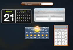
At the height of the skeuomorphism trend at Apple, they tried to literally copy the look of this object's user interface and use it in a software product, now they're going for the principles behind it:
")