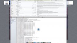
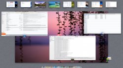
This is Mission Control when 4 applications are opened
Now, I don't know how Apple went through their design process to reach this. But I'll just point out some of the major problems with this design.
1. Desktop Spaces are obstructed by Apps
2. Apps overlay each other
3. App icons are not prominent
4. App names are too blended into their background
5. Absolutely no idea why the desktop shrinks, it does not give me a sense of "taking a step back to look at everything"
Simple solutions to consider to resolve these design problems
1. Dim the background (just like Snow Leopard)
2. Do not let apps overlay each other
3. App icons should be smaller
4. Scrap the shrinking desktop
5. Make space switching animations faster (just a little annoyance)
When I look at the current mission control, I can definitely see what their vision is. But the way it is implemented has many flaws, as pointed out.
This thread is just about pointing out what I think is bad design issues with Mission Control. What do you guys think? And what are your thoughts on working with Mission Control.
Thanks
Last edited by a moderator:


 Also, I disagree with the desktop thingy. I like that it resizes; really gives me the sense of zooming out and looking at all of my stuff in an organized manner. Perhaps it should be a preference...Apple doesn't seem to have many of those =P