I always hated how OSX rendered fonts on my non-retina macs. Always seemed like a blurry mess. Windows fonts might not have been accurate compared to printouts, but at least they were readable.Huh. That's actually the opposite of what I thought it'd be. I haven't seen Windows on a high DPI screen yet, but I figured its rendering shortcomings would be overcome by having more pixels thrown at it.
edit: I take that back. I have seen it running on an SP3 in stores. Looked decent enough to me, and I figured it'd look that much better the closer you get to the 300 PPI sweet spot.
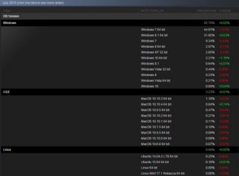
With high DPI screens, the differences are diminished.