I would like to preface the following reviews by saying I dont have any professional judging experience and just take pictures as a hobby. My critiques and comments are solely based on how the entries speak to me visually.
I think entries for this topic should include a description of why their pic inspires them. But I'll leave that for the judge to decide and edit my post if necessary.
[url=http://farm7.static.flickr.com/6200/6084971539_1ea6bde27c.jpg]Image[/url]
Sydney Sunset by
kevinfl2011, on Flickr
I really liked this picture. The way the sunset colors fade into a dark blue is a nice change from the stereotypical orange and red sunsets that you always see. The clouds in the 1/3 of the picture right above the buildings are very dramatic and add to the essence of the picture. I realize it was out of your control but the dark clouds in the upper left of the picture are a little bit distracting as it forces the focus of the picture to the lower left corner of the picture. Overall, a great shot.
I clicked on the picture, went to flickr, and realized this was taken in Bridgetown. My brother in law has lived there for about a year and, from what I hear, it is a pretty incredible place. I like this picture because of the different textures between the sand, water, and sky. The picture is also very sharp. Great use of the rule of thirds. The only two comments I have would be that the picture feels kind of flat. The sand, water, and parts of the cloud are all roughly the same shade of gray. Also, the boats in the water are all focused in a tiny, off-center, part of the picture. I think, visually speaking, moving to the right a bit and getting a little bit of symmetry would enhance the shot.
I think this is a great idea. The picture has a very peaceful and romantic feeling. I dont know if you did this intentionally but the shadow from the rink looks like a heart, a cool effect. The depth of field also enhances the picture because it pushes my eye to the highlighted text. I think the shot could be improved by moving just slightly to the right. That way you get a more defined heart shadow and the reflection off of the light wont interfere with the text which can be a challenge to read. If you ever do wedding photography this would be a really, really cool shot with the bride/groom rings, the heart, and perhaps a scriptural verse about love. Well done.
[url=http://farm6.static.flickr.com/5217/5404069933_a799c3cd38_z.jpg]Image[/url]
Captain and horse 1 by
Tracheotomy Bob, on Flickr
Actually I wanted to take pictures of Lego but I only had Playmobil at hand when I bought the macro lens. Saying that I find Playmobil can be easier to take picture of. Lego is cool but everybody is doing it whereas Playmobil is not quite a popular. The very best people for Lego pictures are people like Avanaut or Blockaderunner on Flickr, they're really worth taking the time to find.
tb
Ill start by saying that my age puts me on team Lego. I dont remember having any Playmobile toys growing up. However, I wont let that bias my review of the picture. I am guessing from your comments you were trying out a macro lens. I think the depth of field is good and, considering how close you are, the picture looks sharp and clear in all the right places. You could improve the picture with some brighter lighting. The depth of filed sharpens the toys face, but it is dark and in shadow. I am not quite sure how it fits the theme of inspiration. Is the toy itself inspiring, or is it the soldier the toy represents?
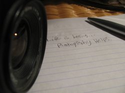
Lifes boring, photography helps.
I think this is a good idea. You are able to convey your message and use dramatic lighting. There are a couple of things that I think would improve the picture a little bit. The lens of the camera is almost entirely black and the paper is white. When I was scrolling through the pictures I thought this one was cut in half. Also you have lots of white paper space in the bottom right corner of the picture but the camera lens actually cuts into the wording. You have a great idea here and I think with a little bit of adjusting you might be onto something.
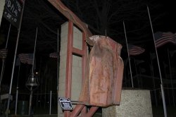
This picture really stands out to me because of the colors. I love the contrast between the bright clean flags and the rusty towers. This is another picture of the bunch where my focus is pushed in the wrong direction. The flags and towers almost feel like a border around a smaller picture. I find myself drawn to the upper left part of the picture where there isnt much substance. All you need here is a little bit of balance. Perhaps a tower on the left side, a tower on the right side, and some flags in the middle will make it feel more symmetrical. You then could use those items to frame the fluffy clouds and give it a more consistent feel. Well done.
I think this really fits the theme well. There were a couple of small things I think would help the picture a bit. I dont know what the lighting situation was around the picture at the time but perhaps this would be a good situation where you could do a long exposure. That way you might get a better exposure out of the flags in the background. I realize, however, that you were probably travelling and didnt have access to a tripod. Another thing I would recommend is giving more focus to the I beam main support World Trade Center sign. I didnt know what the picture represented until I saw the sign and it was a little out of focus. Again, this might be something out of your control because if you focus on the sign the beam is going and rosary are going to be out of focus.
my favorite parts of this picture are the lines and symmetry. The composure of the picture and all of the lines force my attention to the heavens which I think is the idea. The picture also appears to have been desaturated a little bit which is more dramatic. The only thing I would alter in the picture is the background. The trees are dark enough that they drown out the cross and make it more of an after thought. Overall, great job.
This is a cool idea. I am sure if you were doing this in your backyard your neighbors wondered what you were doing, but I think its a great idea. Clearly this is something that required some thinking and pre-shot planning. I dont know if you did a timed exposure for the clouds and then stepped in and fired the flash, but I think it works. The message of the picture feels something like we are just a small speck in the infinitesimally large universe. Exactly what you were going for, right? Give me a break,
Im not a philosopher. The only thing you can change in this picture is burning and silhouetting the tree in the bottom right hand corner of the picture. Also, I think the picture could benefit from a little cropping off the bottom. I want to be inspired by the vastness of the heavens and not worry about looking up your shirt or catching the top of your pajamas/underwear. Very cool idea and execution though.
The Doctor is an inspiration to many.
I like the candidness of this picture (if that is even a word). You caught a moment where the subjects look very happy. The only recommendation I have for this one is scooting over a bit and getting a more front on angle, that way you capture more of the emotion from the female subject.
Image
Oh, I just posted this in photo of the day... but to me it fits the topic so well!
It is a man who is dancing for change in Vienna. I took this photo last week. Many people stopped to watch, but few actually gave him change. It inspires me to take a moment to consider those less fortunate than myself.
[url=http://img594.imageshack.us/img594/4034/dsc1837u.jpg]Image[/URL]
I was really impressed with this picture. I like how you put the subject of the picture off to the right so you can see what he is looking at. You also note in the picture how none of the other people in the frame are paying attention to the street performer at this moment, which you said was the message of the photo. I would step back just a bit so you dont cut off the bottom of the radio and the base of the stand he is on. Great job.
Results
3rd Razeus
2nd AlexH/dslade09 ( I really couldnt choose between the two shots)
1st fitshaced
Great job. As usual I enjoyed the process. I apologize for the delay in judging.
----------
It looks like I was able to make the pictures smaller. They are just too small to see. I need some more practice with the quoting