Become a MacRumors Supporter for $50/year with no ads, ability to filter front page stories, and private forums.

xgman

macrumors 603
Aug 6, 2007
5,675
1,388
This is actually the most interesting thread under the Yosemite section. Apple "should" take note.
 

dmccloud

macrumors 68030
Sep 7, 2009
2,995
1,739
Anchorage, AK
This is actually the most interesting thread under the Yosemite section. Apple "should" take note.

Of what, differing personal preferences? The new font is no harder to read than what Mavericks had, it's just different. The only thing I don't like is that the green "maximize" button now toggles full screen mode instead of maximizing the window to fill the screen exclusive of the menubar and dock - other than that, I've had no issues adjusting to or using Yosemite and the new look.
 

crjackson2134

macrumors 601
Mar 6, 2013
4,834
1,954
Charlotte, NC
So far I'm not liking it!

It could just be me. I'm running in a VM, but I just can't cozy up to the new look at all. I love the look and function of 10.8 & 10.9, but 10.10 just hurts my eyes. I detest the flat look and the new icons. I wish I didn't, I really do, but it has to offer me a lot more by the time it's fully cooked before I'll kick 10.9 to the curb. My fingers are crossed that I can really love this thing by the time it's released but I really doubt it. It just hurts my eyes.
 

ScottishCaptain

macrumors 6502a
Original poster
Oct 4, 2008
871
474
It could just be me. I'm running in a VM, but I just can't cozy up to the new look at all. I love the look and function of 10.8 & 10.9, but 10.10 just hurts my eyes. I detest the flat look and the new icons. I wish I didn't, I really do, but it has to offer me a lot more by the time it's fully cooked before I'll kick 10.9 to the curb. My fingers are crossed that I can really love this thing by the time it's released but I really doubt it. It just hurts my eyes.

Just FYI, running it inside a VM seems to seriously degrade the visual appearance even more. Don't ask me why, but there were tons of missing shadows and stuff when I tried 10.10 inside VMware Fusion that were present when I installed it to a USB key and booted off that instead.

I'm not saying "everything is OK" when you boot it natively, just that it's different- so you should probably hold off judgement until you have a chance to actually try it out on the bare metal.

-SC
 

crjackson2134

macrumors 601
Mar 6, 2013
4,834
1,954
Charlotte, NC
Just FYI, running it inside a VM seems to seriously degrade the visual appearance even more. Don't ask me why, but there were tons of missing shadows and stuff when I tried 10.10 inside VMware Fusion that were present when I installed it to a USB key and booted off that instead.

I'm not saying "everything is OK" when you boot it natively, just that it's different- so you should probably hold off judgement until you have a chance to actually try it out on the bare metal.

-SC

I suspect your assessment is correct. It's really way to early in the game to tell, and the VM seems to really bring it down. I tried to tweak the VM today, but it just didn't help so I deleted the VM altogether. That helped ;)

I'll probably wait for a couple of more iterations and try again with a native install.

I'm just not to keen on flat interfaces (iOS included) so it will take a while for me to adjust.
 

grahamperrin

macrumors 601
Jun 8, 2007
4,942
648
Yosemite still likely to cause pain (headaches)

… is anyone else finding Yosemite extremely difficult to look at?

I'd say extraordinarily difficult.

… can't stand using it for more then an hour at a time. My eyes feel incredibly strained afterwards, assuming I don't get a full blown headache. I have had no such problems under 10.8 (and I stare at the computer for well over 8 hours a day, with several short breaks in-between).

… never experienced anything like this in the 20+ years I've been using computers … I know some systems take a while to get used to and I'm fine with that, but every time I boot into Yosemite for a few hours I come away from it feeling like someone has been prodding my eyes with chopsticks or something.

… using a computer shouldn't be physically taxing …

Same here. Recently seeded builds might be marginally better but still, Yosemite gives me a headache. That's no good.

----------

… all I can draw on are the screen shots. …

I could never get a headache from a screenshot.

Around a year ago, someone described an upgrade to iOS as (amongst other things) a cluster fk of white.

Maybe Apple is also trying to brighten OS X. Whilst I can't describe Yosemite as white, it's certainly too bright.
 

notrack

macrumors 6502
Feb 19, 2012
439
88
I do agree with the op. I noticed that I need to look closer and visually focus more on the controls (menu bar, tool bar etc) even though I know where they are and their location hasen't changed.

My impression is that the UI doesn't guide me as well as Mavericks. It kind of needs more attention to "operate", even after while of using it.
 

MacMan988

macrumors 6502a
Jul 7, 2012
840
122
I have felt the same about Yosemite during the first few days of using it. But then I got used to it and the problem disappeared.

This is whats happening most of the time for me. I think Apple products are elegant and all. But some features are very impractical and inconvenient. But we learn to digest it somehow because it comes from Apple.
 

AllergyDoc

macrumors 68000
Mar 17, 2013
1,997
9,141
Utah, USA
one on the worlds Font experts has state that Helvetica is not the ideal font for readability.
Helvetica really isn't ideal for readability.

However, we read best what we read most. When iOS 7 came out, having to read in Helvetica really bothered me, to the point I avoided using the Reader function of Safari. However, with time and exposure, it's grown on me and reading text set in Helvetica is much easier now. I really like the thinner fonts.

I don't have Yosemite on my 27" iMac so I can't comment on how the font looks on my screen, but I'll be very disappointed if it's a downgrade from Mavericks.
 

8CoreWhore

macrumors 68030
Jan 17, 2008
2,655
1,192
Tejas
These 2 settings in Accessibility is crucial for me..

...try this... Reduce Transparency, and Increase Contrast. Also, turn on Dark Menubar and Dock. :cool:
 

Attachments

  • Screen Shot 2014-09-05 at 10.12.08 PM.png
    Screen Shot 2014-09-05 at 10.12.08 PM.png
    210.7 KB · Views: 217
  • Screen Shot 2014-09-05 at 10.16.12 PM.png
    Screen Shot 2014-09-05 at 10.16.12 PM.png
    63.9 KB · Views: 178

grahamperrin

macrumors 601
Jun 8, 2007
4,942
648
Attached: screenshots of my own preferences for occasional testing of 14A343f.

Chronological order. In the last screenshot, there's an effect of patching the system to prefer Lucida Granda – the title (of the preference pane) is clearer.
 

Attachments

  • General.png
    General.png
    108.8 KB · Views: 237
  • Accessibility, display.png
    Accessibility, display.png
    92.7 KB · Views: 246
  • f.lux.png
    f.lux.png
    82.2 KB · Views: 222
  • cDock.png
    cDock.png
    58.6 KB · Views: 190
  • Desktop.png
    Desktop.png
    63.8 KB · Views: 214

j800r

macrumors 6502
Jan 5, 2011
399
140
Coventry, West mids, England
Fine for me. However in defence of this particular topic I will say they've increased screen brightness max on here. At least it feels that way.
The default brightness started out lower than I usually have it and I've kept it like that.

Maybe you should simply try reducing the brightness yourself? If I turn it up the colours pop slightly more but I agree it IS a slight strain on the eyes, but only cause it's too bright (would be GREAT for areas with sun glare though).
 

grahamperrin

macrumors 601
Jun 8, 2007
4,942
648
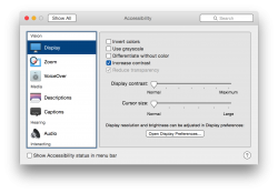
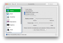
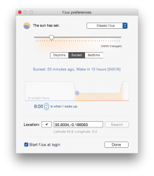
… reducing the brightness …

Done, weeks ago. With a MacBookPro5,2 at its dimmest, Yosemite is too bright for me. I often work with the computer at night.

In dark environments, I can tolerate Yosemite only when adjusted with f.lux. Without that adjustment the operating system is likely to give me a headache.
 

dianeoforegon

macrumors 6502a
Apr 26, 2011
907
137
Oregon
I have Sjögren (dry eye) and the brightness of the folder icons are especially jarring to me.

I did notice that the folder icons on the Desktop in PB2 has a bit of shading that helps tone down the brightness but not seeing the same in a Finder window.

We need to have a way to adjust the glare. Apple hasn't been especially interested in anyone that has special needs. I'd really like to see an ergonomic keyboard, but guess they don't fit in the pretty category.
 

j800r

macrumors 6502
Jan 5, 2011
399
140
Coventry, West mids, England
Done, weeks ago. With a MacBookPro5,2 at its dimmest, Yosemite is too bright for me. I often work with the computer at night.

In dark environments, I can tolerate Yosemite only when adjusted with f.lux. Without that adjustment the operating system is likely to give me a headache.

Then I have to disagree or it must be something unique to the DP. Brightness fully reduced I can barely see the screen cause it's too dark.
 

Schlaefer

macrumors member
May 11, 2010
41
9
What I've noticed: everything is OK if your in keynote-demo-mode: one window with colorful content and/or colorful background image.

But if you layer app/document windows the novel transparency areas practically become a plain white. Background windows are completely white too. Now you have a bunch of white windows with very few distinguishable features. After a few hours working with multiple windows the eye craves for something to hold on to.
 

grahamperrin

macrumors 601
Jun 8, 2007
4,942
648
+1
and I borrowed some of Schlaefer's post for https://forums.macrumors.com/showthread.php?p=19589938#post19589938

… the novel transparency areas practically become a plain white. Background windows are completely white too. Now you have a bunch of white windows with very few distinguishable features. After a few hours working with multiple windows the eye craves for something to hold on to.

Hopefully not a stupid question …

If you then reduce transparency:
  • is that craving immediately and fully satisfied; or
  • does a lack of orientation persist for a short while?
 

Schlaefer

macrumors member
May 11, 2010
41
9
If you then reduce transparency:
  • is that craving immediately and fully satisfied; or

Reducing transparency doesn't help:

  • the Dock looks horrible; every icon without black outline has reduced contrast, the white trash can on the white background should be considered a crime
  • the chance of a single foreground window on a colorful background is now gone too

If you then reduce transparency:
  • does a lack of orientation persist for a short while?

I haven't installed 10.10 on my main computer, so I don't know how it plays out after a few days. These were my observations after using it for a full sunday morning on an old spare non-retina laptop.
 

Apple Knowledge Navigator

macrumors 68040
Mar 28, 2010
3,549
11,960
I'm having a terrible time with the font in Finder's column view. The pixelating is horrible on my 21.5" iMac, and increasing the font size to a ridiculous value is the only way to get around.
 
Register on MacRumors! This sidebar will go away, and you'll see fewer ads.