Become a MacRumors Supporter for $50/year with no ads, ability to filter front page stories, and private forums.
Status
Not open for further replies.

grahamperrin

macrumors 601
Jun 8, 2007
4,942
648
Revisiting a few points

I sometimes use the word 'unforgiving' to describe Yosemite.

… Are you emphasizing that Yosemite's look is it meaning there's nothing you can do to adjust it? …

It does seem impossible to adjust the worst aspects of Yosemite, and that certainly worsens the annoyance, but that's not my reason for using the word. I'll return to this in a few days, maybe sooner.

I think Apple just went a little too far with the flat this attempt and maybe they'll bring some depth back in a few years. (A little depth is a good thing.)

As for the functional changes in the UI such as toolbars, I don't know. …

A few years will be far too late. I will have abandoned Apple far sooner (five years at most, I reckon).

Toolbars, please see below.

You want the test person to have their undivided attention on the stimulus, so sitting them down (comfortably) in front of the display is an obvious choice. Most experimental studies don't make much sense if the test person is distracted with something else.

leman, thank you. I wondered about that for a few weeks.

I do realise the sense, and it is a reasonable approach, but it's likely that any such study would have failed to capture the saccades for what probably annoyed me the most. More on this later (if Apple performed even basic measurements of saccades, I'll be surprised …).

… I don't think Cook is to blame for OS X. Hew oversees the company as a whole. As long as OS X passed the internal design team it will be released. …

I agree, Cook is not to blame. I recall someone else (Wozniak?) making a comparable non-detrimental comment about Cook's overseeing of things.

I assume that things must be passed by more than Apple's internal design team before a release of OS X, but I don't know.

I still find occasional verbal bashing of Sir Jonathan Ive. The more I look at things, the more I believe that he's not to blame. He's also human, like the rest of us.

I suspect that pre-release feedback and public mood were much more positive than public reactions to the release. If that's true: Apple might have underestimated the value of some pre-release problem reports, and so things might have been improperly 'passed'. More on this later (in a nutshell: I can imagine the OS X Yosemite concept being approved for release by people who lack the required organisational memory).

The worst of Yosemite, worked around

For me, Safari is the worst part. Around midnight now. If I can achieve what's below before I go to work tomorrow, there'll be some satisfaction (but not enough to choose Yosemite) –

AKNZv.png


– whenever I tried, that mixture of two operating systems seemed impossible. One group of people has succeeded in that workaround, so I ought to try (and it ought to be a priority).
 

Traverse

macrumors 604
Mar 11, 2013
7,688
4,400
Here
I'll return to this in a few days, maybe sooner.

I look forward to it.


I still find occasional verbal bashing of Sir Jonathan Ive. The more I look at things, the more I believe that he's not to blame. He's also human, like the rest of us.

I place more blame on him because he is head of design, but I also realize he's human and isn't solely responsible for Yosemite's design. He may have influenced it, but he didn't code it. I assume many design meetings and group work efforts contributed ideas.


The worst of Yosemite, worked around

If you find a way to manage this please post your sources! I am worried that tampering with the system may cause instability which is more important to me than aesthetics. What's sad is that I wasn't/am not opposed to an OS X refresh. Safari classic stands out bad with the new menu bar and dock, but since Apple failed to deliver on the design...

What's infuriating is that there are so many features (mostly tie ins with iOS) that I would love and are constantly nagging at me to update again, but the design of Yosemite holds me back. I really don't think you'll see any major adjustments in 10.11, I hope I'm wrong though. By OS X 10.12 I think you will start to see a shift in design again along with an iOS refinement.

__________________

EDIT: I do want to add (not in response to anyone), but there is one app that to me looks so much better in Yosemite and that's Reminders. I don't know why, but after using Yosemite the Mavericks Reminders app just irks me. :)
 

grahamperrin

macrumors 601
Jun 8, 2007
4,942
648
The number 130

Anyone: in the screenshot at <https://forums.macrumors.com/posts/20371630/>: what, do you think, is '130'?

… If you find a way to manage this please post your sources! I am worried that tampering with the system may cause instability …

For a few minutes I experimented with symbolic links from parts of Yosemite to parts of Mavericks. Unfortunately, Safari 7.x lacked a title bar. Sorry!

Instability: a very good point, I normally caution against changes to /System and so on, but I treat this installation of Yosemite (on an old external disk) as entirely disposable so I mucked around with Apple private frameworks without a care.

Frankly, Apple, I shouldn't have to experiment to get something Mac-like on a Mac. In the words of a recent tweet:

"OS Yosemite, je te vomis dans l'anus. Merci."​

More specifically, about the looks, a quick reminder:

This is just my opinion but I reckon it looks anus. …

… the design is hideous and safari looks like ass
 

OldGuyTom

macrumors regular
Original poster
Sep 6, 2013
156
33
US
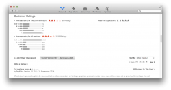
I'm amazed this thread is still alive. I'm amazed at how much thought is going into it. I'm amazed that the number of "1" star ratings in the App Store outnumber the number of "5" star ratings by over 25%.

I'm amazed...but not surprised.
 

KALLT

macrumors 603
Sep 23, 2008
5,361
3,378
One thing that is really starting to piss me off is this very poor contrast everywhere. Look at the picture below, it's a screenshot of Evernote. Look at the text in the notes list, the button 'click to add tags', the title in the writing field. I am in my twenties and have perfect vision, but looking at this makes me uncomfortable.

It's not just Evernote either, 1Password and many others are doing it too. When I asked the 1Password devs, they responded with 'we just use the default text styles Apple provides'. Shame on Apple, shame on uncritical developers. These are apps I have to use frequently and the lack of contrast is really bothering me. So much white, light grey, grey and dark grey. What happened to good old black and the usage of colours?
 

Attachments

  • Screen Shot 2014-11-27 at 14.11.12.png
    Screen Shot 2014-11-27 at 14.11.12.png
    40.8 KB · Views: 119
  • Screen Shot 2014-11-27 at 14.15.27.png
    Screen Shot 2014-11-27 at 14.15.27.png
    28.9 KB · Views: 99

Badagri

macrumors 6502a
Aug 9, 2012
500
78
UK
I'm amazed this thread is still alive. I'm amazed at how much thought is going into it. I'm amazed that the number of "1" star ratings in the App Store outnumber the number of "5" star ratings by over 25%.

I'm amazed...but not surprised.

UK Store

***** 31
**** 4
*** 12
** 8
* 27


[Edit] Updated.

UK Store

***** 31
**** 4
*** 12
** 9
* 29
 
Last edited:

grahamperrin

macrumors 601
Jun 8, 2007
4,942
648
Not looking good

Ratings for Yosemite in the App Store for France


Ouch.

Third party developers following Apple's poor precedents

One thing that is really starting to piss me off is this very poor contrast everywhere. … Evernote. Look at the text in the notes list, the button 'click to add tags', the title in the writing field. I am in my twenties and have perfect vision, but looking at this makes me uncomfortable.

It's not just Evernote either …

I assume that's version 6, with its sleek new design inspired by OS X Yosemite …

In the customers' own words …

oeamt wrote:

"Very Poor Redesign. Please fix it, Evernote.

I am a longtime Premium (i.e. paying) user of Evernote and generally a huge fan of the app and the company, having recommended it to many friends and colleagues. This is the first time I've reviewed anything on the iTunes store, but felt this was worth stating in the event that it may help initiate some kind of shift back to a better UI at Evernote.

In short, the redesigned interface is very poor. There is no longer much discernable visual hierarchy to the screen or your notes and it feels like looking at just one big jumble of notes and buttons with very little rhyme or reason. Outside of whatever color may be in your notes, it's all black and white with a little spots of blue text and the separation of elements is almost nondiscernible. As a frequent daily user of the app, this is very disappointing. Another reviewer said that it makes the app fatiguing to use and I agree 100%.

This is an app that's designed to organize information and make it easily accessible. Although the basic functionality of accessing notes has not changed, this redesign has made the notes feel less accessible and as noted, has made the app fatiguing to use. This comes as a disappointing surprise from Evernote, as they've been consistently excellent to this point. For my experience, a clear design fail and a big step backwards."​

daq man wrote:

"Totally the wrong direction.

I have been an Evernote user for many years. The current redesign is a big step backwards. The UI has been made confusing with very little differentiation between the different areas of the main window. …"​

BarbR7 wrote:

"If I could turn back the hands of time...

A long time premium user of Evernote. This new version is horrible. It works well on my Mac, no complaints there, but the design is ghastly for reasons other reviewers mention: light typeface, columns are there but not delineated, headings are without color. It is extraordinarily difficult for the eye to pick out essential information quickly for a normal individual; forget it if you have any visual impairment. Evernote was the backbone of my entire data management system … simply, the best and most useful app I have ever used and I depend on it. I am devastated by the changes that make it unpleasant and difficult to use now. … The images seen above in no way reflect the look of the interface anymore. A 5 star performer normally - now below the 1 star I gave it for "hate it"."​
 

Attachments

  • 2014-11-27 19-13-27 screenshot.png
    2014-11-27 19-13-27 screenshot.png
    110.1 KB · Views: 606

Cubytus

macrumors 65816
Mar 2, 2007
1,436
18
What concerns rating of Yosemite in my countries MacAppStore: Bad! Eats memory and the design is crap. (19 November, 2014).
See? I was treated as if I were crazy when I said Yosemite ate up RAM and never really freed it. Was told it was my 2009-era MB, even with 4GB RAM upgrade.
 

joedec

macrumors 6502
Jul 25, 2014
443
51
Cupertino
See? I was treated as if I were crazy when I said Yosemite ate up RAM and never really freed it. Was told it was my 2009-era MB, even with 4GB RAM upgrade.

Most haven't seen memory resource increases. Probably posting a new topic to resolve this is in order. Nail down exactly what resource is consuming your memory. Or call Apple, I've heard the calls for Yosemite are free, let them figure it out.

Not judging, just saying.
 

grahamperrin

macrumors 601
Jun 8, 2007
4,942
648
What is it like?

… I'm not sure exactly what you mean by this. Could you explain a little more? …

To set the scene, a question for anyone.

Have you ever been in a shop where someone behind you accidentally catches the backs of your ankles with their shopping trolley – not once, but twice?
 

TheBSDGuy

macrumors 6502
Jan 24, 2012
319
29
I think the majority of my opinions regarding Yosemite have been somewhat reserved. I don't like it, but I've never been "rude" about it. Most of my complaints have been about the cartoonish icons, the translucent menu bar, and the translucency passing through the top part of the window frame which I thought was childish.

Tonight I thought I'd actually try and give Yosemite a real try and see if I could find it tolerable. I can't. I believe this UI may qualify as the absolute worst UI I've ever seen.

Why? I use, and have used for over 10 years the same background, and it's relatively dark. When the menus come down, the effect of translucency makes the text black on a dark shade of gray. Interestingly, translucency seems based not on what's underneath the window you're using but the background. If the window is almost white, I still see black text on a dark gray background. In the past I found this irritating but I never really gave the OS a shot. Tonight I did. After a few hours, I swear to God, my eyes were straining.

On top of this, more than a few applications that worked fine on Mavericks and everything before it don't work at all. I normally use hardwired ethernet instead of Wi-Fi because it's faster, but I read so many complaints about Wi-Fi with Yosemite I decided to try the Wi-Fi. Yep, those problems are real too.

This operating system is, without a doubt, the biggest piece of crap I've ever seen.

'nuff said!!!!
 

Morpheo

macrumors 65816
Feb 26, 2014
1,273
1,589
Paris/Montreal
I think the majority of my opinions regarding Yosemite have been somewhat reserved. I don't like it, but I've never been "rude" about it. Most of my complaints have been about the cartoonish icons, the translucent menu bar, and the translucency passing through the top part of the window frame which I thought was childish.

Tonight I thought I'd actually try and give Yosemite a real try and see if I could find it tolerable. I can't. I believe this UI may qualify as the absolute worst UI I've ever seen.

Why? I use, and have used for over 10 years the same background, and it's relatively dark. When the menus come down, the effect of translucency makes the text black on a dark shade of gray. Interestingly, translucency seems based not on what's underneath the window you're using but the background. If the window is almost white, I still see black text on a dark gray background. In the past I found this irritating but I never really gave the OS a shot. Tonight I did. After a few hours, I swear to God, my eyes were straining.

On top of this, more than a few applications that worked fine on Mavericks and everything before it don't work at all. I normally use hardwired ethernet instead of Wi-Fi because it's faster, but I read so many complaints about Wi-Fi with Yosemite I decided to try the Wi-Fi. Yep, those problems are real too.

This operating system is, without a doubt, the biggest piece of crap I've ever seen.


Why don't you simply turn off transparency then? I don't use it.

While I never experienced any issue with wifi, 10.10.1 apparently fixed the problem, have you tried it?

...I've turned transparency on for the example below. Here are two screenshots, my background is blue. Clearly the background behind the menu has changed so I'm not sure what you mean.
 

Attachments

  • Screen Shot 2014-11-28 at 6.52.36 AM.png
    Screen Shot 2014-11-28 at 6.52.36 AM.png
    38.6 KB · Views: 402
  • Screen Shot 2014-11-28 at 6.52.54 AM.png
    Screen Shot 2014-11-28 at 6.52.54 AM.png
    44.9 KB · Views: 416
Last edited:

Cubytus

macrumors 65816
Mar 2, 2007
1,436
18
Most haven't seen memory resource increases. Probably posting a new topic to resolve this is in order. Nail down exactly what resource is consuming your memory. Or call Apple, I've heard the calls for Yosemite are free, let them figure it out.

Not judging, just saying.
They can't help solve what is clearly a conception problem, can it?

Resources burning RAM: mostly browsers with the same usage pattern as previous OSes, kernel_task process, mail, etc. There are many more system processes running on Yosemite than on Mountain Lion, and they don't turn off.
 

Badagri

macrumors 6502a
Aug 9, 2012
500
78
UK
They can't help solve what is clearly a conception problem, can it?

Resources burning RAM: mostly browsers with the same usage pattern as previous OSes, kernel_task process, mail, etc. There are many more system processes running on Yosemite than on Mountain Lion, and they don't turn off.

I thought 125 to 144 was a lot.
 

grahamperrin

macrumors 601
Jun 8, 2007
4,942
648
Links to topics about Wi-Fi, memory and processes

… Probably posting a new topic to resolve this is in order. …

+1

… I read so many complaints about Wi-Fi …

… RAM … processes …

https://forums.macrumors.com/search/?f=171 to search the OS X Yosemite (10.10) forum:
  • ten topics for Wi-Fi
  • seventy-five topics for WiFi
  • seventeen topics for memory
  • twenty topics for RAM
  • thirteen topics for process
 
Last edited:

tschunde

macrumors member
Sep 26, 2006
42
6
Yosemite is hated on the German App Store, too

German App Store Ratings for Yosemite:

***** 31
**** 7
*** 9
** 15
* 27

Interpretation:
38 Positive Ratings (considering 5 and 4 stars) VS 42 Negative Ratings (considering 2 and 1 star ratings).
This shows me that I am not alone hating on Yosemite for its slow performance and contrast-free UI.
 

leman

macrumors Core
Oct 14, 2008
19,213
19,102
Why? I use, and have used for over 10 years the same background, and it's relatively dark. When the menus come down, the effect of translucency makes the text black on a dark shade of gray.

Did you try using the dark mode? It works much better with darker backgrounds.

BTW, this is a good example of the minor legibility problem I was talking about before. Minor, yes, because it affects only a very specific scenario. It's annoying, sure, but definitively not a big deal because its easily 'fixed' by using a different desktop background. Ultimately, Apple should provide a long-term solution (such as adjusting the translucency algorithm so that a minimal contrast for text is always maintained).

----------

https://forums.macrumors.com/search/?f=171 to search the OS X Yosemite (10.10) forum:
  • ten topics for Wi-Fi
  • seventy-five topics for WiFi
  • seventeen topics for memory
  • twenty topics for RAM
  • thirteen topics for process …

Same for Mavericks:

  • 13 topics for Wi-Fi
  • 76 topics for WiFi
  • 41 topics for memory
  • 31 topics for RAM
  • 13 topics for process …

Lion:

  • 25 topics for Wi-Fi
  • 112 topics for WiFi
  • 53 topics for memory
  • 66 topics for RAM
  • 19 topics for process …

No comments ;)
 

grahamperrin

macrumors 601
Jun 8, 2007
4,942
648
Next …

Oh? Who is to blame, then? The one-armed man? …

One arm does have something to do with it. I'll explain shortly …

…No comments ;)

Oh, sorry – I didn't intend to present those topics in a statistical way. It was just an encouragement to people to make good use of those topics (to keep this one on-topic). As in, there are any number of other topics that might be more suitable. Something like that :)
 

leman

macrumors Core
Oct 14, 2008
19,213
19,102
German App Store Ratings for Yosemite:

...


I hope that you and everyone else who quotes the App Store rating realise that its an extremely pointless thing to do. Given the user base of several dozens millions users who already use Yosemite on their daily base, the number of reviews is particularly laughable (and statistically pointless). People do not usually rate OS X releases in the App Store, they only tend to do it if they have some sort of an issue, such as a botched installation (which should be clear by high number of 1-star ratings). All those reviews are extremely biased. Hell, if only me and my colleagues who use Yosemite and love it would post a review on Swiss App store, that alone would add 20 5- or 4-star ratings.

And please keep in mind, that every OS X release has had low rating since App Store was launched, for precisely the reason listed above. If I remember correctly, Mavericks had around 2 stars. Lion and Mountain Lion had 2.5.
 

Ulenspiegel

macrumors 68040
Nov 8, 2014
3,212
2,486
Land of Flanders and Elsewhere
Same for Mavericks:

  • 13 topics for Wi-Fi
  • 76 topics for WiFi
  • 41 topics for memory
  • 31 topics for RAM
  • 13 topics for process

No comments ;)

Mavericks release date was October 22, 2013 - 13 months.
Yosemite release date was October 16, 2014 - 1,5 months.

Mavericks - 174 topics in 13 months.
Yosemite - 135 topics in 1,5 months.

No comment.
 
Well I've now been using it for weeks. I've spent countless hours searching the internet for ways to tweak it and fix it and make it almost decent to use and look at. From the simple stuff (dark mode/contrast) to more complex stuff (changing the font back, getting all the old iOS 6 and other beautiful skeuomorphic icons to replace the garbage Yosemite ones). And I still hate using it.

For the ones coming in here and defending Yosemite how do you not see this is a PROBLEM? You shouldn't need to spend more time a day searching for way to make an OS useable than you do actually USING the OS. Past OS releases do you know how many hours I spent doing similar things to try and make using the OS almost bearable? If I said it was more than 4 or 5 for all the OS releases previous combined I might be overestimating by an hour or two. Why? Because the previous releases had some quirks as well but were all usable. I'm still looking for ways to make Yosemite usable. I wish there was a way to skin it so I can theme it like Mavericks like I did when I jailbroke my iPhone to make it look like iOS 6 again.

I've been a loyal Apple user (and admitted fanboy) since the 80's. Seeing the mess that is Yosemite and iOS8 Apple will get no more of my money until they change direction.
Great job Cook and Ive pushing away a dedicated user that has purchased many of your products since the 80's. I hope you change courses and bring me back by the time I need to replace my phone or computer. Both are nearing that time so the clock is ticking.
Losing 1 person isn't much but based on the frustration I'm sure I'm not the only one that is not going to buy from them until it's fixed. Little by little that loss of customers and money will add up.
 

imasterus

macrumors regular
Oct 9, 2013
116
19
Safari font has changed today

It's awful but it is true - I have noticed today that Safari displays websites in Helvetica Neue font which is just unbearable on non-retina Macs. I could put with App store stupid redesign (white background with awful font), but I can't stand it regarding Safari. Looks like, it's time to revert to Mavericks.
 
Status
Not open for further replies.
Register on MacRumors! This sidebar will go away, and you'll see fewer ads.