And the winner is...
Being a hobbyist, I focused on describing my thoughts as I viewed the photos and how I perceived those thoughts were influenced by the rule of thirds. Having just an elementary understanding of the rule in practice, it is quite probable my interpretation is flawed in many instances. Any challenges to the photos below are borne out of curiosity and do not attempt to imply any wealth of knowledge or years of experience. Ive learned something from each photo and for that I thank each of you who submitted one.
Deep Diver Thanks for starting off the contest! Here is a great example of framing a subject for a more dramatic effect. In the center of the photo this flower would not hold the same intrigue for me as it does in the upper left. Perhaps a little more depth from shallower depth of field would have made it stand out even more. Nice photo.
gnd Ive seen this photo before and have always thought it to be very interesting. The blurred car in the foreground is in sharp contrast to the rather tranquil buildings and landscape in the background. It makes me wonder why he/she needed to leave so suddenly. Is it just me or does the picture seem to be leaning a little to the right? Overall, it is very nicely framed and a lovely picture.
Ipodtoucher It is rare that I find food an intriguing subject, but youve done a fantastic job of capturing a simple bagel and cup of coffee (I assume?). Great use of the rule of thirds not only with the subject but in the reflection, also. The perfect lighting enhances the warmth of the image and would undoubtedly make me hungry if I hadnt just ate. Nicely done.
VirtualRain Nice use of the rule to make it appear as if Im looking over the shoulder of someone watching a beautiful sunset. You allow me to enjoy the coolness of the blues by framing the upper two thirds with sky. Very nice. Are those oven mitts on the statue?
Schtumple Great, vibrant colors throughout that work together surprisingly well. The cool blue-greens of the dock are in stark contrast to the warmth of the city/town across the water. However; the horizon pretty much goes right through the center of the frame. Im curious if the contrast might more striking if that horizon was moved up or down. That said, what youve done still works for me even though it violates the rule but isnt that part of being creative?
Presha I had to laugh when I first saw this photo. However; I think this photo has a lot more going for it than an explicit demonstration of the rule. At first, the lack of framing at the top and bottom were troubling me, but I quickly came to like the element they add to the picture. Without those lines, my eyes are drawn even more to the interior three rectangles and inevitably to the subject on the right. Within that frame, the rule of thirds is still on display as the boat and water line lie in the upper right. The debris in the foreground is a little distracting, but there isnt much to be done about that. I could definitely see this picture hanging on a wall.
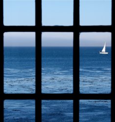
NeverhadaPC I have a power boat and have been trying to capture a good picture of a sail boat for a long time, yet have never been able to do it. Too often, the sail boats I see are not truly photo-worthy, but this one certainly is. The framing of the boat in the picture is wonderful as you allow the reflection of the sail to extend just beyond the bottom. Im a bit troubled by the wall behind the boat as it detracts from my enjoyment of the boat itself and creates a rather abrupt separation between the foreground and background. That can be a good and proper in some circumstances, but it seems out of place here as the subject and other elements of this picture paint a peaceful scene.
luminosity You must know Im a avid wine fan! The framing here is outstanding as Im compelled to reach out and take the glass in hand as soon as the server stops pouring. The conversion to black and white and the graininess of the photo add a certain elegance while focusing my eyes on the object of my desire that glass of red! Very nicely done.
pukifloyd - The Washington Monument as shot from the Lincoln Memorial a classic shot and one Ive tried to capture many times. For me, the framing here is very traditional with the Washington Monument directly in the center of the picture. I like how the lines of the pool do a nice job of leading the eye to the monument. Perhaps if the pool occupied the bottom two thirds with the monument itself in the top third, it would remove the busyness of the crowd and make for an even more compelling photo.
freigeist - I love the way youve broken away from the horizontal and vertical nature of the rule by introducing the diagonal lines of your subject. The framing appears to adhere to the rule, but youve created additional intrigue and perspective by adjusting the lines. As with luminositys photo, the black and white conversion works well, providing the welcome contrast that creates depth. Great photo.
acearchie The wonderful shades of green make for a lovely photo. At first, my eyes seemed to be fighting for focus between the buildings and the horizon youve created in the upper third, but for some reason I think the wall in the foreground helps create a separation between the two that works for me. Im wondering if there might have been room to the left of the photo that would have allowed you to put the road more toward the right of the frame, creating even more of a divide between the forest on the right and the field on the left. Very nice photo.
mtbdudex There must be something about the rule of thirds that brings out the black and white photos. ☺ However; once again the black and white conversion works for me here. The plane is perfectly placed within the frame, giving the perception of the impending take-off. Even with the propellers idle, I get the sense of action and the threaten skies add to the tension. Very nicely done.
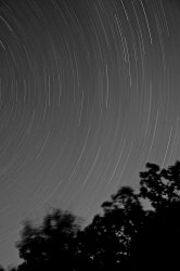
fridgeymonster A very interesting photo - Id love to hear the details about how you created it. The trees in the lower third do a great job of grounding the photo. I can imagine myself laying on a blanket, looking up at the stars and just watching as the night moves by. Im curious how the color version of this photo looks.
JDDavis Youve certainly done a good job of creating tension as Im left more than a little disturbed by the photo. The details and sharpness are brought out by your use of black and white, while the placement of the hand in the upper right gives me a sense that the hand is much too close for comfort. Im not familiar with the piece, but Im sure the artist would be happy with the way youve captured it.
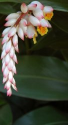
jabbott I love Solvang, so I half expected to see a windmill in the background. ☺ Outstanding detail and very nice separation of the ladybug in the foreground and the flowers in back. The ladybug is off-centered enough to capture my interest and make me wonder what he/she is doing on the bud-less flower. Very nice photo.
feuerschlange Nice juxtaposition of patterns with the bricks level in the bottom third and the building with its horizontal siding slightly askew up top. The placement of the door is very inviting and I find myself very curious as to what is behind it. I probably would have walked right by this door without giving it a second thought, but youve captured enough drama and intrigue that Im glad you didnt.
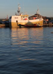
paulg I like the choice of having the water consume the bottom two-thirds of the photo. In doing so, youve directed my eyes to the subject in the upper third. As with the photo by neverhadaPC, I think I would have preferred this boat be out at sea without the distraction of the dock (with its cars and people) in the background and the smaller boat in the foreground. Perhaps a tighter crop that removes the rock (?) on the right hand side and most of the dock would help focus my attention. That being said, I like the absence of people yet the presence of balloons on the boat as it leaves me wondering just what type of celebration took place.
Thank you all once again for entering. Im always amazed at the diversity of the photos each week around a common theme and this one was no different. Without further ado, the winner this week is feuerschlange. Congratulations!

")