mtbdudex - I like this shot. Although not the most original of shots it's well executed and well composed with sharp focus and a pleasingly small DOF. I would perhaps have made a levels adjustment to introduce more black tones but overall a strong image.
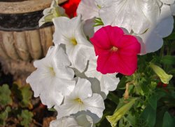
Unpleasant - At first I wasn't sure about this but as I came back to it I started to like it more and more. Convention dictates that having your subject dead centre of the frame is a big no no. Somehow though, I think it works here in a way that I don't think it would have had the patch of white flowers been placed elsewhere in the frame.
fitshaced - (awesome user name by the way) I like the unconventional approach to the theme here, using a static subject, which is normally moving, very clever. Taking the approach you have though in going with a landscape-type shot, I would have liked to have some foreground interest to balance the composition a little better. Also, your image has the opposite problem to that of mtbdudex, in that yours I think has too much in the way of black tones, and white ones too actually. Pulling back on the contrast would have helped this shot enormously I think.
deep diver - I'm not really feeling this shot I'm afraid. It has more of a feel of a snapshot than a well thought out composition for me, although I do like the lighting here.
Keleko - This one intrigued me a great deal. I loved the texture on the hand and I think the reflection underneath helps the image too. Great choice of subject for a black and white conversion too, forcing the viewer to consider the important things about the image - tones, shape and texture. I feel the image has a kind of abstract quality, probably because there is a lack of any kind of sense of scale, which I actually kind of like about it. Well done.
bob118 - I liked this one a lot. While not technically a black and white conversion, there is a very monochrome feel to it and it suits the photo perfectly, again allowing the viewer to appreciate the lines and the tones. A clean, uncluttered background and a good choice of aperture make this shot a success for me.
Love - I'd have loved to have seen a proper, close up shot of that group of leaves in the centre of the frame, with the water drops on them. As it is, they are the interesting part of the photo but they are a bit lost in the frame. The out of focus leave at the bottom centre of the frame I find very distracting too.
Chappers - Is that an orange? I actually really like, and am simultaneously repulsed by this shot! Haha! I like the detail captured in texture of the mould creeping across the surface. I also love the high key white background, which serves to focus attention on the subject. Very well done.
Ravaroo - Something about the composition here throws me off. I think it's the amount of 'dead space' at the top of the frame and the distracting yellow line coming in at the top right. I would have liked to have seen more of the cigar as well as the cutter although I do understand you were trying to make the label a focal point. All in all, a good effort.
Cristian - Another shot that isn't quite working for me I'm afraid. This is one that could have benefitted from having the subject placed off centre to conform more with the rule of thirds. I do like the subject matter though and perhaps a closer crop could have helped to show off the texture and the rust on the hydrant.
epb87 - This one I really liked. This one is all about graphic lines and shapes, and the play of light and shadow. A very abstract approach to the theme, which is very well composed. You should be proud of that shot.
jabbott - I love the colours of this shot. Very bold and with great texture which you have captured well. I may have been tempted to get even closer and really fill the frame with some of that texture.
Razeus - Great shot. Such a simple composition but obviously well thought out. A very retro feel to this shot which I love. I also really like the contrast of the smooth metal and the slightly weathered wood behind. Also, the plug going to the wall really helps here, preventing the right side of the photo just being 'dead space'.
Educ8r - Not really sure about this one. The composition is a bit messy and I'm not really sure where my focus should be directed. The vase of flowers probably needs a bit of 'breathing space' underneath at the bottom of the frame which may have helped.
NeverhadaPC - This could have been a better shot with a couple of changes. The background I find distracting and a clean background, perhaps a high key, white one like Chappers used, may have been a better idea. Also, a smaller aperture would have helped too because I find myself wanting to see more of that great detail and texture in focus.
Phrasikleia - I like this. I like the story here, with the whole debate about Greece potentially leaving the Euro. Good lighting and a good clean background. Well done.
acearchie - I really like this shot. I like that it evokes a feeling of nostalgia, both with the old photographs and the old camera equipment. Really well composed too. The only thing I would say is that I find the two leaves on the table in front of the photos to be kind of distracting. A very small nit pick though with what is still a great image.
Waybo - I love the bright, bold colours in this one. A very well exposed image which has been carefully composed. I like the contrast of the old and the new which blend well together.
NeGRit0 - A great image somewhat spoiled for me by the overdone HDR style processing, which has left an obvious halo around the car on the right. I would have pulled back the tone mapping slightly and, as I find often works, overlaying it on top of the original image at a medium opacity, somewhere around 50%-60%.
The top three for me are:
1st - Razeus
2nd - acearchie
3rd - Phrasikleia
Over to you for the next theme Razeus.