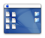
Just a thought: has anyone noticed that the standard OS X folder icon has become extremely dated? The icon, a translucent blue rectangle through which you can see a stripe lined interior, seems to be in need of an update. Since Apple has been going crazy with the number of new interfaces they are adding and their changing of icons for their core apps, you would think that after all of these years they would have modifed such a basic icon, along with other important and dated ones like the application, documents, movies, music, pictures and home icons.
But back to the folder. Even though apple has been making stripes more subtle over the years along with largely removing them from some of their interfaces and replacing them with the "plastic" menu bar, the folder icon is very noticable and very pronounced stripes. This is especially noticeable if you look at a preview of the icon. In addition, the shade of blue used represents the earlier representation of the aqua theme and doesnt really match with anything else.
I think a better representation of the folder might be to keep the translucent exterior but to replace the striped interior with a metal one.


