Hopefully by final version of iOS 7 the folder transparency and color has some content awareness logic added. If you had a background with light color at top and dark color at bottom, it chooses the light color to be the folder color.
Got a tip for us?
Let us know
Become a MacRumors Supporter for $50/year with no ads, ability to filter front page stories, and private forums.
Folder transparency needs content awareness logic
- Thread starter imaginex20
- Start date
- Sort by reaction score
You are using an out of date browser. It may not display this or other websites correctly.
You should upgrade or use an alternative browser.
You should upgrade or use an alternative browser.
Hopefully by final version of iOS 7 the folder transparency and color has some content awareness logic added. If you had a background with light color at top and dark color at bottom, it chooses the light color to be the folder color.
That would be very interesting, but how about a folders setting, you could even choose a wallpaper or different transparent color for your folder background
 that would be interesting,
 I would LOVE to have transparency slider to choose how transparent you would like, I think completely transparent would look AMAZING! maybe a light border.
But wait, that would make you in control of how your phone looks, thats no good.. right?
I would LOVE to have transparency slider to choose how transparent you would like, I think completely transparent would look AMAZING! maybe a light border.
There's a jailbreak tweak that lets you do this, and I love it. I'm using it now without a border, just the folder name in the top left corner. But it also looks very nice with a border, too.
I absolutely hate that the folder grid is 3X3. Why did you do that Apple?! couldn't you keep it at 4X3 or 4X4 to follow the desktop grid? geez.
There's a jailbreak tweak that lets you do this, and I love it. I'm using it now without a border, just the folder name in the top left corner. But it also looks very nice with a border, too.
Screenshot?
Can't upload pics now, will post later tonight.
Thanks. I look forward to seeing it.
There's a jailbreak tweak that lets you do this, and I love it. I'm using it now without a border, just the folder name in the top left corner. But it also looks very nice with a border, too.
Screenshot?
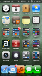
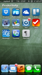
Ok, so, one image is my home screen, and the other is the Productivity folder when it's open.
The JB tweak is called InfiniFolders, because you can put as many icons into this folder as you want (once a screen becomes full, it starts creating more pages inside the folder like in iOS 7). I never put that many icons into a folder, however.
Attachments
Ok, so, one image is my home screen, and the other is the Productivity folder when it's open.
The JB tweak is called InfiniFolders, because you can put as many icons into this folder as you want (once a screen becomes full, it starts creating more pages inside the folder like in iOS 7). I never put that many icons into a folder, however.
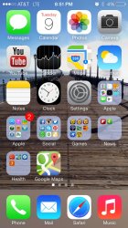
I was referring to the closed folders transparency that needs content awareness. Notice how the folder color on the bottom are blueish because of the sky? I want them to be brown to match the dock and folders near Tyne Sky would be blueish
Attachments
I wish they would just make them straight glass rather than trying to tint them. I don't mind the new pastel colors but the folder tints are pretty terrible, especially if you have a background with a lot of different colors. Same goes for the dock, it is completely against Apples design video. The dock does not "blend in and let your content out" I have a great wallpaper with a lot of complexity and then at the bottom of the screen a pastel blue bar.
Hopefully by final version of iOS 7 the folder transparency and color has some content awareness logic added. If you had a background with light color at top and dark color at bottom, it chooses the light color to be the folder color.
I agree completely. As it is now, it chooses a single color for all folders. Instead, the color for each folder should be based on the portion of the wallpaper the folder is covering.
Because a 4x4 grid would look horrible when zoomed out to the thumbnail icon. Remember this is a zoomable interface now.I absolutely hate that the folder grid is 3X3. Why did you do that Apple?! couldn't you keep it at 4X3 or 4X4 to follow the desktop grid? geez.
Register on MacRumors! This sidebar will go away, and you'll see fewer ads.