Become a MacRumors Supporter for $50/year with no ads, ability to filter front page stories, and private forums.

grahamperrin

macrumors 601
Original poster
Jun 8, 2007
4,942
648
To avoid further repetition, spun off from two or more topics:

Titles and addresses in Safari in seeded build 14A298i of OS X 10.10

A question today in UX (User Experience) Stack Exchange:

The first answer, from me, focuses on a bug that was treated as high priority (seriously broken …) and critical. Fixed in February of this year. The title of that bug:

Difficult to see web site title with the new toolbar/header bar

Context, in Ask Different Chat: http://chat.stackexchange.com/transcript/message/16797050#16797050

Title bars in general

… the actual titlebar, aka "the name of this current window", then I definitely think these should stay for some apps. For example, I'm a huge fan of this thing and really don't want to see it go. … it would definitely take some time with the drawing board to implement it everywhere.

Anyway, yeah I agree that just removing titlebars in places where it would harm usability is a horrible idea.

If for example we view Calculator alone, whilst it's in front (with the application name in the menu bar), it's recognisably a calculator.

Instead: on a peripheral display, allow most of the window of the app to fall behind windows of other apps – some of which might have no title, some of which might be completely without an identifying area … give it time, obscurities such as this may occur naturally (not contrived) sooner than you imagine.

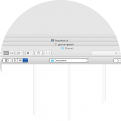
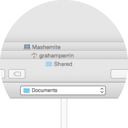
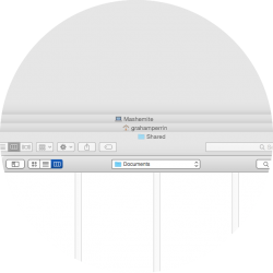
There's the bar, no title.

From the untitled bar alone, can you recognise the app?

Also: consistency. Accepting that removal of all title bars would be horrible, can Apple arrive at a pleasingly consistent approach to either (a) leaving that space blank or (b) populating it with interface elements? And can third party developers arrive at an equally pleasing consistent approach to blankness or population?

Also: proxy icons, proxy icon menus.

And so on …
 

grahamperrin

macrumors 601
Original poster
Jun 8, 2007
4,942
648
So, 14A314h is with testers. I haven't seen it yet …

You can view full website address …

That'll be sane.

(How could anyone call the domain – the domain alone – an address? "I live at: UK" is nothing like an address.)

A minor observation: Smart Search Field is not the best description for something that primarily presents neither the word 'Search' nor a search icon.

Mozilla's approach to description and help is much clearer. There's a bar that primarily shows the address, so it's called an address bar and people can "perform web searches right from the address bar".

A truer description for what Apple has done would be domain field or smart domain field, and people can "perform searches with the domain field".

----

Still bad, presumably: the inconsistencies and lack of coherence caused by abandonment of the title bar concept. A recipe for more inconsistency and mess in the future.
 

grahamperrin

macrumors 601
Original poster
Jun 8, 2007
4,942
648
Gloss, polish … and uncharacteristic crap from Apple – if you look closely

http://asciiwwdc.com/2014/sessions/209

Apple:

… allow there to be more space for content.

So now there's this unified toolbar that does what a title bar and a toolbar had done before.

By unifying those elements, there's now more physical space …

A Google search for Apple's new NSWindow property for hidden window titles. Top hit, a question from a developer – someone who's mainly doing … web standards development at WHATWG/W3C:

http://stackoverflow.com/q/24023000/38108

Developer, in plain english:

… the "fat titlebar" kind of window that has toolbar integrated with other gadgets in the window's title bar, like in the new Safari …

So: unified, integrated, space-saving and … fat.

Apple:

… the thing that you really care about, which is the webpage itself. …

Pause for a moment. Is the title of a book not part of that book? Think of a printed book, a book with chapters, it's customary to have the chapter title at the head of a page. Why is it customary? Simply: it can be very useful to some readers.

Is the title of a page not a part of that page?

----

Apple:

… Safari has some special things that makes this work, one of which is that they have put the window title into the combined URL and search field.

And so you could still see the window title, even though there's no title bar. …

… [applause]

If the speaker had paused whilst saying "you could still see the window title", the audience might have noticed that no, they could not see the title:

BuOoSznCcAAKH8T.png


Special? I think not. Maybe it went unnoticed in the excitement of WWDC. With or without excitement: that failure to demonstrate a basic understanding of the concept of web page titling – whilst proudly presenting features of a web browser – is not indicative of Apple developing the best software. There's either horrible confusion as a basis to that failure, or – if Apple truly understood things – an intention to mislead the audience. I hope it's the former.

Yes there's gloss, yes there's polish, and the massive fan base, but scratching the surface quickly reveals something that's quite wrong.

----

So. Cut the crap, please, Apple.

The fifth developer preview, 14A314h, acknowledges the value of showing the address of a page. It's allowed. A preference.

At WWDC, Apple reinforced the importance of the web page and pleased the audience by describing visibility of the page title in an integrated, multipurpose, space-saving bar. In truth, that bar never shows the title.

So. This previously happy Apple customer would be pleased to see the title and the address in Yosemite. How might that be done? Maybe you could have …

… something more novel than a bar that saves space with some fatness.

How about: an even fatter bar? Yes, that'll do it. Fat enough (deep enough) to match the depth that was previously occupied by a recognisable title bar and a recognisable address bar.

Now: how much space is saved?

Is this truly working out as intended by the designers at Apple?

There's too strong an odour of change for the sake of change. It's a fifth developer preview public beta stench that can trigger (a) sarcasm and (b) serious concern that Apple might refuse to admit a mistake until it's too late.
 
Last edited:

grahamperrin

macrumors 601
Original poster
Jun 8, 2007
4,942
648
Removing titles is severely disorienting

Defocusing from Safari, revisiting Yosemite as a whole. Developer Preview 5.

I ran Yosemite for a few minutes, aiming to give it an umpteenth chance. I see many exquisite things but I was soon reminded that those things are within a mash-up that is somewhat deranged.

Titles. An feature of windows for around thirty years (or from my point of view, more than two decades). Suitable for people who read words. An essential, according to established human interface guidelines.

"Maybe we should celebrate the anniversary of this successful, refined and highly respected operating system by refreshing its appearance. Titles are debatably a waste of space, debatably passé. Let's make make abandonment of that essential a novel and laudable part of this refresh."

Seriously: did any person or group at Apple think that, or anything like that? Did no highly respected individual at Apple attempt to explain to designers of the interface that discarding an essential could prove disorienting to some users? Did designers listen but disbelieve? Whatever the answers to those questions, the end results include hallmarks of derangement stamped repeatedly over the operating system. I applaud Apple for a bold public experiment; for pushing boundaries; but I remain utterly gobsmacked that a relatively deranged design should be forced upon all beta testers by a company as esteemed as Apple.

Back to my few minutes with Yosemite. The multiple moments, split-seconds, of the interface failing to convey what was required when required. Some of those moments were no more than grating.

Then I quit a couple of apps and – for the umpteenth time since I began testing – there naturally occurred a disorienting appearance that was gobsmacking. I took time out to analyse it. The screenshots below may help readers to understand some of what's wrong. I circled some things for myself then viewed each image in isolation, with an open mind, to realise the likeliest explanation.

My immediate focus on what remained after quitting apps was not exactly like this:

attachment.php


It was more like this:

attachment.php


The focus was exactly like this:

attachment.php


Not the front window.

Not the icon to the left of the first apparent title.

Not the left of a title.

My immediate focus was the centre of the title of the first apparent window. Given the decades of presentation of the essential approach to identifying a window, it should come as no surprise that my immediate focus was on the first apparent title.

Problems such as disorientation

For starters, the word that was most immediately recognisable to the human eye was completely unrelated to the thing that the operating system treated as being in focus. The wrong app.

Some Yosemite context:

attachment.php


Is it imaginable that such an approach to 'streamlining' would ease a customer's navigation of the various interfaces comprised within the system?

A simple improvement

Respect the essential that is respected by Mavericks:

attachment.php


– there's a title.
 

Attachments

  • not like this.png
    not like this.png
    40.4 KB · Views: 1,878
  • more like this.png
    more like this.png
    40.2 KB · Views: 1,852
  • dead centre of the first apparent title.png
    dead centre of the first apparent title.png
    21.9 KB · Views: 3,180
  • mash of the day.png
    mash of the day.png
    111.7 KB · Views: 2,702
  • 2014-08-17 17-44-42 screenshot.png
    2014-08-17 17-44-42 screenshot.png
    169.2 KB · Views: 1,868

dsemf

macrumors 6502
Jul 26, 2014
434
107
What app is displaying the top window? It sort of looks like an open dialog window.

DS
 

afsnyder

macrumors 65816
Jan 7, 2014
1,270
33
Defocusing from Safari, revisiting Yosemite as a whole. Developer Preview 5.

I ran Yosemite for a few minutes, aiming to give it an umpteenth chance. I see many exquisite things but I was soon reminded that those things are within a mash-up that is somewhat deranged.

Titles. An feature of windows for around thirty years (or from my point of view, more than two decades). Suitable for people who read words. An essential, according to established human interface guidelines.

"Maybe we should celebrate the anniversary of this successful, refined and highly respected operating system by refreshing its appearance. Titles are debatably a waste of space, debatably passé. Let's make make abandonment of that essential a novel and laudable part of this refresh."

Seriously: did any person or group at Apple think that, or anything like that? Did no highly respected individual at Apple attempt to explain to designers of the interface that discarding an essential could prove disorienting to some users? Did designers listen but disbelieve? Whatever the answers to those questions, the end results include hallmarks of derangement stamped repeatedly over the operating system. I applaud Apple for a bold public experiment; for pushing boundaries; but I remain utterly gobsmacked that a relatively deranged design should be forced upon all beta testers by a company as esteemed as Apple.

Back to my few minutes with Yosemite. The multiple moments, split-seconds, of the interface failing to convey what was required when required. Some of those moments were no more than grating.

Then I quit a couple of apps and – for the umpteenth time since I began testing – there naturally occurred a disorienting appearance that was gobsmacking. I took time out to analyse it. The screenshots below may help readers to understand some of what's wrong. I circled some things for myself then viewed each image in isolation, with an open mind, to realise the likeliest explanation.

My immediate focus on what remained after quitting apps was not exactly like this:

Image

It was more like this:

Image

The focus was exactly like this:

Image

Not the front window.

Not the icon to the left of the first apparent title.

Not the left of a title.

My immediate focus was the centre of the title of the first apparent window. Given the decades of presentation of the essential approach to identifying a window, it should come as no surprise that my immediate focus was on the first apparent title.

Problems such as disorientation

For starters, the word that was most immediately recognisable to the human eye was completely unrelated to the thing that the operating system treated as being in focus. The wrong app.

Some Yosemite context:

Image

Is it imaginable that such an approach to 'streamlining' would ease a customer's navigation of the various interfaces comprised within the system?

A simple improvement

Respect the essential that is respected by Mavericks:

Image

– there's a title.

The title is there, but its an actionable title. You can click the title to change locations. Is that really such a terrible thing? Also, your first and second images are identical.
 

grahamperrin

macrumors 601
Original poster
Jun 8, 2007
4,942
648
What app is displaying the top window?

Thanks for asking. If you don't mind an obtuse answer: I could name the app, but it's more relevant to this topic to note that almost nothing on screen was visually more distant, from my areas of focus, than the name of the app.

… It sort of looks like an open dialog window.

I'll go with sort of looks like that, whilst also sort of looking like a number of other things.

In the moments following focus on the title, I naturally perceived a sheet (a drop-down). Because unless I'm missing something, nothing in Yosemite prevents the top line of a thing from naturally appearing in perfect alignment with the bottom line of a bar, in this case the title bar.

But then hang on, maybe that thing was not a sheet. Was it even something from Finder? After scanning other titles in the vicinity my eye began scanning other areas of the screen. Beginning with the things within a relatively small radius of those titles.

Ah, some buttons. So it's not the most commonplace type of sheet or window, but it does have a Finder columns-like appearance and it's joined to that Finder window to which the system first drew my attention. It is joined, isn't it? No, it's not.

OK, it's a sheet-like Window. Probably not of Finder, because I don't recall any recent action in Finder that might have triggered an Open… dialogue. Since my eye was travelling down the screen it continued to the Dock but there, it wasn't obvious which app other than Finder presented the dialogue so then …

… up to the opposite vertical extremity, and to the word on the extreme left but not quite as far as the Apple menu.

And the name of the app was …

;)

----------

The title is there …

The title of what? And where?

your first and second images are identical.

They are not. I took great care with the images and with that post. The difference is subtle.
 
Last edited:

tkermit

macrumors 68040
Feb 20, 2004
3,582
2,909
So, in comparison, what does the scenario you presented actually look like under Mavericks? :confused:

And, yes, you might want to actually tell us the name of the app you were using...
 
  • Like
Reactions: grahamperrin

tkermit

macrumors 68040
Feb 20, 2004
3,582
2,909
There's a Mavericks screenshot from me at the foot of post 4 above.

Are you saying the dialog from your Yosemite screenshot is displayed by Preview.app as well, and you're logged into iCloud in both scenarios? Let's compare apples to apples here...
 

afsnyder

macrumors 65816
Jan 7, 2014
1,270
33
Thanks for asking. If you don't mind an obtuse answer: I could name the app, but it's more relevant to this topic to note that almost nothing on screen was visually more distant, from my areas of focus, than the name of the app.


I'll go with sort of looks like that, whilst also sort of looking like a number of other things.

In the moments following focus on the title, I naturally perceived a sheet (a drop-down). Because unless I'm missing something, nothing in Yosemite prevents the top line of a thing from naturally appearing in perfect alignment with the bottom line of a bar, in this case the title bar.

But then hang on, maybe that thing was not a sheet. Was it even something from Finder? After scanning other titles in the vicinity my eye began scanning other areas of the screen. Beginning with the things within a relatively small radius of those titles.

Ah, some buttons. So it's not the most commonplace type of sheet or window, but it does have a Finder columns-like appearance and it's joined to that Finder window to which the system first drew my attention. It is joined, isn't it? No, it's not.

OK, it's a sheet-like Window. Probably not of Finder, because I don't recall any recent action in Finder that might have triggered an Open… dialogue. Since my eye was travelling down the screen it continued to the Dock but there, it wasn't obvious which app other than Finder presented the dialogue so then …

… up to the opposite vertical extremity, and to the word on the extreme left but not quite as far as the Apple menu.

And the name of the app was …

;)

----------


The title of what? And where?


They are not. I took great care with the images and with that post. The difference is subtle.

The title is there. "*folder icon* Documents" click the title and you can access different sections. It's an "actionable title" as I like to put it. In your first and second screenshot (the second still doesn't have any difference that seems to make a difference in how I interpret what I'm seeing)
 

grahamperrin

macrumors 601
Original poster
Jun 8, 2007
4,942
648
The title is there. "*folder icon* Documents" …

That's not a title.

It's a list item, an exclusive choice, in a pop-up menu that appears as a window-frame control.

By logging in to Yosemite as a different user, I realised that the Yosemite images in post 4 almost certainly represent an additional appearance bug. If so – and if the first user experience had been fixed to match that of the second user – there remains a critical problem.

Mavericks successfully emphasises the first thing that is naturally in my focus area in the first moment, the split-second following sight of an object. Knowing that human interface guidelines reflect more than thirty years of good practice, it is no surprise that there's the emphasis; and that the emphasis in Mavericks is naturally on the thing that is most important to me in that first moment.

Yosemite has removed that most important thing, that which defines a first impression of a window. Gone.

In your first and second screenshot (the second still doesn't have any difference that seems to make a difference in how I interpret what I'm seeing)

The centres of the images differ.

The first large circular image centred on the area that you interpreted as a title in posts 6 and 13 above. That was neither a title, nor my immediate area of focus.

The second large circular image centred on what was my immediate area of focus: a title bar, with an essence at its centre.
 

afsnyder

macrumors 65816
Jan 7, 2014
1,270
33
That's not a title.

It's a list item, an exclusive choice, in a pop-up menu that appears as a window-frame control.

By logging in to Yosemite as a different user, I realised that the Yosemite images in post 4 almost certainly represent an additional appearance bug. If so – and if the first user experience had been fixed to match that of the second user – there remains a critical problem.

Mavericks successfully emphasises the first thing that is naturally in my focus area in the first moment, the split-second following sight of an object. Knowing that human interface guidelines reflect more than thirty years of good practice, it is no surprise that there's the emphasis; and that the emphasis in Mavericks is naturally on the thing that is most important to me in that first moment.

Yosemite has removed that most important thing, that which defines a first impression of a window. Gone.


The centres of the images differ.

The first large circular image centred on the area that you interpreted as a title in posts 6 and 13 above. That was neither a title, nor my immediate area of focus.

The second large circular image centred on what was my immediate area of focus: a title bar, with an essence at its centre.

If I didn't notice much of a difference, and my cousin who has no technological experience didn't notice... then it's unimportant for the masses and thus just a silly nitpick you have. Yes, I do understand that the title bar is essential, but seeing as people don't really seem to care all that much.... its ok that they tried something new.
 

Fuchal

macrumors 68030
Sep 30, 2003
2,607
1,086
That's a pretty terrible experience. I hope they'll iron out a lot of these issues. They seem to be making fairly substantial changes from beta to beta.

I know as a UX professional I'd never let something like that ship.

Personally, I've not had such severe issues with Yosemite, but I'm running it on an 11" Air - and I think a lot of the overlap issues are very uncommon with that screen size.
 

grahamperrin

macrumors 601
Original poster
Jun 8, 2007
4,942
648
Chat with developers about presence of the title in the Web browser


I had some nice brief chats with one of the maintainers for WebKitGTK+, with a GNOME developer and with GNOME Foundation member Yosef Or Boczko (yoseforb).

Presence of the title in the header bar of GNOME Web

http://ux.stackexchange.com/a/63749/16809 for a summary of points made by Gustavo Noronha Silva (kov) and Carlos Garcia Campos (KaL).

Incidentally

When Yosef first saw Apple's preview screenshot of Safari 8 –


– he commented on the similarities between Apple's work, and the earlier work on the header bar for GNOME Web. He offered a shot of epiphany-3.10:

 
Last edited:

grahamperrin

macrumors 601
Original poster
Jun 8, 2007
4,942
648
… no modern browser has proper title bars anymore — everyone is moving to having titles on tabs.

An example of recent development


OmniWeb test builds for OS X 10.9.0 or later, from The Omni Group – eight builds since Yosemite was announced.

A less modern browser

… In Japan this browser takes NO1 market shares and followed by IE 10. …

A thought-provoking approach to tabs-on-top, with plenty of space for the title at the top. A Sleipnir window with two tabs:


It's not a browser for me, but it's useful to compare:
  • a Safari 4 approach to streamlining (tabs on top)
  • a Sleipnir approach to streamlining (tabs on top, title on top, context-sensitive)
  • a Safari 8 approach to streamlining in pre-release build 14A343f of Yosemite (never the <title> on top, either the domain or the address on top)
  • a GNOME Web approach to streamlining (title on top, address on top, context-sensitive).

For me, the current pre-release Safari 8 is worse than the Safari 4 experiment. With Safari 4 at least I could get part of the title on top.

The Activity window of Safari

It's no longer a feature of Safari (missing from version 7 etc.). I most often used it to bring tabs or windows to front.

The Workspaces window of OmniWeb is equally effective. Simply double-click a title; wherever that window or tab is, it will come to the front.

Side note: now I recall, my use of the Activity window was extremely frequent; a double-click on a title alone, within the nearly omnipresent list of titles, was my preferred method of navigation. I kept the Activity window in the top right corner …

… reminiscent of the application switcher in Classic versions of Mac OS, the Activity window of Safari was my much loved, extremely frequently used, title-based page switcher. This may go towards explaining why I find it so difficult to work without a title in the title bar of Safari 8 …
 

Attachments

  • OmniWeb title bar, tabs and workspaces.png
    OmniWeb title bar, tabs and workspaces.png
    350.6 KB · Views: 1,657

grahamperrin

macrumors 601
Original poster
Jun 8, 2007
4,942
648
If I become quiet in MacRumors, the reason will probably be feedback to Apple with reference to relevant points in discussion here. …

From my feedback today:

The toolbars of Safari … 8.0 in Yosemite should be fixed in the same way that the header bar of GNOME Web was fixed. …

Now, my quiet time begins …
 

grahamperrin

macrumors 601
Original poster
Jun 8, 2007
4,942
648
For reference only

Last week, to Apple, in Feedback Assistant:

A few weeks ago I made a suggestion:

> The toolbars of Safari 7.1 and 8.0 in Yosemite should be
> fixed in the same way that the header bar of
> GNOME Web was fixed.

After further thought, I should probably retract that suggestion.

With GNOME Web, which has a sparse header bar (few buttons), there's a reasonably high likelihood that the bar will show the title in its entirety.

With Safari, which is likely to have more buttons, there's less likelihood that the bar would be able to show the title in its entirety.

And finally:

To summarise: I treat the removal of the title bar as a regression.

In most tests of Yosemite, working without the title bar became unbearably annoying.

I continue to prefer Mavericks, and don't expect that preference to change.

More broadly, the Yosemite/Safari 8 experience has turned me off Apple products; I no longer plan to buy an iPhone, and so on.
 

grahamperrin

macrumors 601
Original poster
Jun 8, 2007
4,942
648
… is there a way to change the search/url box from a fixed-width box in the middle of the toolbar …

Not to my knowledge. If I recall correctly, the limited width is amongst the negative criticisms of Safari in the recent review in Ars Technica.

If Safari had a title bar, as it should have, then I would expect more space to show the URL.
 
Register on MacRumors! This sidebar will go away, and you'll see fewer ads.