Become a MacRumors Supporter for $50/year with no ads, ability to filter front page stories, and private forums.

eatrains

macrumors 6502a
Original poster
Mar 11, 2006
693
5,053
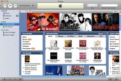
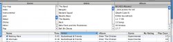
I, like many of you, wasn't happy with the changes Apple made to the iTunes UI in version 7. So I modified the resource file and used a combination of iTunes 6 elements and my own creations to return iTunes 7 to the Aqua look and feel.

To install, download and decompress the iTunes.rsrc.zip file linked below. Then find your copy of iTunes, right- or control-click on it and choose Show Package Contents. Navigate to Contents>Resources and rename the iTunes.rsrc in there so you'll have a backup. Then put the new one you downloaded in that folder and start up iTunes.

I created and tested this in 10.3.9, though I don't know of a reason why it won't work on Tiger. The usual warnings apply: use at your own risk, I'm not responsible for any damage, yadda yadda yadda.


http://eatrains.spymac.com/iTunes.rsrc.zip
 

Attachments

  • itunes.jpg
    itunes.jpg
    167.9 KB · Views: 390
rtdgoldfish said:
Isn't this the same thing as posted here??

If so, WTG at trying to get credit for other people's work by renaming the file and hosting it on your own site....

I hadn't seen that site before, though when making this I was sure I wasn't the first to do so. After looking at the screenshot from the link you posted, I noticed a few differences, one of which being I have "aquified" the view buttons.
 
Is there any chance you could put the visualizer/equalizer buttons back?
 
Thanks! I just realized that I pretty much hate the entire look of iTunes 7, from the icon to the black selection indicator. I feel a lot better now.
 
2nyRiggz said:
Why would I download that...It looks the same except it has the gloss effect and blue bar...maybe its just me that thinks iT7 is an improvement over 6.


Bless
I second that. The aqua isn't necessary to the look of itunes. In truth, I like the new buttons but I don't like the black/blue selectors...but that is all I do not like.
I don't even care that it's not aqua anymore. I think if the aqua scroll bars were back and left the rest then ok. Nonetheless good work, I just don't see a need to move.
 
eatrains said:
I hadn't seen that site before, though when making this I was sure I wasn't the first to do so. After looking at the screenshot from the link you posted, I noticed a few differences, one of which being I have "aquified" the view buttons.

There are many of these floating around. As far as I can tell, there is quite a large backlash against certain new elements. (awful scrollbars, crappy new play buttons...)

User Lixivial has been plodding away on one in a different thread... there is another one called AguaT on the various software sites... I am going to give this one a go though. Looks nice. Anything's better than the new look!
 
Here's some feedback for you as I'm running it now- I think you've covered all the major bases. One thing that is missing is you've forgot to switch the headers for when you are in browse mode.
 

Attachments

  • wrong-headers.jpg
    wrong-headers.jpg
    74.5 KB · Views: 155
decksnap said:
Here's some feedback for you as I'm running it now- I think you've covered all the major bases. One thing that is missing is you've forgot to switch the headers for when you are in browse mode.

Those have always been gray.
 
hmm. right you are. sorry. :)

How about the background color of the side pane? Are you planning on fixing that?
 
jessica. said:
I second that. The aqua isn't necessary to the look of itunes. In truth, I like the new buttons but I don't like the black/blue selectors...but that is all I do not like.
I don't even care that it's not aqua anymore. I think if the aqua scroll bars were back and left the rest then ok. Nonetheless good work, I just don't see a need to move.

Agreed. People are saying that this is the preview to Leopard's UI but no one realizes that Time Machine was. The scroll bar to the coverflow is the same as Time Machine's Header...thing haha
 
Register on MacRumors! This sidebar will go away, and you'll see fewer ads.