Become a MacRumors Supporter for $50/year with no ads, ability to filter front page stories, and private forums.

Samwise592

macrumors regular
Original poster
Feb 4, 2007
163
0
Long Island, NY
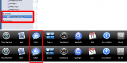
this might have been posted before, but about half way through the "mail" sneak peak, when he says "You can even zoom in and out on your photos to make them look just right" the slider bar he uses, it's the same as the screen sharing menu in iChat. If Leopard's getting a makeover, i'd put all my money on that clean-cut transparent black theme.
 
the screen sharing window is pretty good looking (not to mention the function itself, seems perfect for helping novice users in galaxy far far away). But a whole system around that. Maybe its just but that seems maybe like too much of a good thing. I dont know maybe i will be proven completely wrong and love It if that is the final look
 
On this post in the topic "Leopard UI - Any news on changes?" an image was posted. If you look at that image, on the side bar under "Saved" the folder "Photoshop apps" is selected with a white glow around it. I also noticed this (white glowing) feature on the Leopard Sneak Peek page when you hover over the different features (Time Machine, 64-Bit, etc) it has that same glowing feature.
I'm still not sure if I like it, though. Do you?
And, do you think it'll be included in Leopard?
 

Attachments

  • image.png
    image.png
    109.5 KB · Views: 180
It would be nice to have a themes tab in system preferences and you could choose
1)Brushed Metal
2)Plastic Metal - i.e. iTunes style
3)Blackqua (AKA blahqua)
4)Translucent (like Vista but much better)
 
It would be nice to have a themes tab in system preferences and you could choose
1)Brushed Metal
2)Plastic Metal - i.e. iTunes style
3)Blackqua (AKA blahqua)
4)Translucent (like Vista but much better)

Mmm...like a buy-out of shapeshifter?
 
Register on MacRumors! This sidebar will go away, and you'll see fewer ads.