With the new Pro model now released I was looking forward to a slightly bigger screen without going all the way to a plus/max size, both for increased real estate and a better typing experience. However, I’m struggling to see a material difference between a 6.1 to a 6.3 screen when doing side by side comparisons in-store. Of course, daily use might be different, so wondering if any 16 Pro owners else feels the increased screen size is a genuine quality of life improvement?
Got a tip for us?
Let us know
Become a MacRumors Supporter for $50/year with no ads, ability to filter front page stories, and private forums.
iPhone 16 Pro 6.1 v 6.3 screen
- Thread starter Total Respray
- Start date
- Sort by reaction score
You are using an out of date browser. It may not display this or other websites correctly.
You should upgrade or use an alternative browser.
You should upgrade or use an alternative browser.

I agree with your assessment. On a different note, I was disappointed in the iPad mini 7 update and so I was considering going from my 13PM to 16PM since it is a bit bigger. I went to see them in store and the 16PM seems just the slightest tad taller than my 13PM but does not appear (at least as far as I can tell) to be any wider. So I found myself looking at the iPad Pro 11. It has an awesome screen size and is incredibly light in the hand. (Sadly for my bank account, I always find myself drawn to the most expensive devices 🙄).
With the new Pro model now released I was looking forward to a slightly bigger screen without going all the way to a plus/max size, both for increased real estate and a better typing experience. However, I’m struggling to see a material difference between a 6.1 to a 6.3 screen when doing side by side comparisons in-store. Of course, daily use might be different, so wondering if any 16 Pro owners else feels the increased screen size is a genuine quality of life improvement?
according to data sheets the width of a 16pro is the same as pros from previous years, but it's 1.3mm taller and the bezels are thinner which in the end makes the screen 6.3" vs 6.1" previously without changing much on the outside.
So basically the gain in .2" is nothing more than making the display taller? If so that is worthless to me, they should have kept the display aspect ratio the same as the previous models then it would be a bigger display.according to data sheets the width of a 16pro is the same as pros from previous years, but it's 1.3mm taller and the bezels are thinner which in the end makes the screen 6.3" vs 6.1" previously without changing much on the outside.
If you aren't going to make the screen wider, which is what makes everything appear slightly bigger, then to me that is false and misleading advertising because its not a bigger display, its just a taller display.
The bezels were decreased so it’s both wider and taller.So basically the gain in .2" is nothing more than making the display taller? If so that is worthless to me, they should have kept the display aspect ratio the same as the previous models then it would be a bigger display.
If you aren't going to make the screen wider, which is what makes everything appear slightly bigger, then to me that is false and misleading advertising because its not a bigger display, its just a taller display.
At least it gained a tiny bit of width then. Thank you for the info.The bezels were decreased so it’s both wider and taller.
No problem. Enjoy those extra 27 pixels in width 😅At least it gained a tiny bit of width then. Thank you for the info.
So for anybody still interested, I was able to test a 6.3 Pro this weekend and compared it in detail to my 12. There was no tangible difference. Yes, in certain apps (eg Maps) you see a few mm of extra detail in each direction but in other apps (eg Safari) I found virtually no difference at all. I think I realised why - its the Dynamic Island which is thick and low. When combined with the fact that most apps have a ’header’ section which has to accommodate the DI, this meant that the header was a decent way down from the top of the screen thus negating much of the benefit of the increased height. The remaining space for the body of the app has only an immaterial amount of extra space.
If the rumours are true about a smaller DI next year, maybe this will better liberate those extra 0.2 inches. Until then, I plan to stay with my 12 which is holding up great.
Edit: the difference between 6.1 v 6.3 may be more noticeable when comparing phones that both have DI but I did not compare.
If the rumours are true about a smaller DI next year, maybe this will better liberate those extra 0.2 inches. Until then, I plan to stay with my 12 which is holding up great.
Edit: the difference between 6.1 v 6.3 may be more noticeable when comparing phones that both have DI but I did not compare.
Last edited:
Did you test with webpages by chance?So for anybody still interested, I was able to test a 6.3 Pro this weekend and compared it in detail to my 12. There was no tangible difference. Yes, in certain apps (eg Maps) you see a few mm of extra detail in each direction but in other apps (eg Safari) I found virtually no difference at all. I think I realised why - its the Dynamic Island which is thick and low. When combined with the fact that most apps have a ’header’ section which has to accommodate the DI, this meant that the header was a decent way down from the top of the screen thus negating much of the benefit of the increased height. The remaining space for the body of the app has only an immaterial amount of extra space.
If the rumours are true about a smaller DI next year, maybe this will better liberate those extra 0.2 inches. Until then, I plan to stay with my 12 which is holding up great.
Edit: the difference between 6.1 v 6.3 may be more noticeable when comparing phones that both have DI but I did not compare.
Yes, in Safari. Just a couple of millimetres extra content vertically.Did you test with webpages by chance?
That is very unfortunate but thank you for the info. Looks like the the "Display size increase" isn't actually real. They should have kept the display aspect ratio 19.5:9Yes, in Safari. Just a couple of millimetres extra content vertically.
This was more cosmetic change because they reduced display frames. In reality there is no noticeable difference between 6.3” or 6.1” when you hold iPhone 16 Pro in hand (similar width).
Last edited:
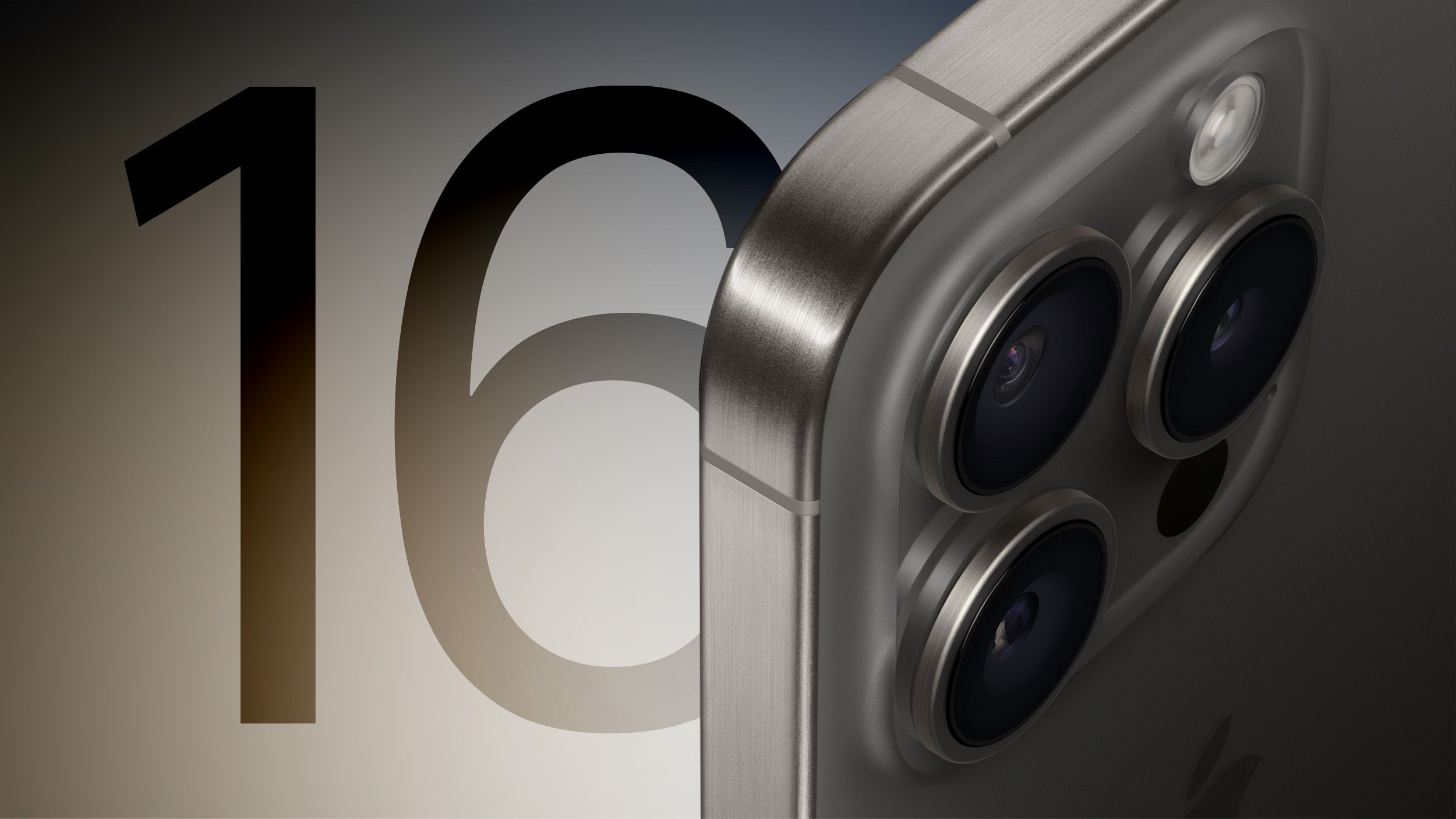
I thought I read somewhere that the size increase was to accommodate the tetraprism lens for the smaller Pro model.
Edited - link found:
 www.macrumors.com
Edited - link found:
iPhone 16 Pro Again Rumored to Include Tetraprism Telephoto Lens With 5X Optical Zoom
Both the iPhone 16 Pro and iPhone 16 Pro Max will include Apple's tetraprism Telephoto lens with improved zoom capabilities, Apple analyst Ming-Chi Kuo reiterated today. Apple introduced a new tetraprism lens system for the iPhone 15 Pro Max, enabling 5x optical zoom for the first time. The...
www.macrumors.com
Last edited:
That's good that it helps a little. I feel the 6.1" is just too small, so I got a 15 Plus and its too big. I was hoping the new phone would be a true 6.3" but I guess it isn't, probably more like a 6.2" display in regards to the width.It's not much, but the 16 Pro screen is 2.0 mm wider than the 13 Pro screen. I think it helps a tiny bit, especially for typing.
For comparison, the 16 Pro Max has a 6.3 mm wider screen than the 16 Pro.
I too tried a 16 Pro Max for a few days and also came to the conclusion it was too big (I like 1-handed use a lot, and felt unstable with the lesser grip). "Regular" Pro is the sweet spot for me, even though sacrifice is some battery and screen real estate.That's good that it helps a little. I feel the 6.1" is just too small, so I got a 15 Plus and its too big. I was hoping the new phone would be a true 6.3" but I guess it isn't, probably more like a 6.2" display in regards to the width.
Personally, I did see a small difference going from 15 pro to 16 pro. Interestingly, I noticed that I am doing less mistakes when typing, but that can be also Placebo.
I recently switched from a 14 PM to a 16 PM and the size difference actually is barely noticeable. But it is welcomed anyway. Just don’t make the swap just for screen dimensions because you will be disappointedWith the new Pro model now released I was looking forward to a slightly bigger screen without going all the way to a plus/max size, both for increased real estate and a better typing experience. However, I’m struggling to see a material difference between a 6.1 to a 6.3 screen when doing side by side comparisons in-store. Of course, daily use might be different, so wondering if any 16 Pro owners else feels the increased screen size is a genuine quality of life improvement?
It is not wider, as a phone, it is just taller. But reduced bezels makes it wider.I agree with your assessment. On a different note, I was disappointed in the iPad mini 7 update and so I was considering going from my 13PM to 16PM since it is a bit bigger. I went to see them in store and the 16PM seems just the slightest tad taller than my 13PM but does not appear (at least as far as I can tell) to be any wider. So I found myself looking at the iPad Pro 11. It has an awesome screen size and is incredibly light in the hand. (Sadly for my bank account, I always find myself drawn to the most expensive devices 🙄).
Again, the screen ACTUALLY is wider due to reduced bezels. So no false advertising hereSo basically the gain in .2" is nothing more than making the display taller? If so that is worthless to me, they should have kept the display aspect ratio the same as the previous models then it would be a bigger display.
If you aren't going to make the screen wider, which is what makes everything appear slightly bigger, then to me that is false and misleading advertising because its not a bigger display, its just a taller display.
To be honest the switch from 15 PM to 16 PM doesn’t worth anyway. With iPhone you have to upgrade every 2 or better 3 generations, as a rule of thumbPersonally, I did see a small difference going from 15 pro to 16 pro. Interestingly, I noticed that I am doing less mistakes when typing, but that can be also Placebo.
Register on MacRumors! This sidebar will go away, and you'll see fewer ads.